Early news literacy ‘lessons’ benefit Washington Post reporter
When Shane Harris, an intelligence and national security reporter at The Washington Post, was in fourth grade in the mid-1980s, he received an informal introduction to news literacy.
As part of his language arts and English class, Harris and his classmates spent a week learning how to read the newspaper. They started with the front page, as the teacher explained how stories placed there were likely the most important of the day. Then they turned to the opinion pages, learning the difference between columns and news stories.
“That is basic news literacy,” Harris said recently, “and it kind of informed a lot of my behavior as a news consumer ever since.”
Harris has reported about intelligence and national security for two decades and is the author of two books: The Watchers: The Rise of America’s Surveillance State and @War: The Rise of the Military-Internet Complex. He’s also a firm believer in news literacy as a solution to today’s convoluted information landscape. So Harris quickly jumped on board when the Post’s executive editor, Marty Baron, told the newsroom about the News Literacy Project’s Newsroom to Classroom program , which connects journalists with students.
“I was just really pleased that as an institution, we were encouraging our reporters to go talk to young people about how to read the news and how to be smarter consumers about it,” Harris said.
Connecting Washington Post, classroom
Once he signed up, Harris, who lives in Washington, D.C., connected with Cade Elkins, a high school teacher in Huntington, West Virginia. Initially, the session was going to take place over Skype with Elkins’ students in the room to ask questions of the journalist. But then COVID-19 hit and the school went remote. Elkins solicited questions from his students and presented them to Harris during an insightful, hour-long video conversation.
You can watch it here.
 Harris was not surprised that the students asked pointed questions. He said he always enjoys speaking with young people, because they think of topics he’s not normally asked in everyday conversations about his job.
“They tend to ask like really frank questions that oftentimes go to just core basic issues about what we do, how we do what we do,” Harris said. “And I was also really impressed that they were clearly discerning. They had skeptical questions, too, about how we report and what they read and what they see.”
Elkins and Harris talked at length about an issue that Harris sees as critically important to having an informed public that trusts standards-based reporting — demonstrating how quality journalism is done.
Lifting the curtain on journalism
“I think that sometimes we hide behind the mystique of what we do to kind of convey some level of authority to it of, ‘Just trust us, we’re professionals,’” Harris said. “Well, you know, to a degree, yes, we’re professionals, but that doesn’t mean we’re above explaining how we do things to people.”
That’s a big part of what the Newsroom to Classroom program — and our NewsLitCamp® — are all about. If students have a better understanding of how reporting works and that a story doesn’t start and end in a day but develops over time, Harris noted, they will be more likely to trust good reporting and believe in its importance.
Journalists also can gain trust by helping students — and the general public — understand that they are doing their jobs to inform readers and are not insiders armed with special information that they choose to disclose based on personal motivations.
“I think the more that we can convey to people that what we do is a job and that we’re moving through the world just like everybody else, it makes it seem, I hope, that what we’re doing is more trustworthy and certainly more transparent,” Harris said.
News literacy a must
In high school, Harris’ favorite class was civics. He loved learning about government. But a lack of civics knowledge and education is a problem in the U.S. Almost half of adults questioned about civics couldn’t name all three branches of the government, according to the 2020 Annenberg Constitution Day Civics Survey. Given that reality and the immensely challenging information landscape, Harris thinks news literacy is a must for students and the public.
“We’re talking about basic tools that you have to equip people with not just to be good citizens participating in a democracy, but to ensure that they’re not exploited and they’re not taken advantage of,” he said. “I feel really strongly that news literacy is an important part of that kind of curriculum.”
The Newsroom to Classroom program is part of the solution.
If you are a teacher signed up for Checkology®, reach out to a journalist in the directory. If you are a reporter interested in talking about your profession to students, learn more about the program here.
Free news literacy resources for the public
Since 2008, NLP has helped students across the U.S. and beyond learn to sort fact from fiction. Now, to meet the urgent need for news literacy among people of all ages, we are unveiling free tools and resources for the public. This includes a customized version of our signature e-learning platform, Checkology®.
This expansion of our mission comes in response to the growing crisis of false information in America.
“We believe misinformation and a lack of news literacy skills and knowledge pose an existential threat to our democracy,” said Alan C. Miller, NLP’s founder and CEO. “We recognize the critical need for people of all ages to have the ability to determine what news and information to trust and to understand the importance of a free press as informed and engaged participants in a democracy.”
News literacy lessons for all
We have developed a version of Checkology that provides the public with a comprehensive news literacy program. And it is now available at no cost. Launched in 2016, Checkology is widely used by educators to teach middle and high school students news literacy skills, habits and mindset.
This new public version includes foundational lessons, supplemental practice opportunities and fact-checking tools for reverse image searches, geolocation and more. In addition, it teaches users how to identify credible information, seek out reliable sources, understand media bias — as well as their own. It also helps users learn to apply critical thinking skills to differentiate fact-based content from falsehoods. And users gain an understanding of the importance of the First Amendment and the watchdog role of a free press.
Learn more by watching our video:
New podcast
And today, we launched the podcast Is that a fact?, featuring experts who address the question, “How can American democracy survive and thrive in our toxic information environment?” The first episode, featuring writer and professor Brendan Nyhan of Bright Line Watch, is available on our website and on various podcast platforms. Upcoming guests include Kara Swisher of Recode and The New York Times, Maria Ressa of Rappler and Michael Luo of The New Yorker.
The 10-episode season is hosted by Darragh Worland, NLP’s vice president of creative services. The show will include conversations with leading American thinkers, journalists, foreign policy experts, psychologists and authors. It will seek to help listeners understand how they can become part of the solution to the misinformation crisis. Future segments will drop every Wednesday.
Additional resources
Also, starting Tuesday, Sept. 22, we will publish a free weekly newsletter for the public called Get Smart About News. This publication is adapted from our popular free newsletter for educators, The Sift®. It will highlight and debunk timely examples of the most widespread conspiracy theories, hoaxes and rumors. Readers will find tips and tools to help navigate today’s complex information landscape. Get Smart About News will arrive in subscribers’ inboxes every Tuesday.
Finally, in 2019, we launched a free mobile app Informable®. Updated in 2020 to address COVID-19 misinformation, Informable helps people of all ages practice four distinct news literacy skills in a game-like format using real-world examples.
PSAs to help voters learn to navigate election misinformation
NLP and The Open Mind Legacy Project (OMLP) released public service announcements today to educate voters on how to avoid being misinformed about the November elections. Comcast, The E.W. Scripps Company and public media stations will air the video and audio PSAs, which also will be featured in a paid and organic digital ad campaign on social media and other streaming platforms.
As the election approaches, misinformation and disinformation about the voting process by both domestic and foreign sources have the potential to undermine the democratic process. U.S. intelligence officials have issued warnings that other countries are already using such tactics to sow confusion and interfere in the election.
The initiative aims to prevent voters from being misled by false information, such as being told that they can vote by text or by phone, that the election is canceled or that polling places are closed or have been moved.
PSAs in English and Spanish
The PSAs include four 30-second and two 15-second videos in English and Spanish, as well as audio versions of the spots. They will debunk myths about voting, address the need for voters to break out of their filter bubbles and advise them to verify facts before sharing social media posts. The PSAs will drive viewers to a special webpage created to help the public understand how misinformation can influence elections. The page will include real-time examples of falsehoods, free resources for the public, blog posts with tips on understanding election-related data, downloadable graphics that show people how to identify misinformation, and quizzes and other tools to help build news literacy skills in the weeks leading up to the election.
The PSA campaign will focus on communities targeted in previous election-related misinformation campaigns that remain vulnerable to voter suppression tactics, including Black and Latinx populations. The effort is expected to reach millions of Americans.
You can watch and listen to the spots here. Anyone interested in airing them can download them or contact NLP for more information at www.newslit.org.
About The Open Mind Legacy Project
The Open Mind Legacy Project, a civic education and media nonprofit, produces The Open Mind, a weekly public affairs broadcast and daily podcast, supporting fact-based discourse, deliberative democracy and engagement of ideas.
Making sense of data: How to be savvy about data in the news
Making sense of data: How to be savvy about data in the news is is the conclusion of a series, presented by our partner SAS, exploring the role of data in understanding our world. SAS is a pioneer in the data management and analytics field.
Data is one of the best ways to understand our world, but it can also be one of the most challenging things to get right. Over the course of this series we’ve looked at the power and shortcomings of data and data visualizations. If you aren’t paying close attention, data easily can be used to mislead you. Common areas of concern arise in each step of data collection, analysis and presentation. Additionally, data can also be misleading in infographics and social media, two increasingly popular ways people are exposed to data. But, with this series and more practice, you can feel more confident about the way you are exposed to and consume data.
As we all experience increased exposure to media and data-driven messaging, we need to stay vigilant in how we read and respond to those messages. So, here are the top six takeaways from this series on how to be a savvy data consumer:
Be a critical thinker
What is the author trying to convey with the data? Does the data match the argument? Is more information needed to better understand the data?
Go beyond the numbers and search for context
Also, where did the numbers come from? What exactly does each number represent? Gather all the information you can about how the data was collected and why to help you understand what it really means.
Ask and answer your own questions
So, what does the data make you curious about? Does it prompt you to want to learn more? Are you able to answer your questions with the data that’s been provided? Try doing your own analysis on the data and see what you find.
Check important chart elements
And remember to double-check the most important elements of the chart to see if the data visualizations may be misleading in any way. This includes checking the scale on both axes as well as legends and labels to ensure they match what you expect.
Look past design
Is the visualization you’re looking at focused more on being beautiful or on accurately presenting information? Focus your attention on the underlying data and not the visual elements.
Be skeptical of flashy messaging
Big, bold titles and messages can be misleading. Confirm whether eye-catching content really matches the data presented. Even when you see subtle mentions of the author’s conclusions, it’s good to double-check those, too.
And keep in mind that data is all around us. It’s not only important to be a savvy consumer of data but also to give data the context it deserves when presenting your own findings. Continue to think critically about the data you see and be sure to take a closer look if something appears misleading. With these guidelines in mind, you have the power to use data to better understand and describe the world.
Test yourself: Take our data quiz (here or below)!
Related articles:
- 6 Strategies for making sense of data in the media
- Diving into charts and graphs in the news
- Exploring statistics in the media
- Understanding complications with data collection
- Evaluating claims made from data
- Special look at issues with infographics
- Spotlight on data in social media
- Quiz: Can you make sense of data?
![]() About SAS: Through innovative analytics software and services, SAS helps customers around the world transform data into intelligence.
About SAS: Through innovative analytics software and services, SAS helps customers around the world transform data into intelligence.
Making sense of data: Spotlight on data in social media
Making sense of data: Spotlight on data in social media is the sixth in a series, presented by our partner SAS, exploring the role of data in understanding our world. SAS is a pioneer in the data management and analytics field.
Like infographics, social media and other forms of user-generated content pose unique challenges regarding data. Many news outlets and journalists have checks and balances in place to ensure that information reported (especially information based on data) is as accurate as possible. But those same checks and balances do not hold true for those creating and sharing content. Social media gives user-generated content a wider reach and greater influence than ever before. Sharing content on social media poses additional challenges. For example, it can be difficult to identify the original source, and consequently, its credibility. In this post we’ll examine common issues that arise with user-generated and shared social content.
Social media posts are often criticized for allowing users to share pieces of information without putting it in context. This is particularly problematic with data. While the numbers and charts may represent real information, the reader needs context to interpret information correctly. Readers may inadvertently share questionable charts or statistics because social media platforms make it easy to do so. Images of graphs and charts pulled from research articles can quickly be shared without citing the source. These images might then circulate widely without context.
Intended for sharing
Even thoughtfully designed charts and graphs taken out of context can be problematic, but what happens when content is designed specifically for social media? Authors of social content know that readers often prefer brief messages instead of a large amount of information. Knowing shorter content is more likely to quickly spread to a wider audience, authors may intentionally design their social posts with content that will catch the eye of the audience they wish to reach.
In earlier posts, we’ve discussed features that can make data and data visualizations hard to interpret correctly. Whether it’s logarithmic scales or truncated axes, we’ve seen how these may make data easier to read, but may unintentionally cause readers to draw inaccurate conclusions. While these mistakes are often unintentional, some users may intentionally manipulate visualizations to reinforce a specific point of view.
A fresh look
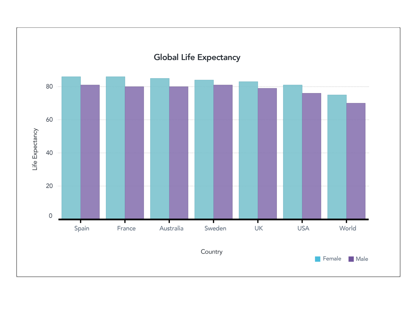
Figure 2. Global Life Expectancy (full axis) World Bank (male) World Bank (female)
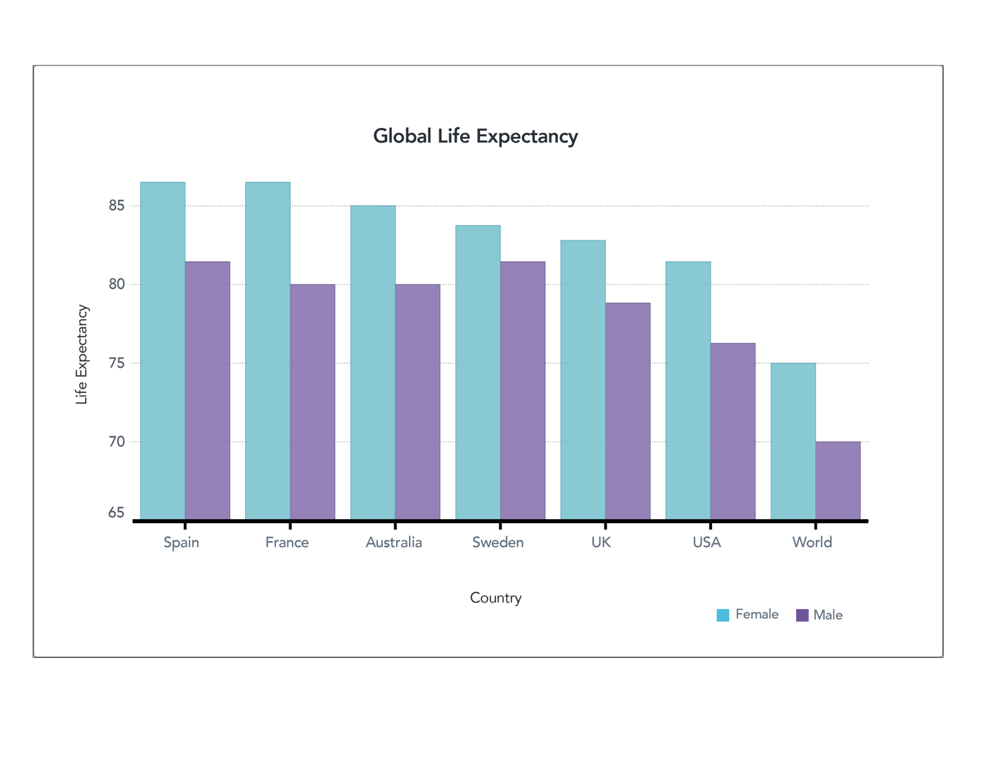
Figure 1. Global Life Expectancy (truncated axis) World Bank (male) World Bank (female)
Let’s take another look at some of the data we examined before. These two charts show life expectancy in different countries. We demonstrated how truncating the axes allow you to see the differences in data, but also might lead readers to view those differences as more significant than they really are. Now suppose this isn’t an honest mistake, and the author wanted to create content to convince you of something – perhaps that you should move to France to live longer. If that were the case, the author might create a chart like the one below.
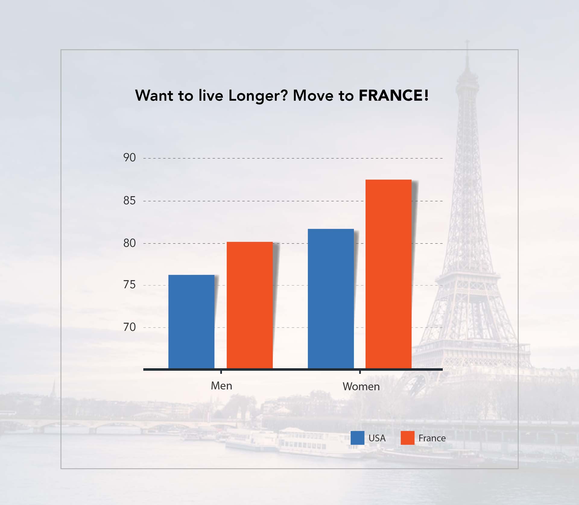
Figure 3. Life Expectancy Social Media Post
Does this seem like something you might see on your social media feed? The is the same data as in previous charts, but it’s been heavily manipulated so that you focus on what the author wants you to see. First, it includes a large title with the conclusion the author wants you to make – that moving to France will lead you to live a longer life. It doesn’t mention that this is solely the life expectancy of the country’s residents. A variety of cultural and lifestyle factors come into play, and would not apply if you simply move to a place. Also, removing gridlines and shrinking the size of the font showing age makes it harder to read the scale of the data. The choice of colors also further conveys the purpose — implying that the U.S. is worse than France.
Manipulating data to make a point
Let’s take a look at another chart. Here’s data from the same source, presented two different ways.
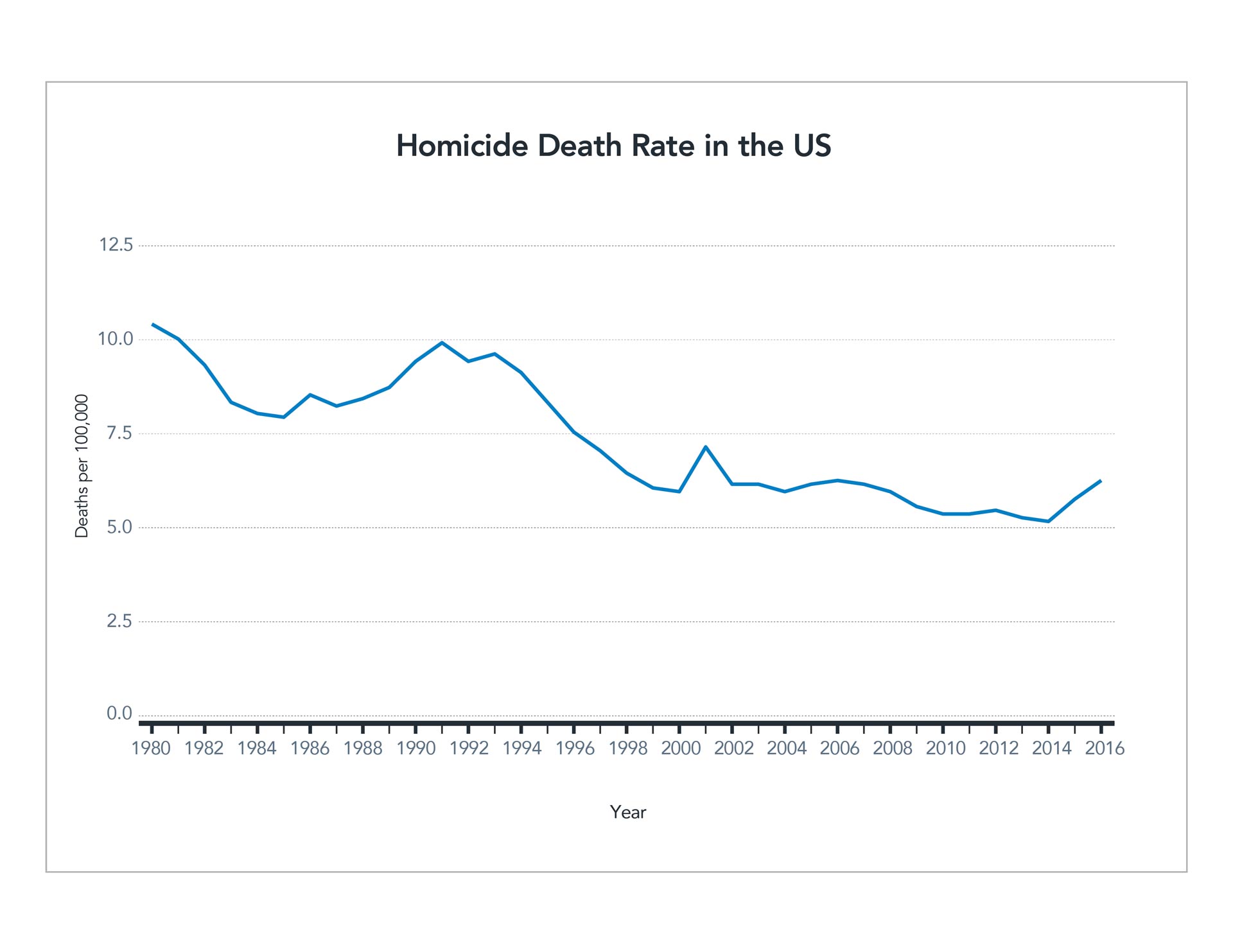
Figure 4. Homicide Rate Line Chart CDC
Figure 5. Homicide Rate Social Media Post CDC
The first shows the death rate by homicide relative to the population. It charts the rate over 36 years and indicates a mostly steady decline. Despite some bumps and dips, but overall, the trend is downward. However, look how the data can be manipulated to prove a specific point. The second graph uses a different unit, the raw number of homicides each year. It dos not average it out as population increases. The scale of years also is manipulated slightly. The first half of the graph represents four years, while the second half represents only two years. However, this isn’t brought to the reader’s attention. The axes are truncated, and the width is even reduced to further exacerbate the angle of the line. Again, the chart has a bold title with a random (and in this case meaningless) statistic tossed in for good measure.
There are many ways to manipulate data to prove a specific point. These graphs are just two examples of the ways people may present data to make a particular point, especially when sharing on social media. If you see a graph like the one above, with a catchy headline and no additional context, take a careful look and see if you can find how the author may have manipulated information to emphasize a point.
Disregard suspect data
It is challenging and sometimes impossible to conduct further research on social media posts or find the source or context of data presented. If you can’t find a reputable source that provides this context, it’s best to ignore the information. Approach it as an opportunity to be a responsible consumer of data — don’t share or “like” such posts! If you’re particularly curious about a point being made, see if you can find your own data to back it up and perhaps create your own content in a thoughtful, context-driven way.
To learn more see Diving into charts and graphs in the news or our full list of related articles below.
Test yourself: Take our data quiz (here or below)!
Related articles:
- 6 Strategies for making sense of data in the media
- Diving into charts and graphs in the news
- Exploring statistics in the media
- Understanding complications with data collection
- Evaluating claims made from data
- Special look at issues with infographics
- How to be savvy about data in the news
- Quiz: Can you make sense of data?
![]() About SAS: Through innovative analytics software and services, SAS helps customers around the world transform data into intelligence.
About SAS: Through innovative analytics software and services, SAS helps customers around the world transform data into intelligence.
Making sense of data: Special look at issues with infographics
Making sense of data: Special look at issues with infographics is the fifth in a series, presented by our partner SAS, exploring the role of data in understanding our world. SAS is a pioneer in the data management and analytics field.
Infographics are one of the most visual ways to tell stories with data. They are designed to catch the reader’s eye, and they use visuals to provide a lot of information in a small amount of space. However, we’ve learned there are many ways data can mislead a reader, and those same issues often come up when using infographics. Let’s explore some of the special features of infographics that make these representations particularly challenging to interpret correctly.
Over-designing infographics
Infographics are intended to attractively display information and often incorporate several design elements. But sometimes those design elements overpower the data and distract the reader from the underlying information. Common design elements inspire the infographic below.

Figure 1. Example Infographic CDC
This infographic communicates facts regarding the causes of accidental deaths in the U.S. in 2013. The charts are designed to be visually appealing, and they are. However, the data itself could be communicated in a clearer and more concise manner if the creator used traditional graphs and charts.
Let’s start with the pie chart. It shows the main causes of accidental death. There isn’t much of a difference between the rates of poisoning (30%), falls (26%) and motor vehicle accidents (23%). Yet, the enlarged wedges imply that poisoning deaths far exceed deaths in motor vehicle accidents. This type of design violates the principle of proportional ink.
The next graphic shows a rounded bar chart depicting motor vehicle deaths by age. Here again, this type of display alters the perception of the data. Because the inner circle has a smaller radius, the yellow bar appears to go farther than any other bar. But if you look at the actual data, it should be much smaller than the purple or blue bars. The manipulation of the graphic makes it appear more significant than it is.
Consider size and scale
The use of icons to represent data, as seen in the chart showing accidental deaths of infants, is a common infographic design. However, if the creators aren’t careful, the size and scale of the icons can make the data difficult to accurately interpret. In this graphic, the drowning icon is smaller in scale than the others, hiding how many more deaths are caused by drowning compared to other causes. This graphic would be much easier to interpret correctly if the scale of the icons was equal.
The next bar chart, showing drowning by age, uses a different design treatment — a 3D view. This makes the chart more appealing than a traditional bar chart, but again, the design makes it harder to read. The 3D view doesn’t display axes so the only thing the reader can do is compare the different categories, not make judgments on the total numbers. The perspective on the chart is misleading as well. The scale of the first bar (ages 5-25) looks significantly larger than the last bar that’s further away (65+) but, the actual difference in these values is not substantial (710 and 554 respectively). This is another case where the design treatment of the graph makes it easy to draw incorrect conclusions.
The last graphic, accidental deaths by firearm, uses icons to communicate a statistic, but the graphic isn’t particularly helpful. Here each image icon represents 10 people accidentally killed by firearms, but the use of the graphic doesn’t help the user understand the scale of deaths. It is simply there to add visual display to a statistic.
Prioritizing design
In addition to the design issues above, important information may be left out of an infographic. The creator isn’t intentionally trying to mislead readers in this case, but rather, he or she is prioritizing design because the additional data might detract from the overall product. This can include important features such as axes, labels and other elements that are critical for reading and understanding a chart. Consider the 3D bar chart in our example. Without an axis labeling the value of those bars, it is impossible to interpret the chart accurately.
Context is often one of the most important things infographics can lack. We’ve talked in detail about the importance of asking questions about the data you’re reading, such as “what did the survey ask?” and “where does this data come from?” That information is often present in longer articles able to describe the methodology and sources of data. Infographics may not have this context to help you answer critical questions. A good infographic will provide at least a reference to where the data comes from, or where you can find more information, but this isn’t always the case. You may see infographics with data from a variety of sources, which means it may have been collected using different methodologies or samples, making it challenging to piece together a cohesive picture.
Overall, infographics can be a nice way to engage readers with data and information. However, issues arise when the design of the infographic takes precedence over accurately communicating information. Creators of infographics should carefully focus on readability first, before considering design. And readers should recognize that the issues we have covered about interpreting data in reports, articles and surveys hold true when interpreting infographics, and may be especially challenging in this case.
Test yourself: Take our data quiz (here or below)!
Related articles:
- 6 strategies for making sense of data in the media
- Diving into charts and graphs in the news
- Exploring statistics in the media
- Understanding complications with data collection
- Evaluating claims made from data
- Spotlight on data in social media
- How to be savvy about data in the news
- Quiz: Can you make sense of data?
![]() About SAS: Through innovative analytics software and services, SAS helps customers around the world transform data into intelligence.
About SAS: Through innovative analytics software and services, SAS helps customers around the world transform data into intelligence.
Making sense of data: Evaluating claims made from data
Making sense of data: Evaluating claims made from data is the fourth in a series, presented by our partner SAS, exploring the role of data in understanding our world. SAS is a pioneer in the data management and analytics field.
Every day people use data to better understand the world. This helps them make decisions and measure impacts. But how do we take raw numbers and turn them into information that we can easily understand?
We make claims, or statements, about what we think the data tells us. And we often get our information from what the media report about data. And authors use data to support arguments or inform the public. However, the claims may depend heavily on how and what type of data was collected. We discussed some issues with data collection in the last post, but let’s go into more detail about issues that may arise when authors use data to build arguments or make claims.
Control or comparison groups
People often use data to draw comparisons between different types of groups or behaviors. It’s important to pay attention to the questions asked and who is being asked. And, it’s equally important to ask what researchers are comparing their claims against.
Imagine we poll people and find that 60% say green is their favorite color and they eat vegetables every day. We could claim that liking the color green means a person is more likely to eat vegetables. While the survey indicates that most people who like the color green eat vegetables daily, it’s hard to draw further conclusions without a comparison group.
If only 20% of people who don’t like the color green eat their vegetables, this might suggest an interesting relationship. However, it might also be true that 60% of people who don’t like green eat their vegetables – the exact same proportion. In this case, liking the color green has absolutely nothing to do with vegetable consumption. You might also find that 90% of people who don’t like the color green eat vegetables daily. This shows a negative relationship between liking the color green and eating vegetables daily.
As you can see, if an author presents only one number without comparison, interpreting the true value of the statement can be difficult. We need to compare that number against another group to get a better picture of its significance.
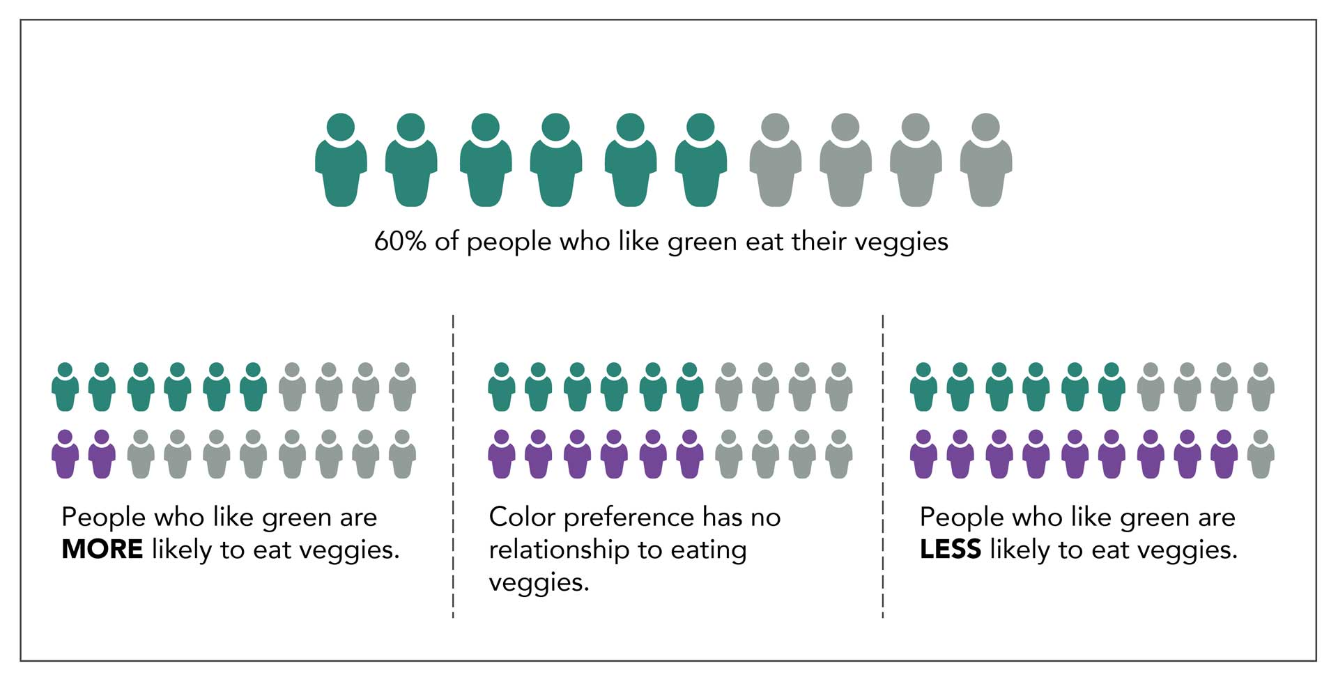
Figure 1. Comparison groups
Learn more: Making Sense of Data on Checkology
Interventional studies
This is especially important when researchers conduct interventional studies in areas such as medicine, fitness, food, and other areas to investigate a particular outcome. In these cases, researchers use a control group. This is a special population that serves as a comparison and does not receive whatever is being tested. Designing an appropriate control group can be tricky because things can change simply because the group is aware it is being observed.
Imagine we conduct a trial for a new weight loss drug. Participants are split in half. One group receives the new drug, and the other group receives nothing. Our goal is to determine which group loses the most weight. It may be that the people who receive nothing realize that the situation remains the same and they are not receiving treatment. It’s unclear how this might affect their behavior. Similarly, the people taking the drug assume something might happen, and perhaps this affects their attitude and behavior. We can’t tell if the drug had the impact or if the act of taking a pill changed their behavior. For this reason, many studies include a placebo, a pill that doesn’t contain any chemicals at all, as part of the comparison. This works well especially if researcher and participants do not know who gets the placebo and who gets the real drug.
More challenging studies
This can be much harder in studies that don’t involve medication. Perhaps my intervention is an exercise program. How can I design a fair control group? Do I give my control group advice to not exercise? Do I ask them to do exercise that is similar to my program but not exactly the same? Each of these decisions directly impacts the comparisons I might be able to make and how I will communicate results.
When reading such study data, it’s important to look at the actions of both the experimental group and the control group. Ask yourself if the comparison seems fair, or if it seems as though one group had an advantage or disadvantage. What other factors might explain the results you see?
Bias in research
Finally, why the studies are being conducted and who is interested in the research are of particular concern in data and research studies. Specifically, organizations collecting data on their own products may be motivated to prove those products work or that people like them. They may unintentionally make decisions in designing their research questions or comparison groups that increase the chances they get the results they’d like to see. Researchers who receive money from a specific organization may also make decisions that favor the group that funded their research. As we’ve already learned, there are many complicated decisions that go into collecting data that will inevitably impact the quality of the final result, so it’s important to critically analyze these choices.
While data allows us to measure and better understand our world, it is not a perfect representation of reality. There are many opportunities for bias or flaws when collecting data that can impact the quality of the results. Critical thinking is the best way to find these biases or flaws when reading about data. Ask how the data was collected and from whom. Look for who was included and who was left out. If there is something that seems impressive, ask “compared to what?” To gather those answers, you may have to do some digging of your own, but it will help you determine what data you can trust and recognize data that may be too biased or flawed and should be disregarded.
Test yourself: Take our data quiz (here or below)!
Related articles:
- Six strategies for making sense of data in the media
- Diving into charts and graphs in the news
- Exploring statistics in the media
- Understanding complications with data collection
- Special look at issues with infographics
- Spotlight on data in social media
- How to be savvy about data in the news
- Quiz: Can you make sense of data?
![]() About SAS: Through innovative analytics software and services, SAS helps customers around the world transform data into intelligence.
About SAS: Through innovative analytics software and services, SAS helps customers around the world transform data into intelligence.
Making sense of data: Understanding complications with data collection
Making sense of data: Understanding complications with data collection is the third in a series, presented by our partner SAS, exploring the role of data in understanding our world. SAS is a pioneer in the data management and analytics field.
As we have seen, statistics and visual representations of data can be misleading. But what happens when the data itself is misleading? And if data is supposed to be based on fact, you might wonder how data can be misleading. It comes down to the way it is collected. It is essential to have a strict process of collecting data before analyzing or presenting it. To ensure the data is accurate and as representative as possible, we must pay special attention to how data is collected.
Here are some of the most important questions to consider when understanding how data is collected:
- Who or what is represented in this data?
- What questions are being asked?
Sample selection and data collection
Without collecting data on an entire population, it’s nearly impossible to report it with complete accuracy because of sampling limitations. Suppose we want to better understand the eating habits of Americans. The only way to ensure we have an accurate picture of American eating habits is to monitor every single American, every second of the day, and record everything they eat. Since this is impossible, researchers will oft en use a sample, or a small portion of the population of interest. When the sample selected isn’t representative of the larger group, you get misleading data.
Consider how this might play out if someone was conducting a dietary study of Americans. In this case, the study asks 100 people about their eating habits. But how are those people selected? Options are endless:
- Collect data from 100 friends. That’s a convenient sample, but most people’s friends are about their age and eat similar types of foods.
- Gather data from a local restaurant or grocery store. Again, this might impact the type of data collected. For example, surveying people in a fast-food restaurant may give very different answers than surveying people in an upscale restaurant or a health food store.
- Conduct surveys at a non-food establishment, such as a library. This could be problematic, as library–goers might eat differently than the rest of the population. But even more concerning, those library–goers all come from the same area. The type of food people eat varies by locale. Those who live in cities likely eat different foods than those who live in rural areas. Food preferences can also vary depending on a person’s background or culture.
All of these are confounding factors or present possible issues with data. If we want a representative sample, we need to gather data from a cross section of age, gender, race, residence, income level, and so on. Finding such a representative sample can be incredibly difficult, and so it doesn’t often happen. Researchers typically report the population used in samples. This helps the reader understand who is reflected in the sample and the impact that might have on the results. As a consumer of data, it’s important to pay close attention to this piece of information. Ask yourself if the results presented by the researchers apply to the whole population or if those results only apply to the population sampled.
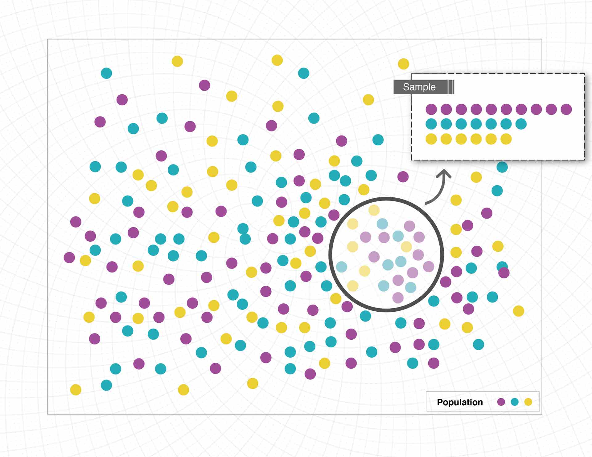
Figure 1. Biased Sample
Additionally, there can be issues when how the data is collected, or the questions asked, only tell part of the story. We said before that the best way to see what people are eating is to consistently monitor what they do, but getting firsthand access to information like this is often impossible or unethical. Instead, researchers design studies or questions to gather similar information. Consider the following scenarios:
- Researchers ask participants to keep a food log for a week that details everything they eat and track total servings of fruits, vegetables, meat, etc.
- Researchers ask participants “In general how many servings per day do you have of fruits, vegetables, meat, etc.?”
- Researchers ask participants “What kind of foods do you usually eat?”
Each of these scenarios is trying to answer the same question: What do people eat? But the information is being gathered in very different ways.
Scenario 1 seems closest to our observation study, but there are some ways that the data may be biased. One concern is that people know they’re recording their foods, and this may lead them to eat differently for the duration of the study. The data could also vary depending on the time of year. Many people make different food choices in the summer compared to the winter.
Scenario 2 also presents problems. This question asks people to think more holistically but relies on memory and judgment. Individual estimates of what is typical may vary from what is actually eaten. People may intentionally or accidentally make themselves appear to be healthier eaters than they really are. It can also be difficult to accurately judge your own behavior.
In Scenario 3, the question isn’t specific enough to gather good information. While people might report the amount of fruits and vegetables they eat, the question leaves room for general or unrelated answers, such as cuisine type (Italian, Mexican or others), or a preference to eat out or at home.

Figure 2. Conducting a Survey
As you can see, the way questions are asked, and who is asked those questions, makes a big difference in the kind of information collected. Some questions are better than others. When interpreting data, see if you can find the questions asked by the researchers. Are they good questions? And are the results influenced by how the researcher asked them or how they gathered the data?
Test yourself: Take our data quiz (here or below)!
Related articles:
- Six strategies for making sense of data in the media
- Diving into charts and graphs in the news
- Understanding complications with data collection
- Evaluating claims made from data
- Special look at issues with infographics
- Spotlight on data in social media
- How to be savvy about data in the news
- Quiz: Can you make sense of data?
![]() About SAS: Through innovative analytics software and services, SAS helps customers around the world transform data into intelligence.
About SAS: Through innovative analytics software and services, SAS helps customers around the world transform data into intelligence.
Making sense of data: Exploring statistics in the media
Making sense of Data: Exploring statistics in the the media is the second in a series, presented by our partner SAS, exploring the role of data in understanding our world. SAS is a pioneer in the data management and analytics field.
“Numbers don’t lie” is a phrase we often hear to support the idea that something must be true if you can cite data or statistics about it. But even accurate numbers can paint a misleading picture, particularly if people don’t know what to look for. Several common ways to report metrics and statistics can easily mislead readers. Let’s explore how statistics can be misinterpreted.
Mean vs. Median
Mean and median are two statistical concepts that often get muddled. Both are measures of central tendency, meaning the values are intended to represent the “middle” of the data. But this can be done in different ways, which is important to understand.
To find the mean, or average, add together the value for every member of a group and divide it by the total number of members. Say you and four friends were trying to figure out the average amount of money in your wallets. You’d count up the total amount of all your money and divide it by five. Median, on the other hand, represents the value in the very middle. In this case, you’d arrange each person’s money from the least amount to the greatest. The median is the amount in the middle. Two people have larger amounts, two people have smaller amounts. The person with the median amount of money is smack in the middle.
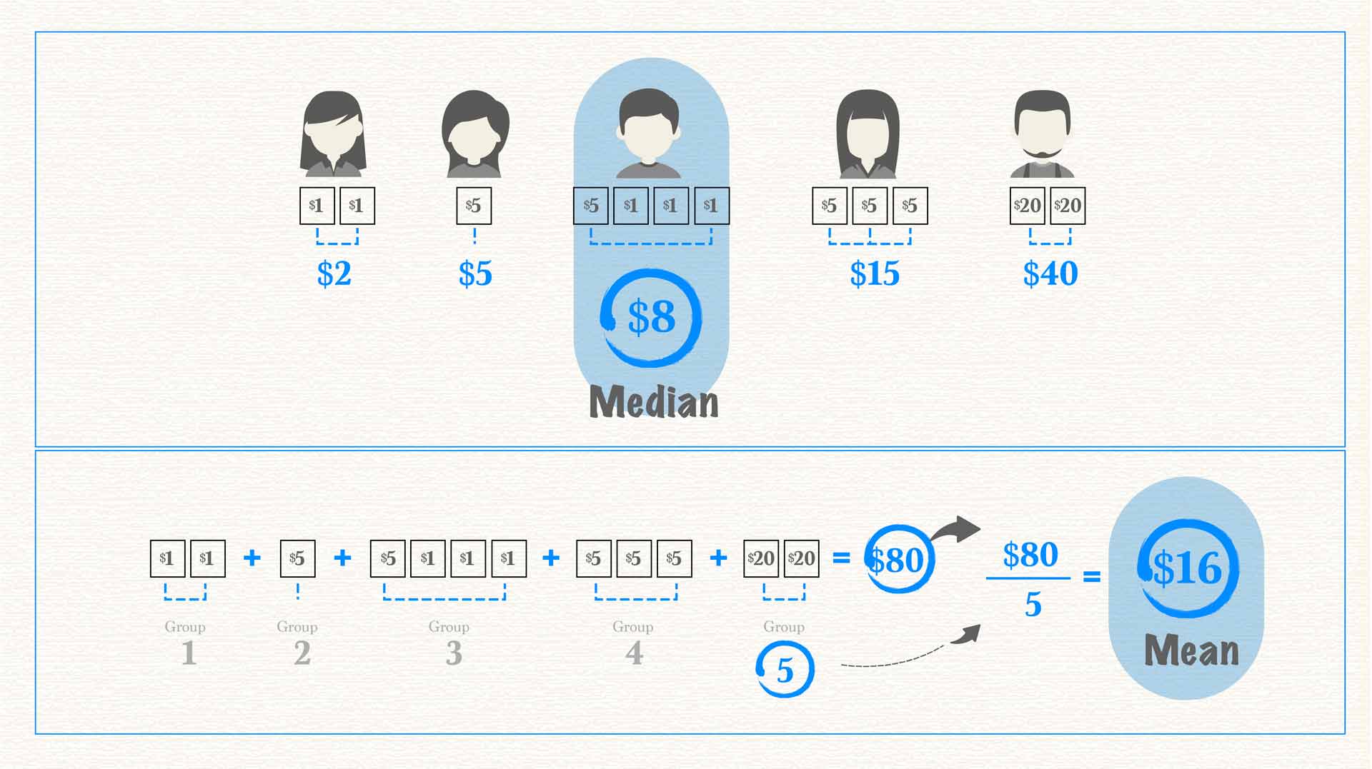
Figure 1. Median vs. Mean
As you can see in the image above, the average and the median are not always the same. In fact, with heavily skewed data, they can be quite different. When we talk about skewed data, we’re referring to data with a heavy concentration of values on one end and only a few values on the other end. This often happens when discussing income, which is easily skewed because most of us have middle- or low-income levels while only a small percentage have very large incomes. Take U.S. income data from 2014, for example.
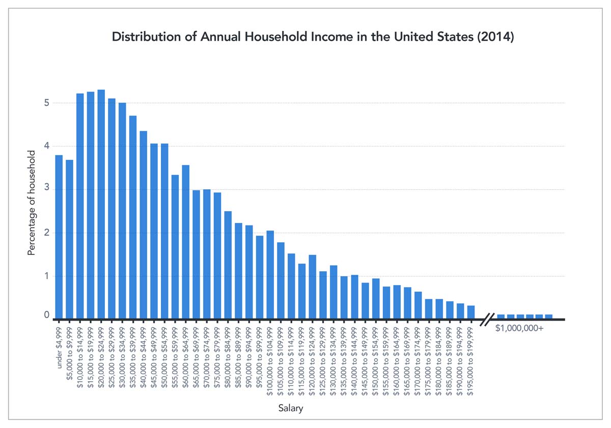
Figure 2. Distribution of Annual Household Income in the United States (2014) U.S. Census Bureau
Don’t be misled
The median income in the U.S. is approximately $33,000, while the mean (average) income is approximately $50,000. This data shows half the U.S. population makes $33,000 or less. However, if you consider the total of 2014 incomes across the population and divide by income-level breakdowns, the average salary is $50,000. This average salary might lead you to believe that the “average American” is doing better than he or she actually is. In reality, people who make the median salary would love the 50% raise the average salary represents. The value reported can make a big difference in how people understand information.
Impact on decision-making
A solid understanding of these metrics is especially important when statistics influence decision-making. Consider how life expectancy is often reported. Though we rarely see the term “average” used, that is what the data show. The average age at death in the U.S. is around 79, but the median age at death is about 83. This difference has a big impact on decision-making, such as retirement planning. It is quite different to say, “the average person dies at 79” compared to “half of adults live 83 years or longer.” Our retirement funds would likely be more of a priority in the second instance than in the first.
So, which measure is the best one to give when explaining data? Whenever possible, the answer is both. Knowing both mean and median gives the reader a better understanding and clearer picture of the data at hand and helps them draw accurate conclusions. But having people apply this thinking is not always in the best interest of the person reporting the numbers. You’ll notice that lottery tickets often advertise the “average winnings,” which can be enticing, compared to the “median winnings,” which are usually $0.
Percent Change
Changes, when given as a percentage, are another type of statistic commonly misused or misinterpreted, and can cause confusion.
One particularly confusing case arises when the value that is changing is, itself, a percentage. Suppose a local politician is performing “fairly well” with an overall approval rating of 50%. Then, this politician opposes a bill to fill all the potholes in town, and with that, the politician’s public approval plummets. If the politician’s approval rating dropped by 20 percent, that is 20% of the initial 50%, giving the politician a 40% approval rating. The narrative changes if the politician’s approval rating drops 20 percentage points. This brings the rating of 50% down to 30% — 20 points lower. The language sounds very similar but the resulting numbers are quite different.
Another common source of confusion arises when something increases over 100%, or doubles. Imagine we’re talking about a garden and how many more tomatoes were grown this year compared to last. If 100% more tomatoes were grown this year compared to last year, that means the yield doubled — 10 tomatoes became 20. What if the yield went from 10 tomatoes to 15? The yield increased by 50%, but the total yield is 150% of the previous year. Confusing? Yes! That’s why statistics can be difficult to interpret.
Avoiding confusion
Sometimes authors confuse the two and report that something increased 150% when it only increased 50%. Say the garden produced 25 tomatoes this year, an increase of 150%. But someone might interpret that to mean the garden had 150% of the yield and only had 15 tomatoes. It’s often confusing, and when reading someone else’s reporting it can be hard to tell if the correct percentage is being cited since these terms are often and easily misused accidentally, or perhaps by design. If reporting an increase, an easy way to solve this problem and help the reader fully understand the metric being used is to provide all the numbers up front. One could report, “the garden’s yield increased from 10 to 25 tomatoes. That’s a 150% increase!”

Figure 3. Tomato yield example
Another tricky area when interpreting data involves the unit an author chooses to present. Sometimes, the same information can look very different depending on the unit presented. For example, during the COVID-19 pandemic we’ve seen different sources report new cases, total cases and cases per capita, all of which have very different patterns of behaviors across states and countries. Authors also might talk about total deaths, deaths per capita or deaths as a proportion of positive cases. This post provides more detail about the differences these numbers represent and how those differences in reporting can impact how we understand data.
A significant influence
The types of statistics and metrics authors use to communicate data can have a significant influence on how information is interpreted, especially if the author is not careful to fully explain the reasoning behind them. Authors can also make mistakes when presenting and interpreting statistics because of nuanced differences in language and calculations.
To ensure you understand data you encounter, carefully consider whether the metric used is the relevant one, given what the author is trying to communicate. If you don’t feel it is, try to find more information about what might be missing. If you are presenting your own data, the safest route is to carefully explain the metrics being used and the motivation behind those metrics. Working through this explanation helps you as well, providing the opportunity to confirm you’re reporting information in the best way possible.
Test yourself: Take our data quiz (here or below)!
Related articles:
- Six strategies for making sense of data in the media
- Diving into charts and graphs in the news
- Understanding complications with data collection
- Evaluating claims made from data
- Special look at issues with infographics
- Spotlight on data in social media
- How to be savvy about data in the news
- Quiz: Can you make sense of data
![]() About SAS: Through innovative analytics software and services, SAS helps customers around the world transform data into intelligence.
About SAS: Through innovative analytics software and services, SAS helps customers around the world transform data into intelligence.
Making sense of data: Diving into charts and graphs
Making sense of data: Diving into charts and graphs is the first in a series, presented by our partner SAS, exploring the role of data in understanding our world. SAS is a pioneer in the data management and analytics field.
Charts and graphs are useful tools for communicating complex information. They allow consumers to see — rather than read or calculate — differences and trends. Charts and graphs provide readers the ability to visually consume information, answer their own questions and draw novel conclusions. Yet, these types of data visualizations are often designed to communicate the purpose of the creator. Those creators make decisions while designing charts and graphs to potentially emphasize characteristics of the data that lead users to draw specific conclusions.
Need an example? Let’s start with this chart showing life expectancy for males and females in different countries.
Figure 1. Global Life Expectancy (truncated axis) World Bank
This chart was specifically designed to highlight the differences among groups. It’s very clear that in all the countries selected, women outlive men by several years. We see that the high-income countries selected in this chart have greater life expectancy compared to the rest of the world, but people in the U.S. have a lower life expectancy than those in other industrialized nations.
If we examine the chart more carefully, we see that it violates the principle of proportional ink. This principle of data visualization recommends that the amount of ink used to represent values be proportional to the value it represents. This chart violates this principle with a truncated — or shortened — vertical axis that starts at age 65. When you look at the difference between male and female life expectancy across the world, twice as much ink is used for the female bar as for the male bar. If viewers don’t double–check the labels on the axis, this may inadvertently lead them to think that women are living twice as long as men. More likely, readers notice the labels but still perceive the difference as being very significant.
Figure 2. Global Life Expectancy (full axis) World Bank
Alternatively, the above chart represents the same data but follows the principle of proportional ink. The height of each bar is proportional to the value it represents. Here, the significance of the trends is visible but much less stark. We can again see that women outlive men and that the U.S. is a bit behind the rest of the industrialized nations, but this chart highlights that the differences are a matter of a few years and not a much higher order of magnitude.
If an author were trying to discuss the differences, you could imagine that this chart would be less compelling than the first. Neither is inaccurate; they just use visual cues to highlight different aspects of the data, which can lead readers to draw different conclusions.
Looking at a line chart
Let’s explore a different approach using a line chart. The chart below shows changes in the U.S. birth rate (births per 1,000 people) over time. This line appears to be moving slowly and steadily downward, representing a decline in births over time.
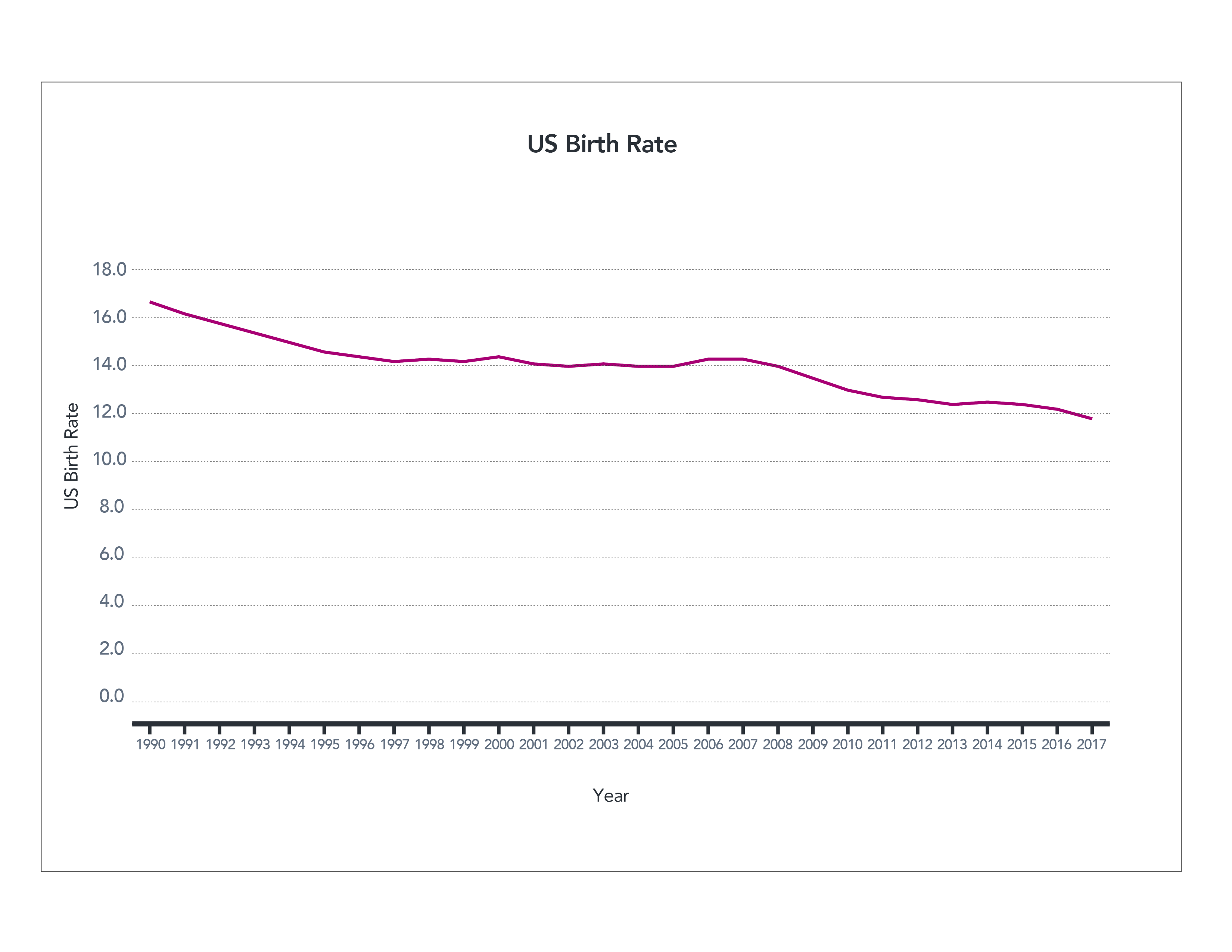
Figure 3. US Birth Rate (full axis) World Bank
The information is correct, but what happens if we truncate the axis again?
The declining birth rates begin to look much more significant in the following chart. This visualization also highlights that the steady decline seen above wasn’t actually so steady. From 1997 to 2008, the birth rate stayed more or less the same. So which graph is accurate? Again, technically both.
Both highlight different aspects of the story using the same data. If an author wanted to highlight the pattern of steadiness from 1997 to 2008, they might use the second graph. If they wanted to highlight the slow and steady decline, they might choose the first. An author may even further manipulate the information by focusing on a specific time frame.
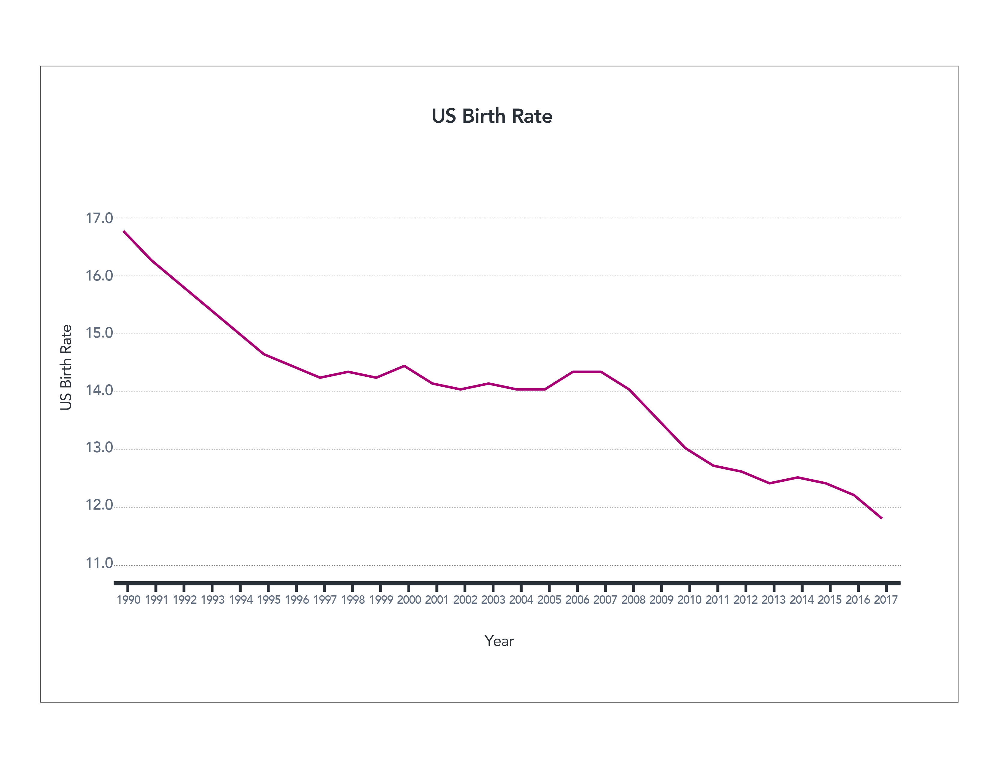
Figure 4. US Birth Rate (truncated axis) World Bank
Now take a look at a graph depicting birth rates that starts in 1997, below. This data visualization makes it look like something happened in 2008 that caused a sudden, unprecedented downturn in birth rates. When we have access to the larger historical perspective, we can see that declining rates occur over the last 30 years, but the context is lost in this presentation. This could be a case of intentionally misleading the reader. The author may choose not to give the reader the full picture in order to reinforce a specific point.
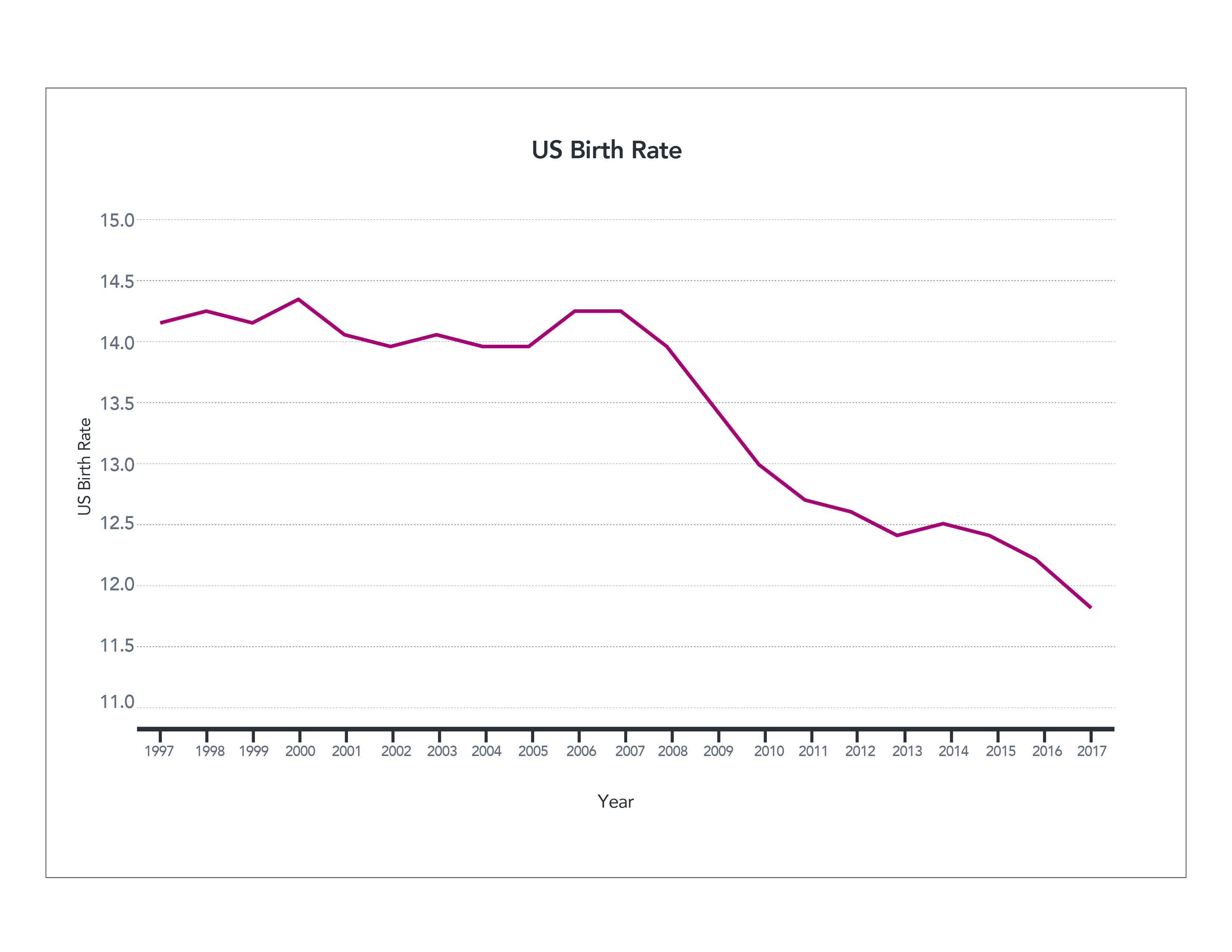
Figure 5. US Birth Rate (1997-2017) World Bank
Here’s another example that may be particularly hard to interpret. Sometimes authors wish to present data that occurs on very different scales. The chart below shows the leading causes of death in the U.S. over time. Heart disease, the number one cause of death, killed around 400 people per 100,000 in 1980. The fourth most common cause of death, unintentional injuries, killed approximately 40 people per 100,000. What’s harder to see are the rates of the lowest–ranked causes of death. They’re all clustered at the bottom because of the scale of the vertical axis, making them hard to read.
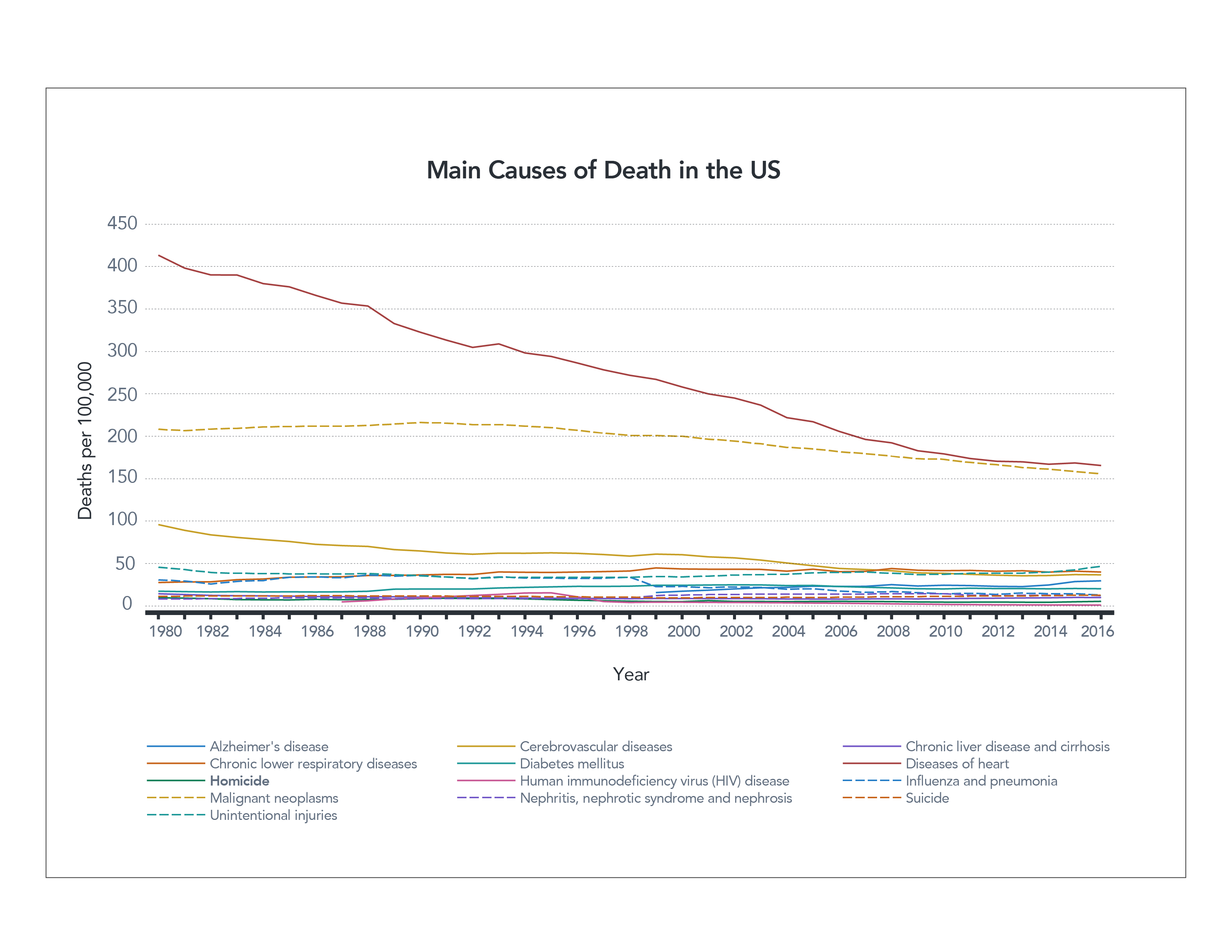
Figure 6. Main Causes of Death in the US (linear axis) CDC
Understanding a logarithmic scale
One way to fix this is by using a logarithmic scale. This means that values from 1-10 are given the same vertical real estate as values 10-100, and 100-1,000. Using a logarithmic scale can help spread out data that have significant differences in values. You then can see individual trends in each line much better. By spreading out the data in the chart below, you can see the drop in deaths from HIV much more clearly than in the first graph.
However, logarithmic scales are not necessarily something most people are familiar with, and they can be challenging to read properly. You might look at this chart and note that there has been a slight decrease in the number of deaths caused by heart disease from 1980 until now, but in reality the number has been reduced by more than half, from about 400 to 160 people per 100,000.
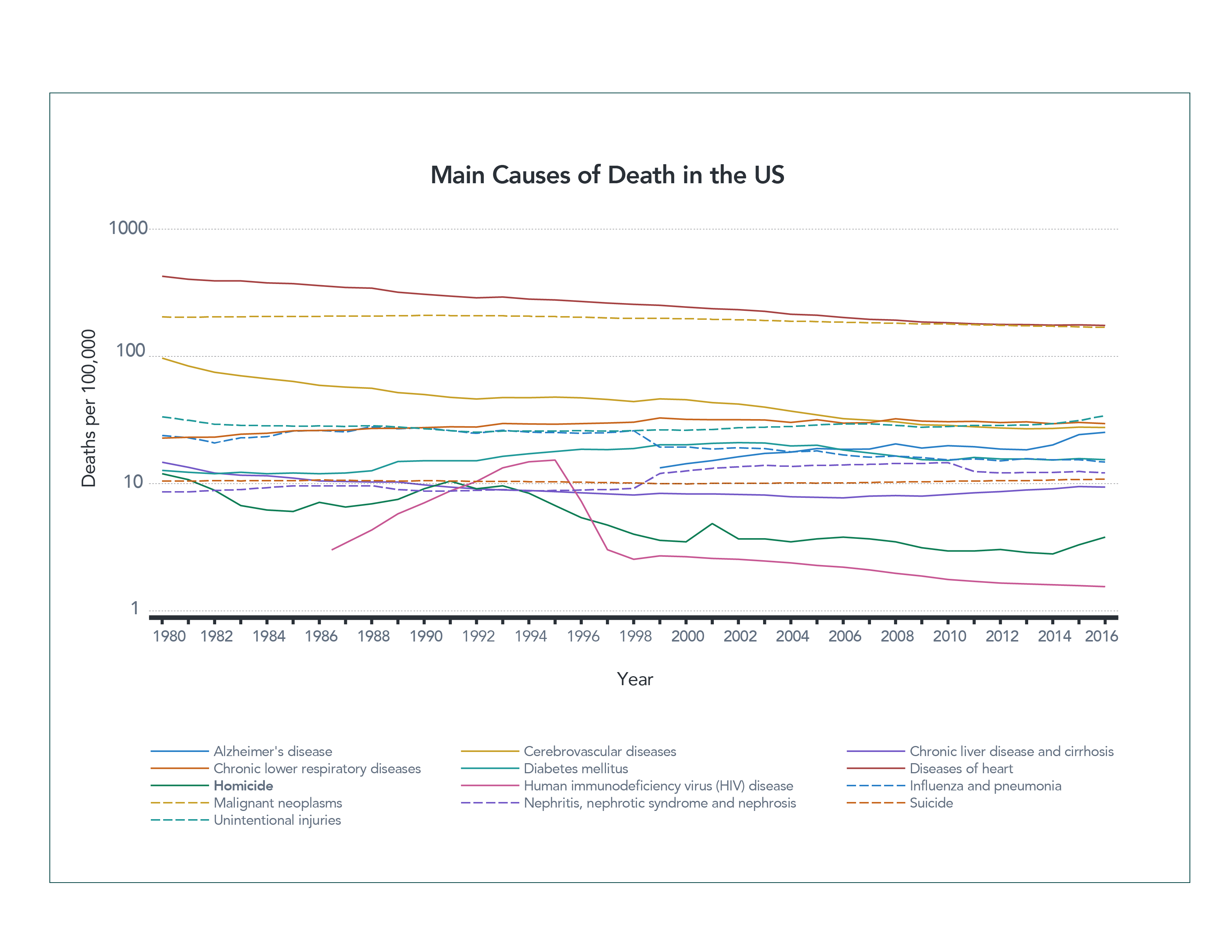
Figure 7. Main Causes of Death in the US (logarithmic axis) CDC
Both graphs have their value. One allows you to see the lower values more clearly; the other is easier for most people to interpret. Which is the appropriate one to use? Unfortunately, the answer is “it depends.”
As with all other forms of information, authors will choose the one that most accurately communicates their purpose. That purpose might be to persuade you or simply present a particular piece of information more prominently. What matters most is how you, the reader, respond to the data.
You can be a better consumer of data visualizations by examining the charts and graphs you see more carefully. Take note of whether a vertical axis has been shortened or distorted in some way, for example. Consider what the data might look like if presented differently. Examine the data that’s been chosen, what’s been left out, and if the graph tells the whole story. Could you gather more information to give the graph better context?
Asking and answering these types of questions will make you a smarter and more responsible consumer of data. You’ll be able to find the true answers behind the data and distinguish those from the information the author was specifically trying to draw attention to.
Test yourself: Take our data quiz (here or below)!
Related articles:
- Six strategies for making sense of data in the media
- Exploring statistics in the media
- Understanding complications with data collection
- Evaluating claims made from data
- Special look at issues with infographics
- Spotlight on data in social media
- How to be savvy about data in the news
- Quiz: Can you make sense of data?
![]() About SAS: Through innovative analytics software and services, SAS helps customers around the world transform data into intelligence.
About SAS: Through innovative analytics software and services, SAS helps customers around the world transform data into intelligence.
Making sense of data: Six strategies for making sense of data in the media
The series described below, presented by our partner SAS, explores the role of data in understanding our world. SAS is a pioneer in the data management and analytics field.
Data can be a powerful tool. It helps us to understand the world with more precision and greater clarity. Data is often the foundation for research, news articles and social media posts. Authors rely on data to help tell their story or prove their point. Because of its power to influence our understanding and decision–making, it’s essential that we learn how to confidently and critically consume the data we encounter.
If data is so intertwined with our daily lives, how then do we gain the skills to make sense of it, ask the right questions and draw the right conclusions?
We will address these questions and more in this blog series and cover a number of data analysis and presentation topics.
Diving into charts and graphs
When we talk about data visualizations, we’re referring to charts and graphs that help people visually make sense of large amounts of data rather than comparing raw numbers. Charts and graphs make it possible to see patterns and trends more clearly. At times, however, they can create confusion due to the way they’re presented. They can be misleading even if the underlying data is accurate. We’ll explore some of the common decisions that graph designers make when presenting information and how these decisions may impact what you see and understand.
Exploring statistics in the media
Whether it’s climate change or economic growth, statistics are often used to reinforce and better explain issues we face. Yet, there are many ways to use statistics to represent similar information. The type of measure or statistic used can significantly alter the story being told, so it’s important to be careful and understand the numbers. We’ll look at commonly used statistics and how they are often presented to help you understand what those numbers really mean.
Understanding complications with data collection
Even though data represents relevant issues, it is largely impossible to capture a completely accurate picture of the world around us. Instead, researchers rely on data collection methods to gather a close approximation. Unfortunately, the tools used can unintentionally skew the results. Therefore, it is important to understand the context of data creation. We’ll discuss key questions about the data collection process so you can determine what conclusions you can draw from the data.
Evaluating claims made from data
Data is often used to justify claims or statements about our world. However, it’s important to consider the context in which that data was collected to understand whether those claims are justifiable. We’ll look at two areas of concern – when authors use data to make comparisons and when research funding may introduce bias.
Special look at issues with infographics
Infographics are designed to be visually appealing tools that can communicate a lot of information. But their focus on visual design often makes them hard to interpret correctly. We’ll discuss some common issues with infographics and how they tie into the principles we discussed previously.
Spotlight on data in social media
Social media is a powerful tool for communication, and many people are creating their own content to share messages broadly. However, individual content creators may be more likely to post data and graphs that are misleading. One reason is that the flashiest stories are often shared the most rapidly and widely. We’ll discuss how social media encourages users to forgo the guidelines discussed in previous posts.
That’s a lot of information about data to cover, but it’s important. Data matters, and we’re excited to start the journey to understanding it better with you.
Test yourself: Take our data quiz (here or below)!
Related articles:
- Diving into charts and graphs in the news
- Exploring statistics in the media
- Understanding complications with data collection
- Evaluating claims made from data
- Special look at issues with infographics
- Spotlight on data in social media
- How to be savvy about data in the news
- Quiz: Can you make sense of data?
![]() About SAS: Through innovative analytics software and services, SAS helps customers around the world transform data into intelligence.
About SAS: Through innovative analytics software and services, SAS helps customers around the world transform data into intelligence.
March on Washington demonstrates democracy at work
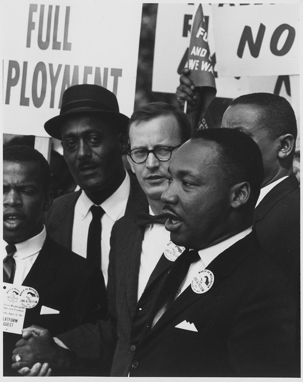
Dr. Martin Luther King Jr. speaks at the March on Washington. National Archives, Records of the U.S. Information Agency, Record Group 306 (National Archives Identifier 542014)
The rights of all Americans to freely assemble and to bring grievances to the government’s doorstep are intrinsic to American democracy and enshrined in the First Amendment. It’s what we’ve done for generations, perhaps most memorably on Aug. 28, 1963, when 250,000 people descended on Washington, D.C., to participate in the March on Washington for Jobs and Freedom. That day, the Rev. Martin Luther King Jr. delivered his “I Have a Dream” speech at the Lincoln Memorial, and it became a lasting touchstone of the civil rights movement.
But earlier that summer this now-seminal event was far from a sure thing. President John F. Kennedy initially opposed the march over fears of unrest that could derail civil rights legislation. After he decided to support the march, the Los Angeles Times received a message that its headquarters would be bombed unless the paper called the president a racial slur in print.
And during the planning, death threats targeted King and other key figures. Activists around the nation also received bomb threats. Meanwhile, opponents in Congress sought legislation to block the march. Some argued the demonstration was an “illegal assembly” that would cause violence and should be banned.
Despite this atmosphere of intimidation, the march took place peacefully, galvanized a movement and proceeded into the history books.
2020 march on Washington
This Friday, on the 57th anniversary of the march, the American tradition of public protest will continue when thousands of people again travel to Washington to call for racial justice. The Rev. Al Sharpton’s National Action Network organized the march in response to frustration over the killing of George Floyd in the custody of Minneapolis police in May, as well as other acts of violence against people of color. The Black Lives Matter movement also will march.
And just as in 1963, Friday’s demonstration faces challenges. Because of COVID-19 public health concerns, the event will include requirements for limited seating, social distancing, and other safety protocols. These concerns also prompted the NAACP to instead schedule a 2020 Virtual March on Washington, while the Movement for Black Lives will hold a virtual Black National Convention.
At NLP, we help young people understand the essential roles of the rights guaranteed by the First Amendment in a robust democracy. As Americans, we all must recognize the importance of these rights and ensure their protection for everyone.
Opposition to 19th Amendment relied on false narratives
This week marks the 100th anniversary of the ratification of the 19th Amendment to the U.S. Constitution, which gave women the right to vote. It took the women’s suffrage movement decades to achieve that goal, thanks to entrenched discrimination that severely restricted women’s lives.
Opposition to women’s suffrage relied on false narratives that seem particularly outrageous, and sometimes comical, even for that era. For example, an Atlantic magazine article Why Men Thought Women Weren’t Made to Vote noted the common theory that the mental effort of voting could make women infertile. In addition, mainstream science also deemed women’s brains to be unfit. “And if women overexerted their already inferior brains, the thinking went, their health could suffer,” the article explains.
Brutality and discrimination
Yet, the supposedly fragile nature of women did not prevent authorities from treating suffragists with brutality. Consider the 1917 arrests and imprisonment of nearly three dozen women picketing outside the White House. Their jailers gave them maggot-infested food, beat the women and force-fed those who went on a hunger strike. The D.C. Court of Appeals ruled the arrests unlawful, and freed the women.
While the 19th Amendment extended the vote to all women, in reality, black women (and for a time, Native American women) could not broadly exercise that right. Discriminatory laws in the South kept many Blacks — women and men — from the polls until the passage of the Voting Rights Act in 1965. The voter suppression tactics targeted at people of color also were based on false narratives.
False narratives persist
However, while these events and the opposition to the right to vote might sound like relics of an ancient civilization, it’s important to remember that false narratives persist. Such tactics can boost efforts to deny people their rights as citizens and denigrate segments of our population. In modern elections, false narratives raise false alarms about voter fraud and sow distrust of widely accepted voting methods.
Remember, news literacy is essential to being well-informed about how government works and to recognizing false narratives. Use your news literacy skills and knowledge during this election season to avoid misinformation — and to help others do the same.
NLP’s e-learning platform is now free
NLP is now offering its signature e-learning platform Checkology® free to help ease the transition to remote teaching and hybrid learning environments for educators and families. By removing barriers to access, NLP will support educators across the country with essential news literacy lessons at a time of urgent need. Misinformation about COVID-19, the upcoming presidential election and nationwide demonstrations against racial injustice has sown confusion, divided voters and put people’s lives at risk.
Checkology teaches young people to recognize and debunk misinformation, understand the vital role of a free press in a democracy, and become informed and engaged participants in civic life. Leading journalists, along with First Amendment and digital media experts, guide students through the platform’s 13 interactive multimedia lessons. (One foundational lesson is translated into Spanish.) Featuring real-world examples from social media and news sites, these learning experiences resonate with students, test their understanding and teach them critical-thinking skills. Checkology has been updated for the 2020-21 school year, making it even easier to use, with one-click integration, drag-and-drop lesson customization and in-platform support.
NLP now on Flipgrid
In addition to free Checkology, NLP is partnering with Microsoft’s platform Flipgrid to help educators connect with more students through social learning. Teachers create “grids” around available topics, or develop their own topic material for the platform, with question prompts that students answer by video. NLP’s content includes various news literacy topics, many building on Checkology lessons, as well as activities for students, including fact-checking “missions” and misinformation “quests.”
To further support educators, and to build a community around news literacy education, NLP is also creating a national news literacy educator network. As part of this new educator network, NLP is training teachers, librarians and school administrators across the country to support a news literacy curriculum, help find opportunities for local partnerships and build channels of communication for their communities as local news literacy champions.
Educators interested in becoming ambassadors can access NLP’s online application at www.newslit.org, starting on Aug. 17. The network will formally launch in January 2021. You can send questions to [email protected].
NLP board welcomes journalist Enrique Acevedo and political consultant Whit Ayres
We are pleased to welcome two esteemed colleagues to NLP’s board of directors: Enrique Acevedo and Whit Ayres. Enrique and Whit bring diverse perspectives, significant professional expertise and a passion for our mission to NLP’s board. Their contributions will help us implement our strategic expansion and solidify our position as the nation’s leading provider of news literacy education.
Enrique Acevedo is a correspondent for the 60 Minutes spinoff program 60 in 6 on Quibi. Previously, he was an Emmy-award winning anchor of Univision’s Noticiero Univision Edición Nocturna, the network’s late-night news program. He has covered major news stories around the globe in English and Spanish for print, broadcast and online media, including three U.S. presidential elections, the 2011 earthquake and tsunami in Japan, the humanitarian crisis in Haiti and the drug wars in Latin America.
Whit Ayres is a leading Washington, D.C. political consultant with over 30 years of experience in polling and survey research for high-profile political campaigns and associations. He is the author of 2016 and Beyond: How Republicans Can Elect a President in the New America and founder and president of North Star Opinion Research, a national public opinion and public affairs research firm in Alexandria, Virginia.
The Voting Rights Act remains relevant 55 years after passage
The sixth of August marks 55 years since President Lyndon B. Johnson signed the Voting Rights Act into law. The legislation outlawed discriminatory voting practices adopted in many Southern states after the Civil War, including literacy tests and poll taxes.
The Act’s goal was to make it impossible to thwart the aims of the 15th Amendment to the U.S. Constitution, which nearly a century earlier established the right to vote for Black men in America. In the decades after the amendment was passed, Black voters faced obstacles to voting in many states, including voter intimidation. It took the Voting Rights Act of 1965, with its enforcement powers, to remove many of the barriers preventing Black people from fully exercising their voting rights.
Because of a Supreme Court ruling seven years ago, however, the issues the Voting Rights Act raised and the voter suppression it sought to address remain relevant today.
In December the U.S. House of Representatives passed legislation to restore a key provision of the Act. The bill would return election oversight of some state and local jurisdictions to the federal government as a way to prevent voter suppression, a provision the Supreme Court struck down in 2013. And last week, the House approved a proposal to rename the legislation in honor of Rep. John Lewis (D-Ga.), the civil rights icon who died of cancer on July 17.
Voting rights in 2020
Efforts to suppress voting and disenfranchise marginalized communities continue. But today it often involves social media content that misleads voters. Tactics include spreading rumors that polling places have closed or moved, sharing falsehoods that an election has been canceled or wrongly telling voters they can vote by text or phone.
Such methods occur every election year, and you can expect to see them gain momentum as November’s presidential election nears. That’s why NLP will launch a voter education campaign this fall to help the public identify credible sources of information and become more news-literate.
That’s because news literacy skills enable voters to discern credible sources of information regarding early voting, voting by mail, and other voting issues. They also help protect every voter’s right to make his or her vote count in November. And news literacy can build the essential critical thinking skills citizens need to remain engaged and informed participants in our democracy.
Understanding COVID-19 data: Age isn’t everything
This piece is part of a series, presented by our partner SAS, that explores the role of data in understanding the COVID-19 pandemic. SAS is a pioneer in the data management and analytics field. (Check out other posts in the series on our Get Smart About COVID-19 Misinformation page.)
As the United States enters its seventh month in the grip of the COVID-19 pandemic, we have seen myths created and debunked, fears and hopes elevated and dashed, and initial assumptions become lessons learned.
The most important piece of conventional wisdom proven false is that the virus targeted only older people and that younger generations were largely safe from infection. However, data released by the Centers for Disease Control and Prevention (CDC) on June 19 tells a different story. As of May 30, 70% of those who tested positive for COVID-19 were under 60. In March, by comparison, approximately 25% of positive cases occurred in people under 50.
One theory for the surge of cases in those under 60 is that in the early days COVID-19 testing was restricted to only the sickest patients. Therefore, many people with mild cases — often those under age 65 — may not have been diagnosed. Regardless, the new CDC report underscores that younger generations are vulnerable to COVID-19 infections and can get very sick or die.
Yet, the elderly and those with certain chronic health conditions do remain most vulnerable to severe illness and death. Experts have been exploring questions about vulnerability and how to protect at-risk populations since an outbreak of 129 cases of COVID-19 among patients, staff and visitors resulted in 40 deaths at a Kirkland, Washington, nursing home in February.
COVID-19 risk factors about more than age
Initially, public health officials focused primarily on age when evaluating COVID-19 vulnerability. But the definition of vulnerability quickly expanded to include those with underlying health conditions like diabetes, asthma, cardiovascular disease, and obesity. We now know that individuals over age 65 who contract COVID-19 are more likely to develop severe complications not solely due to age, but also because they may also have underlying health conditions. This partly explains why 40% of U.S. deaths from COVID-19 have occurred in nursing homes and other long-term care facilities.
Knowing that age and underlying health conditions help determine the risk of vulnerability is important, but it doesn’t fully explain why so many cases occur in those facilities.
Other factors that aid in the spread of infectious disease may be present:
- Shortages of personal protective equipment like masks and gowns can hinder necessary precautions.
- Shared bedrooms and common living spaces among residents make it nearly impossible to effectively socially distance.
- Transfers of residents from hospitals and other locations can introduce exposure to disease.
- Frequent visitors, employees and other providers coming from outside the facility further increase risk.
Data makes the difference
Analyzing data about aging populations helps us better understand why these individuals are at greater risk for COVID-19. For example, we can use data to see where the most vulnerable populations are located and how they are impacted by the virus. When we look at the geographic distribution of population by age along with data on secondary conditions that may be present, we get a better idea of the dangers facing aging populations. This deeper knowledge reveals how contributing factors can lead to high susceptibility to COVID-19 and helps us understand how to protect these populations
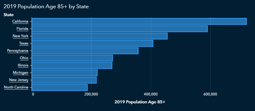
There are more than 50 million Americans over the age of 65. California, Florida, Texas and New York have the highest number of older Americans, with Sumter County, Florida, having the highest overall percentage in the nation.
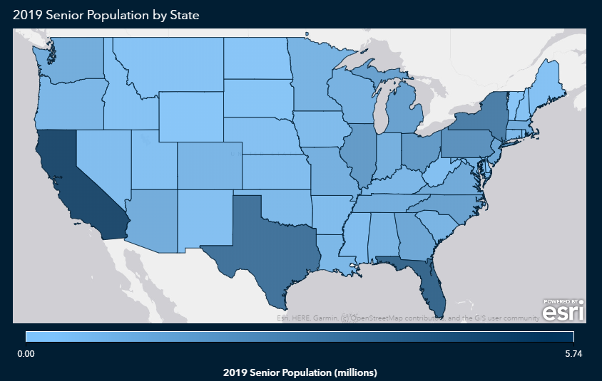
As we might expect, those states also have higher concentrations of people over age 85, since that’s a subset of the 65-and-over population.
Do COVID-19 risk factors follow state lines?
Obesity and diabetes often go together, and according to CDC data, the states most affected by obesity and diabetes overlap and tend to be concentrated in the southern United States.
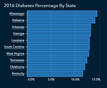
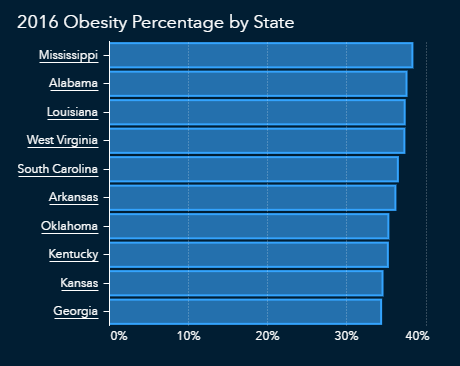
The CDC also reports cardiovascular disease in terms of hospitalizations, with a focus on those over age 65. The data shows an overlap with states that have higher numbers of diabetes and obesity. This could mean that those hospitalized with cardiovascular disease might also have diabetes and/or obesity, which would put them at even higher risk of severe complications from COVID-19.
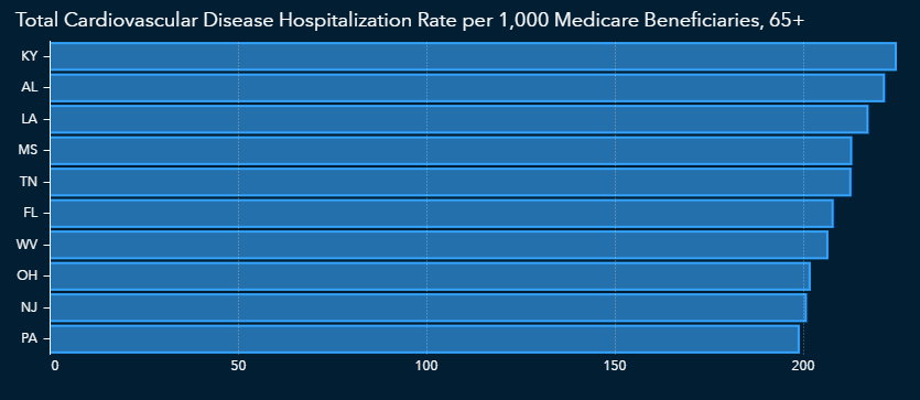
Finally, we must look at data regarding lung conditions such as asthma. Some states with a high incidence of asthma cases overlap with those states that have large populations with at least one of the other risk factors we’ve examined.
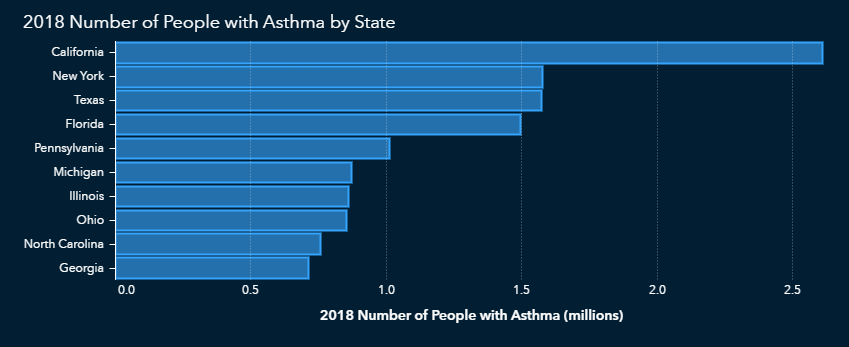
What does all this mean?
The data appears to show that there are vulnerable people everywhere in the U.S., but there are concentrations in several areas. As states loosen restrictions initially put in place when the pandemic hit the U.S., it becomes important to evaluate population data within each state to ensure that those who are most vulnerable are protected. In recent weeks we have seen upticks in cases in some states that loosened restrictions.
It is crucial that we identify risk factors and set up proper safeguards. By evaluating additional risk factors and analyzing data within our own communities, we gain a more complete understanding of the COVID-19 impact. When we consider the whole individual, rather than age alone, we better understand what it means to be vulnerable during this pandemic and going forward.
Other articles in this series:
![]() About SAS: Through innovative analytics software and services, SAS helps customers around the world transform data into intelligence.
About SAS: Through innovative analytics software and services, SAS helps customers around the world transform data into intelligence.
Virginia high school teacher named NLP’s 2020 Educator of the Year
Virginia educator Patricia Hunt is the recipient of NLP’s inaugural Educator of the Year Award for the dedication and innovation she brings to her teaching of news literacy — an essential life skill for the digital age — and for her wider advocacy of news literacy education.
Hunt, who teaches 12th grade government courses at Wakefield High School in Arlington, Va., first learned about NLP from a Maryland colleague in 2011, before NLP’s classroom program was active in Virginia. Hunt borrowed the NLP classroom guide from her colleague to use in her courses.
“Patricia has set the gold standard as the first recipient of our educator of the year award,” said Alan C. Miller, NLP founder and CEO. “She became an early adopter of our Checkology® virtual classroom e-learning platform when it was launched in 2016 and has made it an integral part of her government class. She’s also developed engaging activities to enhance her students’ ability to learn and apply news literacy skills, and her passion for improving the well-being of her students is contagious and inspiring. We are so proud to give her this award and spotlight her as a champion for news literacy education.”
Watch the video of Hunt receiving her award:
Soon after Hunt began using Checkology, NPR visited her classroom and made it the focus of this piece, The Classroom Where Fake News Fails. Hunt has also hosted classroom visits from several other news outlets. These include CNN.com; ABC News.com; HBO; WRC-TV; NHK, Japan’s public television station, and Czech public television. (Watch an NLP video about Checkology’s impact in her classroom.)
“My goal as an educator is to give students the tools that they need to become lifelong learners. My hope would be for them to continue listening to the news, to continue checking their news feed against other news feeds, to stop and pause before sharing. Checkology is the best tool I’ve found to meet that goal,” Hunt said.
Professor brings creativity to news literacy instruction
 It’s a good bet that Lyn Millner’s students will be ready to do some serious fact-checking this fall leading up to the presidential election.
They’re already experienced at it. Millner, who teaches at Florida Gulf Coast University in Fort Myers, Fla., created the Vote Vetter project during the midterm elections in 2018. Her News Literacy class of 80 students teamed up with three professional journalists and the university’s media partner, Fox 4, to fact-check political claims in ads, tweets, mailers and news stories.
Millner was a finalist for the News Literacy Project’s 2020 Educator of the Year because of that steadfast dedication to teaching news literacy and for the many creative methods she’s used to engage students and the general public.
“I believe I have a responsibility to educate the public as well,” Millner said, noting she also speaks to community groups and book clubs. “And in the past five years, I’ve found that adults are really hungry for news literacy skills.”
Millner’s courses include News Literacy, Journalism Senior Capstone, News Editing, News Reporting and Writing and Writing for a Mass Audience — and she uses news literacy concepts in all of them. Millner requires her News Literacy students to use NLP’s Checkology® virtual classroom and begins most of her classes with a misinformation moment taken from The Sift® newsletter.
Taught to suspend judgment
One of Millner’s signature approaches is what she calls the Suspend Judgment project. Students choose a controversial topic, write down what biases they might have about that topic, and imagine what their friends and family believe about it. Then they interview those friends and family members about their views. Students then research all sides of the issue and write a paper proving they can suspend judgment on the topic, instead of winning an argument. The project tackles the confirmation bias many people fall into.
Millner also makes connections to real-life journalism for her classes. Once a week, her News Literacy students hear from a current or former professional journalist. Each semester, Mara Liasson, a national political correspondent for NPR and a Fox News contributor, visits the class. Students prepare for her visit by analyzing her use of language in NPR and Fox reports and preparing questions about her work.
Millner challenges her journalism students to think through difficult news decisions such as when to characterize a falsehood as a “lie” as opposed to an “untruth” or a “statement without evidence.” She asks her News Editing students to consider their responsibilities as news consumers, how their own bias might enter into their decisions, the use of fair language, journalism’s business model and other aspects of practicing quality journalism.
Measuring what students know
Students care about the news, but Millner notes they aren’t always aware of the credibility of their news sources and whether their information is reliable. She measures students’ progress on becoming news-literate with a survey before the semester, and NLP’s quiz (How news-literate are you?) at the end.
“Throughout the semester, I test their skills in informal ways by presenting them with information that may or may not be true and asking them to make a plan for determining whether the item is true,” she says. “They must list their steps and what they found.”
Millner is encouraged that many students from her News Literacy course, especially in recent years, have returned as teaching assistants, taking an active role in delivering news literacy lessons to their peers.
News literacy across disciplines
Millner also integrates news literacy into other departments at the university. In 2018, when the school’s philosophy majors hosted a political debate for the community, her News Literacy class live fact-checked the event. Miller also co-taught an honors course with a biology professor and virus researcher, emphasizing to students the importance of using sound journalist principles to write responsibly, accurately and fairly about their research.
She also uses creativity to attract interest. Millner has hosted First Amendment festivals at the university, including one where students were offered free pizza in exchange for naming their First Amendment rights. Many students, drawn by the pizza, walked up knowing only one or two freedoms. They walked out knowing all five.
Her creative teaching methods and rigorous attention to detail have made Millner a stalwart in the FGCU teaching community. She’s also not fazed by the new reality brought by COVID-19. Millner begins each online session with a “This week in misinformation” quiz, and the students who check in early present their findings on a piece of misinformation to the entire virtual class.
With the pandemic and the 2020 presidential election, Millner’s students will be dealing with ample amounts of misinformation. But thanks to her dedication to facts, they’ll be ready.
NatGeo senior executive editor named NLP’s 2020 John S. Carroll Journalist of the Year
Indira Lakshmanan, senior executive editor at National Geographic and a veteran foreign and national correspondent, is the 2020 recipient of NLP’s John S. Carroll Journalist of the Year Award. Lakshmanan is a frequent TV and radio commentator on journalism and journalistic ethics, served as the first Newmark Chair in Journalism Ethics at the Poynter Institute, and was executive editor at the Pulitzer Center.
“Last year, Indira did a superb job leading the revised Understanding Bias lesson for Checkology,” said Alan C. Miller, NLP founder and CEO. “Her expertise on journalistic ethics and practices proved invaluable to the development of the lesson, during both the video shoot itself and in writing the script.”
In November 2019, at NLP’s request, Lakshmanan led a high-profile session on news literacy at the National Council for the Social Studies conference in Austin, Texas, and interviewed Washington Post Executive Editor Marty Baron on a keynote panel.
“It has been such an honor to get this award and a privilege to get to work with you and the next generation in teaching them about news literacy and the importance of reliable journalism to a healthy democracy and society,” Lakshmanan said.
Watch the video of Lakshmanan receiving her award:
Named for one of the most revered newspaper editors of his generation, this award is given annually to journalists who have contributed significantly to NLP and its mission. The honorees, who receive $500 and a glass plaque with an etched photo of Carroll, are selected by a committee of NLP board members and staff. During an acclaimed journalism career spanning four decades, Carroll was the editor of three major U.S. newspapers — the Lexington (Kentucky) Herald-Leader, The Baltimore Sun and the Los Angeles Times. He was a founding member of NLP’s board and served as its chair for four years until shortly before his death in 2015.
Florida college graduate named NLP’s 2020 Gwen Ifill Student of the Year
Kristen Locker, a new graduate of Florida Gulf Coast University, is NLP’s 2020 Gwen Ifill Student of the Year. Locker, the first college student to receive the award, was nominated by her professor, Lyn Millner, a finalist for NLP’s Educator of the Year Award.
“Kristen told us, ‘Checkology helped me navigate where I get my news.’ She says she no longer believes things at face value or relies on a single source and always researches information before sharing it,” NLP founder and CEO Alan C. Miller said. “We have no doubt that this will prove useful to Kristen as she moves on to film school and into her professional life.’’
Locker used Checkology while a student of Millner’s and became a teaching assistant in her news literacy course the following year. In addition, Locker delivered a lecture on verification tools, developed assignments for students and produced a video to promote news literacy to freshmen.
Watch the video of Locker receiving her award:
This award commemorates Ifill, the trailblazing journalist — and longtime NLP supporter and board member — who died in 2016. It is presented to female students of color who represent the values Ifill brought to journalism. Ifill was the first Black woman to host a national political talk show on television as moderator of Washington Week, and she was a member (with Judy Woodruff) of the first female co-anchor team of a national news broadcast, on PBS NewsHour.
“After reading more about Gwen Ifill, I saw how much she did and the weight of her work in corresponding, advocating, reporting, writing, all of that,” Locker said. “To see what she’s done in her lifetime, it’s just so inspiring. I want to follow in that legacy.”
Student honorees receive a $250 gift certificate and a glass plaque with an etched photo of Ifill.
“Honoring the legacies of John Carroll and Gwen Ifill — as iconic journalists, exceptional board members and extraordinary individuals — reaffirms our values and who we are as an organization,” Miller said.
Educator of the year finalists team up for powerful news literacy work
Here’s a “problem” any educator might like to have: Students find their class material so engaging that the teacher has to rein in the class discussion.
That’s exactly what Jake Cameron and Angelica Cardona experienced at Queens High School of Teaching, Liberal Arts and the Sciences in Queens, New York. Using the Checkology® virtual classroom from the News Literacy Project (NLP), they introduced news literacy education into their 12th grade government classes this spring. Students responded right away.
“The work we did with them was so powerful, they would come in and say, ‘See how this is being covered,’ or ‘Look at the partisan bias,’” says Cardona. “They make so many connections so quickly.”
The commitment of the two teachers to news literacy, even after New York City schools transitioned to distance learning because of the COVID-19 pandemic, earned them nominations for NLP’s 2020 Educator of the Year Award. Both were named as finalists.
The lively discussions showed Cardona and Cameron just how much news literacy resonated with students, even if they did have to sometimes step in and tell them it was time to move on to new material.
“It was nice to see that engagement happening,” Cameron says.
Civic engagement focus
The colleagues teach economics and government — with a civics focus — to approximately 280 seniors, developing the curricula together. They discovered Checkology through their school’s partnership with Civics for All, a New York City Department of Education initiative to provide students skills and knowledge related to democracy that features NLP resources.
“We are trying to improve civic engagement among high school students, how to improve democracy through civic duties. It’s a civic responsibility to be informed and to know what it means to be informed,” Cardona says.
She and Cameron customized Checkology lessons and resources to accommodate their workshop-style classes and created activities and tests to measure learning. In addition, they worked with English Language Arts colleagues to incorporate news literacy in their classwork. Students gained insights into how issues of race, social justice, technology and current events impact them in school, in their communities, and in the world.
Cameron also saw students apply what they learned about logical fallacies to discussions on climate change in their science classes. The students were able to examine multiple tweets regarding a meme on the topic and determine which fallacies applied, he says.
“All you can ask for as a teacher is that they take what they learn into the world and use it,” Cardona says. “It definitely made a mark.”
Students committed to news literacy
The flexibility of the platform proved particularly useful during distance learning, as the teachers moved away from a workshop model of teaching to more independent study. They also incorporated content from The Sift®, NLP’s weekly newsletter, which provided fresh and relevant examples regarding COVID-19 misinformation and related topics.
There were even some distance learning advantages. “Remote learning allowed the students to take their time with news literacy,” Cameron says, and they did not feel rushed to complete a lesson that might have been due at the end of a period lasting 40 or 50 minutes.
This fall, the teachers will further integrate news literacy into their government classes, with a focus on information and misinformation about the election. Looking ahead, they would like to create a more intentional inclusion of news literacy among humanities courses. They also hope to one day begin to offer students news literacy education in 9th grade.
“The one highlight that we take away from this is that our students have started to commit themselves to news literacy. We have seen a tremendous change in the way students are integrating the news literacy skills into their own lives,” Cameron says. “They began looking for information beyond the headlines.”
Real-world examples enhance news literacy lessons
Conor Murphy built the course “Social Media: Navigating Current Events” largely around NLP’s Checkology virtual classroom (Photo by Martha A. Hennessey).
Editor’s note: Earlier this year we wrote about Conor Murphy, a teacher at West Genesee High School in Camillus, N.Y. Murphy recently was named a finalist for NLP’s 2020 Educator of the Year Award. At that time he described NLP’s impact on his teaching:
“My entire craft as an educator has been influenced so heavily by the News Literacy Project since joining the ranks in 2017 (the year Murphy began using the Checkology® virtual classroom in his teaching).
“Without hesitation or exaggeration, I can say that the News Literacy Project has completely revamped how, what, and why I teach social studies.
“I believe so much in the importance of a news literacy education that I went through the rigorous process to create an elective course with the sole focus of news and media literacy education. Checkology is the guiding source throughout the elective course, Navigating Current Events.”
This February 2020 article illustrates Murphy’s innovative and creative approach to teaching news literacy:
Some days, events outside the classroom disrupt high school teacher Conor Murphy’s lesson plans. He wouldn’t have it any other way.
Murphy, who teaches at West Genesee High School in Camillus, New York, believes current, real-world examples engage students and enhance learning in ways that no textbook can. When fire struck Notre Dame Cathedral in Paris in April 2019, misinformation, rumors and doctored photos seemed to spread faster than the flames. So Murphy shelved his social studies lesson and had students explore misinformation in real time.
In fall 2019, Murphy took this approach a step further. He created the elective course “Social Media: Navigating Current Events” to teach students critical news literacy skills through real-life events and issues as they arise. He developed the course largely around the News Literacy Project’s Checkology® virtual classroom, which he began teaching in his other classes in 2017.
“As a social studies teacher, I get really excited when current events prove what we are talking about,” said Murphy, who has been teaching for 12 years. “In media literacy, you can throw the lesson plans by the wayside.”
Understanding what they encounter
The U.S. drone strike that killed Maj. Gen. Qassim Suleimani, Iran’s top security and intelligence commander, in Iraq in early January provided another teachable moment. Murphy and his students discussed how the incident unfolded on social media. Students described and analyzed what they saw online, from credible reporting to doctored images, false context and propaganda.
The Checkology lesson on misinformation resonates strongly with students, Murphy said. “It teaches them to recognize what they experience, like false equivalency and fabricated content. These are the things kids are seeing and not recognizing.”
He encourages students to point out false and misleading content when family members and friends share it online — and to help them fact-check it. “The important thing is to bring this home. Bring it to the dinner table, talk about it with your friends at lunch,” he tells students.
Emma Santola, 18, who took Murphy’s new course, does just that. “I have been ready to call out people, try to educate them, even if it’s not challenging them, but just giving them more information,” she said.
‘Moment of clarity’
The Checkology lesson “Introduction to Algorithms” is another eye-opener for students. While they know that social media platforms use algorithms to filter what people see based on their online activities and interests, the extent of algorithms’ influence surprises students. “There is kind of an ‘aha’ moment of clarity,” Murphy said.
Santola said she and many peers know that advertisers are targeting them and that tech companies are “listening.”
“It’s not something I think about, even though I know it can do damage,” she said. “Most of us just don’t care. But we should care. Because at what point does it stop? They’re selling my data. My information is valuable to somebody, but who is that someone and what is that going to do for me in the future?”
To drive home this point, Murphy paraphrases a takeaway from a lesson on media literacy from the YouTube channel Crash Course, telling students: “If you’re not paying for a service, you’re the product.”
Right time for news literacy
Santola said she also found Checkology’s lesson on “Press Freedoms Around the World” particularly illuminating. “It was the most important lesson we did, and most surprising was the treatment of journalists,” she said. “We have this notion in the U.S. that we are No. 1 in that, but we’re not. I would have thought we were at least in the top 10.” (The U.S. was ranked 48th in Reporters Without Borders’ 2019 World Press Freedom Index.)
Classroom discussion around that lesson addressed how different U.S. government leaders have treated the news media. “That led to what is fake news and how to distinguish fake news from what is news we just don’t like. Calling them fake news media is really dangerous. Some students don’t hear that at home,” Santola said.
And she found herself revisiting her own online habits after completing Checkology’s “Understanding Bias” lesson. “It made me more skeptical because I think I can be quick to be caught up in my own confirmation bias,” Santola said. “Diversifying my media diet is important to learning more and getting the full scope.”
Of Murphy’s new course, she said: “I feel like it’s important for everyone to take. It seems extremely relevant. If any time is the time to take it, it’s now.”
Georgia student sees impact of news literacy education
As the COVID-19 pandemic began delivering a surge of misinformation to our social media feeds and inboxes, a student in Denise Wood’s Honors World Literature and Composition class emailed her.
“I thank you for teaching us about misinformation last semester. It has helped a ton in recent days as I see loads of false claims, pseudoscience, and logical fallacies,” sophomore Afnan Ahmad wrote regarding his fall 2019 news literacy instruction.
Wood, an educator at Union Grove High School in McDonough, Georgia — outside Atlanta — teaches news literacy using the Checkology® virtual classroom. “I had become very concerned about the credulousness I noticed in my students. They often seemed to believe that if something was published, it must be true,” she says.
But she was not surprised to see Ahmad apply what he learned to critically assess information about COVID-19. “Afnan is a very committed student who is intensely curious about the world,” she says. He was definitely engaged (in Checkology) from the get-go. He asked questions in class and came up with several relevant examples.”
Ahmad says Checkology helped him to learn how to filter online content and be more discerning. “The unit really taught me how I should be aware of what I’m exposed to on Instagram and Twitter,” he says. “So much information is created to scare someone and instill hatred.” Previously, Ahmad said he assumed all news sources were credible.
And throughout this pandemic he has seen plenty of dubious content. “It’s a problem especially for more vulnerable populations,” Ahmad says. “A lot of family back in Bangladesh, where my parents are from, they don’t have the exposure to information we have. They might see a fake cure and believe that.”
Helping others
He also helps his parents view social media content with more skepticism. For example, regarding posts from impostor websites that mimic legitimate news outlets, he demonstrates the steps he follows to verify credibility. These include examining the source, checking for biases and considering them, and looking at how other sites report the same information.
And he does the same with peers, especially regarding COVID-19. “For the most part, I’m the one educating my friends about it. They are often surprised that everything they see is contradicted. It is hard to keep up with the information and the contradictions.”
Still, some of what Checkology taught Ahmad is less tangible. “It makes me have a sense of confidence that I’m looking at the correct post and correct source and can help my family and people around them.”
International perspective
Ahmad travels widely and brings an international perspective to his news consumption. “News stories in other countries focus on global news, but in the U.S. we focus on domestic news,” he says. “We have a focus on empowering ourselves.” Other countries focus internally, but also pay attention to what’s occurring around them, Ahmad observes. “It’s important for me to have all those perspectives.”
He also has a strong interest in propaganda, content that distorts and manipulates facts and information. Wood covers that topic in class. “I’ve combined the Checkology lessons with a larger unit on propaganda, which I connect with both current events and literature,” she says. “We usually use this concurrently with reading Animal Farm.”
And he said he is more attuned to spotting propaganda. “Now I know even a public announcement can be bias and propaganda. It’s not straightforward, and it can be subconscious in really subtle ways.”
And he expects to apply news literacy skills as he considers a career in medical research. “It has a grounding in what I’ve learned about information being credible.”
The First Amendment protects reporters, too
As a former Reuters correspondent in Chicago, I often reported on excessive force by law enforcement, including the deaths of Black people and the ensuing protests. The awful, unjust events of recent weeks and months — the killings of George Floyd, Breonna Taylor, and Ahmaud Arbery, and the racism faced by the Central Park birder — unfortunately did not surprise me.
But last week, as I watched — outraged — video of live coverage of CNN reporter Omar Jimenez’s arrest, I found myself asking out loud: “Why?”
Jimenez also is a journalist of color. He had properly identified himself as a member of the media while covering protests in Minneapolis, just as I had done time and time again during my career. He was nothing but respectful and professional to authorities, and more than willing to accommodate them by repeatedly offering to move.
Immediately after watching the video, I read LZ Granderson’s powerful piece in the Los Angeles Times. In it, Granderson, a columnist for the paper, reflected on his experiences as a Black man in America, recounting “just a fraction of the times I’ve been pulled over for looking like someone.
“So, yeah, on most days I choose to be numb just to survive.”
I wound up sobbing at my laptop — sad, tired and angry about the state of the country. I’m still crying: over the discrimination experienced by me, by people I love, and by people of color. And over our suffering — past, present and future.
As I read more reports about violence against journalists, I wondered where I would be and in what condition if I were still reporting. Over the past several days, journalists have been targeted by law enforcement and protesters, arrested like Jimenez and his crew, struck with rubber bullets, pepper balls and other projectiles, beaten and hospitalized, and their equipment and property damaged and vandalized.
Protesters: The same First Amendment that gives you the right to free speech, to assemble peacefully and to seek redress of your grievances from the government is the very same First Amendment that gives journalists the right to free speech and a free press.
These attacks on journalists are not acceptable, and they are dangerous — not only for journalists, but for democracy. They challenge, ignore and undermine America’s constitutional principles.
Standards-based journalists are not trying to cause trouble or become part of the story. To the best of their ability, they are striving to inform the public, report truthfully about what is happening, document events and give voice to the voiceless — putting themselves at risk in the process.
Journalists are integral to American democracy. They hold people in power accountable. The more informed people are, the better they understand the issues we face, and the more likely they are to be active, engaged participants in society and to cast well-informed votes. Attacking journalists, arresting them and failing to protect them — as well as protesters who gather peacefully — are attacks on our democracy, as well as the First Amendment of the U.S. Constitution.
Journalists are used to at least some level of hostility. For decades before journalists were publicly called “the enemy,” some elected officials and members of the public did not like reporters, did not want to give them information, criticized their work and questioned their motives.
But these are more intense times.
Attacks on journalists occurred against the backdrop of COVID-19, which has designated members of the media “essential” and disproportionately affected communities of color. Journalists risk their health to do their essential work, reporting near crowds of people and interacting with the public.
Journalists of color must carry additional burdens, including having to temporarily suppress personal anger, grief, and trauma about the racial injustices they witness and experience in order to do their work under constant deadline pressure. Also, the journalists covering the unrest may not have been provided with hostile environments training.
In addition, journalists may be extra slammed because many already-downsized newsrooms have slashed staff and resources through layoffs, furloughs and pay cuts. Some news operations have shut down completely. All of this at a time when inaccurate information could lead to death.
Journalists — human beings and absolutely not “the enemy of the people” — work hard in perilous conditions, have families of their own and want to get home safely when their jobs are done. To law enforcement, protesters and others targeting journalists: Let them do their essential jobs. Our democracy demands it.
Suzannah Gonzales spent more than 20 years working in journalism, most recently as a Reuters correspondent in Chicago. She currently serves as the associate director of education for the News Literacy Project, a nonpartisan national nonprofit working to empower educators to help young people sort fact from fiction.
Our statement on racial justice, a free press and the right to protest
Once again, our nation must face the scourge of racial injustice with the recent killings of George Floyd, Ahmaud Arbery, and Breonna Taylor, among too many others. These deaths have sparked protests around the country, highlighting the critical importance of our rights: to seek racial justice, to seek a redress of grievances, and to safeguard a free press.
We stand by the Black Lives Matter movement’s call to end these injustices and the violence inflicted too often on Black people and other communities of color. The United States will never realize its high ideals of forming “a more perfect Union” until this injustice ends.
We believe that our democracy depends on a free press holding the powerful accountable. We stand with journalists working to tell the story of our democracy in action through accurate, fair and contextual reporting. Without the transparency they provide as eyewitnesses to history, our freedoms are imperiled. We deplore the escalating attacks on journalists by police and call upon elected and appointed officials everywhere to put an end to such abuses.
We are also committed to free speech and the right of people to peaceably assemble and protest. Democracy depends on these rights, as protected by the First Amendment, as well.
NLP statement on Twitter’s rules and policies
In response to growing concerns about how Twitter handles tweets from elected officials that violate the social media platform’s rules and community standards, News Literacy Project Founder and CEO Alan C. Miller issued the following statement:
“This is a very important issue that grows more pressing each day and is only amplified by the current pandemic and the upcoming United States presidential election. Twitter’s recent decisions to add labels to tweets from President Trump are part of what has been a years-long debate about how social media companies should apply their community standards to public officials, weighing the potential harm of an inaccurate or misleading tweet against the public’s need to know what elected officials are saying. That’s why I believe it’s urgent that we, as a country, take steps to make sure that the next generation is prepared to understand and meet these challenges.
Aspects of this debate offer opportunities for engagement and learning in the nation’s classrooms and homes. We can help students understand whether social media platforms should be considered publishers; whether labeling or removing tweets from an elected official amounts to censorship; whether social media platforms are taking actions in ways that are consistent and fair, and how community standards should be enforced among other users.
Young people are inheriting an information ecosystem that has unfolded in ways we never imagined, and thus it is imperative for us to provide guidance on how these platforms should be used. Today’s students are tomorrow’s voters and leaders. Now is the time to make sure they are prepared to recognize and reject misinformation that spreads on social media platforms. As this issue demonstrates, news literacy skills must be built into the education system so students can determine what is fact and fiction in the information they consume, share and act on.
As the leader of a nonpartisan education nonprofit, I welcome these critical conversations. It is vital that we all understand the terms of the debate if we’re to land on a solution that is fair, informative and productive.”
Educator relies on Checkology in class — and for teaching remotely

A few years ago Heather Turner, a teacher librarian in the Fabius-Pompey Central School District in central New York, saw social media posts from other librarians about Checkology® virtual classroom, and she was intrigued.
“I was looking for something to augment what I was already doing with digital citizenship,” says Turner, who has been an educator for a dozen years.
She then began using Checkology, NLP’s e-learning platform, in her classroom. “I teach media literacy in all of its facets so that my students are citizens who can discern the bias and information behind and about media,” she says.
Teaching remotely
And when the COVID-19 pandemic forced the closure of schools in Turner’s district earlier this year, she relied on Checkology as she transitioned to distance learning.
Perhaps surprisingly, she found similarities in online and classroom teaching. “I find that sometimes the students need a little bit of direct instruction as well as the videos and questions,” a major component of Checkology. She also supplemented Checkology’s 13 lessons with hyperdocs, which include comprehensive resource links, so the students can demonstrate their learning.
Two months into the COVID-19 education disruption, Turner has found that her students are adapting to the changes needed with distance learning. “They are doing much better now than when it first started,” she says.
But there are still challenges for students, educators and families, she notes. “I think we have to think of this as emergency school, not distance learning. This is not something students or staff signed up for and the stress has been hard for everyone.”
As COVID-19 continues to impact our lives, Turner said she is working to help students see the connections between the pandemic and the related “infodemic” of an overwhelming amount of information, much of it false and misleading.
Classroom connection: ‘Overwhelmed’ by information and misinformation
While 58% of Americans report being “well-informed” about COVID-19 and the virus that causes it, more than a third (36%) say they feel “overwhelmed” by the information (and misinformation) circulating about the pandemic: That’s a key finding from a new survey conducted by Gallup and the John S. and James L. Knight Foundation as part of the Gallup/Knight Foundation Trust, Media and Democracy initiative.
The survey was conducted online between April 14 and April 20 with a random sample of 1,693 members of the Gallup Panel (a research panel designed to be representative of the U.S. adult population); the margin of error is plus or minus 3 percentage points. Results were published on May 11.
Other findings
- Almost 80% of respondents said that “false or inaccurate information about the coronavirus has been a major problem.”
- Almost half (47%) named “the Trump administration” as the primary source of misinformation about the pandemic; a third (33%) named “the mainstream national news.” But when respondents’ second choices were added in, “social media websites and apps” was the combined “winner” (the first choice of 15% and the second choice of 53%, for an overall total of 68%), followed by the Trump administration (the second choice of 7%, for an overall total of 54%).
- Respondents were evenly divided (42% for both) over whether social media platforms should immediately remove posts that are suspected of containing coronavirus misinformation or whether they should leave the posts up until the information in them is either confirmed or debunked.
In addition, younger adults (18-34) were more likely than older adults (55+) to say they are overwhelmed, though the reasoning for this was unclear.
Trust in news organizations played a part in responses, the survey found: Those with a favorable opinion of the media were “nearly twice as likely as those who view it negatively to say they are well-informed, 79% to 41%.
Classroom discussion
The World Health Organization describes the overwhelming spread of information — and misinformation — about COVID-19 as an “infodemic.” How would you describe your experience with this “infodemic”? How difficult is it to find credible information about COVID-19? How often do you encounter information that you’re not sure about? Where do you encounter questionable information? Have mainstream news outlets gotten anything wrong about the pandemic? If so, what was it?
Another idea
Have students review the Gallup report and replicate it by asking people 18 and older in their households the questions featured in the report. How do students’ results compare with the survey findings?
Classroom connection: QAnon conspiracy theory paved way for other hoaxes
Conspiracy theories about the COVID-19 pandemic can be described in a variety of ways — alarming, outlandish, dangerous — but they shouldn’t be surprising. Even the Plandemic “documentary” that suddenly swept its way across social media earlier this month did so on a path paved with fragments of pandemic conspiracy theories that were already in circulation.
But as a report by Adrienne LaFrance in the June issue of The Atlantic points out, if one theory has established conspiratorial thinking as an “acceptable” option in the modern marketplace of ideas, it’s QAnon.
Born in the aftermath of the Pizzagate debacle with two cryptic, anonymous posts published to the controversial message board 4chan in October 2017, QAnon has grown into a large and nebulous belief system. Its “leader,” known only as Q, is “a purportedly high-ranking government official.” At its heart is the baseless notion that President Donald Trump is secretly working to bring about a “Great Awakening” to expose an elite cabal of child sex abusers — including prominent political figures in Washington — that has been concealed by intelligence agencies, or “the deep state.”
QAnon conspiracy theory aims to simplify complex issue
In many ways, QAnon is a quintessential conspiracy theory: It offers its adherents simple explanations in place of complexity, a coherent entity on which to place blame for the transgressions of modern life, and a sense of control and populist purpose. But in other ways, it seems to have tapped into deeper veins of moral gratification: an apocalyptic vision of a renewed America that resonates deeply with evangelical Christian beliefs about the End Times. (Indeed, at least one church has been founded on QAnon belief principles.)
Whether they see QAnon as prophecy, as self-described “research” or as an “open source intelligence operation,” its followers have grown so numerous, and pushed its rhetoric so persistently on so many fronts online, that its most anodyne permutations — vague references to a coming reckoning for immoral Washington elites — are disturbingly present in mainstream discourse. They appear as Q icons and slogans at political rallies and are popularized by an increasing number of social media influencers and public officials.
 As it has grown, QAnon has expanded to absorb other conspiracy theories, explain away its own inconsistencies and incorporate new developments, such as the COVID-19 pandemic. So-called wellness influencers are spreading QAnon talking points alongside posts that tout unfounded “cures” or praise “holistic living.” And an April 8 “Q drop” — a post, said to be by Q, on an internet message board — had the cryptic message shown at left.
Related
- “’Immune to Evidence’: How Dangerous Coronavirus Conspiracies Spread” (Marshall Allen, ProPublica).
- “I was a conspiracy theorist, too” (Dannagal G. Young, Vox).
Discuss: What are the characteristics of conspiratorial thinking? How can entirely baseless conspiracy theories “feel” so right to some people? What role does evidence play in conspiracy theories? Why do you think conspiracy theories tend to arise during periods of great social and economic change? How do fear and anger contribute to the belief in conspiracy theories?
Classroom connection: ‘Plandemic’ brings conspiracy theory mainstream
 The 26-minute video Plandemic which pushed an array of dangerous and provably false conspiracy theories and other misinformation about the COVID-19 pandemic ignited fringe communities last week and went massively viral before major social media companies took steps to remove it from their platforms.
Purporting to be a preview of an upcoming “documentary,” Plandemic relies on a single source — Judy Mikovits, a discredited scientist — to vaguely contend that a powerful cabal of public health officials and others is exaggerating the current outbreak and seeking to exploit it for profit. Mikovits also makes a number of demonstrably false medical statements, including that wearing a mask “activates” viruses that people might be carrying and that “healing microbes” in seawater and “sequences” in sand can boost immunity.
The video, posted May 4, garnered more than 8 million views and hundreds of millions of engagements on social media before YouTube, Vimeo and Facebook started to remove it three days later. Produced by filmmaker Mikki Willis, whose Ojai, California-based production company, Elevate Films, creates “transformative media,” Plandemic positions Mikovits as a victim-turned-whistleblower, presenting a highly misleading and one-sided account of her career that includes a number of accusations made against Anthony Fauci, the director of the National Institute of Allergy and Infectious Diseases and a member of the White House Coronavirus Task Force.
Falsifield details
It paves over the retraction in 2011 of a controversial study of chronic fatigue syndrome that Mikovits had co-authored two years before; it also falsifies details about her arrest in 2011 on two charges related to the theft of a computer, flash drives and other materials from the Whittemore Peterson Institute in Reno, Nevada, where she had worked as research director. (The charges were dropped.)
Footage of the interview with Mikovits, who in recent years has been an outspoken critic of vaccinations, is interspersed with a number of video segments that seem to bolster her claims but are actually highly misleading or unreliable. The b-roll footage includes out-of-context clips of Fauci, Microsoft co-founder Bill Gates and other public figures; a portion of a report from CGTN, the Chinese state global news network; and several clips of people in medical scrubs calling into question the scientific consensus about the pandemic, including YouTube footage of Eric Nepute, a St. Louis chiropractor who suggested that the quinine and zinc in tonic water could treat COVID-19. Also prominently featured is footage from an April 22 press conference held by two physicians, Dan Erickson and Artin Massihi, who own urgent care facilities in Bakersfield, California, and have made a case to reopen California based on deeply flawed statistics.
Note: While the viral spread of Plandemic was aided by its slick production values and slippery sourcing, it also stitched together a number of baseless conspiratorial claims — anti-vaccination rhetoric, misinterpretations of COVID-19 Medicare payments to hospitals, possible COVID-19 treatments such as hydroxychloroquine, and the complicity of tech platforms — that felt familiar to a broad number of people who had already seen them online.
Related
- “I’m an Investigative Journalist. These Are the Questions I Asked About the Viral ‘Plandemic’ Video.” (Marshall Allen, ProPublica).
- “Why It’s Important To Push Back On ‘Plandemic’—And How To Do It” (Tara Haelle, Forbes).
- “The Falsehoods of the ‘Plandemic’ Video” (Angelo Fichera, Saranac Hale Spencer, D’Angelo Gore, Lori Robertson and Eugene Kiely, FactCheck.org).
- “Virus Experts Aren’t Getting the Message Out” (Renée DiResta, The Atlantic).
- “How covid-19 conspiracy theorists are exploiting YouTube culture” (Abby Ohlheiser, MIT Technology Review).
Discuss: What made Plandemic spread so widely so quickly? Were social media platforms correct to remove it? Why might a video like this — offering a simple explanation and a focal point for blame — appeal to so many people right now? What other conspiracy theories do this?
Idea: Have students share their stories of seeing Plandemic go viral last week, and ask whether they still have questions about points it raises. Work together to seek credible sources to answer those questions.
Parents find that Checkology enhances daughter’s distance learning
Not long after schools closed in Jackson, Wyoming, in March due to COVID-19 health concerns, Charlotte Krugh found that her daughter, Julia, 11, had too much free time on her hands. The sixth-grader’s distance learning assignments occupied her about three hours a day. Her sister Eliza, 9, who attends a different school, had a full day of work.
Krugh and her husband Brad were unhappy with how much time Julia spent watching YouTube videos while they were busy working from home. So they began to look into resources that would be meaningful and that Julia also might enjoy.
“We wanted something that would keep her engaged and not be busy work,” Krugh says.
That’s when she discovered that the News Literacy Project was offering its Checkology® virtual classroom free to U.S. educators and parents in response to school closures.
“At first she didn’t want to do it,” says Krugh, who, a former teacher well familiar with students’ resistance to additional work. “Then last week, she started to get into it.”
‘Aha!’ moments in distance learning
After a few lessons, Julia made some discoveries. For example, she had never given much thought to propaganda — a category of information in the InfoZones lesson. And she gained a new perspective on the YouTube crafting channel she watches. Krugh had told Julia that her favorite crafter might be getting paid to feature some of the products used in her videos, but she dismissed that idea. After completing a Checkology lesson that discussed sponsored content, Julia changed her mind. She told her mom: “You know, she might want to be trying to sell me something.”
Julia Krugh, 11, works on a Checkology lesson. Photo courtesy of Charlotte Krugh
“She is learning and we’re really pleased,” says Krugh.
And Julia wasn’t the only one in the family benefiting from distance learning. “One of the things that surprised me, I feel like I am pretty news savvy, but I got a few things wrong,” Krugh says. She was referring to the Checkology lesson on Branded Content that describes how some blog posts are actually deftly disguised advertisements. “I think there is something we all can learn from it.”
With that in mind, she also might introduce Eliza to Checkology. And she hopes to engage the group of friends Julia has virtual lunch with most days. “I’m hoping that some of her friends might be interested in it. It would be fun to have them do it,” Krugh says.
In the context of COVID-19
The COVID-19 pandemic also provides opportunities for Julia and Eliza to broaden their perspectives, based on diverse sources of information. They take part in video calls with a great aunt who is an infectious disease doctor and stay in touch with friends they made in Spain, where the family once lived. That country has been hit hard by COVID-19, and the girls’ friends have been allowed outside to play only recently after many weeks indoors.
And a slide presentation that Eliza worked on provided a chance to discuss the validity of sources for COVID-19 information the friend provided. “I think that having a variety of ideas inform you is super important,” Krugh says. “It gives us an opportunity to talk about different ideas and where they come from.”
That’s also a basic tenet of news literacy education. This resonates with the family.
“We are not teaching critical thinking skills early enough. Anything we can do to improve academic success and beyond, we should be doing,” Krugh says. “We want our kids to question and wonder and be curious.”
Classroom connection: YouTube search results to include fact-checker information
YouTube users in the United States will soon see information panels from third-party fact-checkers at the top of some search results, the company announced on April 28, citing the rapid spread of misinformation about COVID-19. The panels will appear in searches for specific claims and will feature relevant articles from “an open network of third-party publishers” of fact checks.
More than a dozen U.S. fact-checkers are already involved, the company said. These include FactCheck.org, PolitiFact, The Washington Post’s Fact Checker and The Dispatch. Participants must use the ClaimReview tagging system, a protocol developed by Duke Reporters’ Lab that extracts key details from fact checks so they can be displayed on other platforms. (Bill Adair, creator of PolitiFact, is head of Duke Reporters’ Lab.) Fact-checkers must be what YouTube calls an “authoritative publisher.” This is what YouTube considers an “established and relevant” source whose “expertise and trustworthiness” have been evaluated by external raters. Otherwise, fact-checkers must be verified signatories of the code of principles of the International Fact-Checking Network.
YouTube said its systems “will take some time” to “fully ramp up.” It piloted this feature in Brazil and India last year and plans to expand it to more countries over time.
Donation to fact-checking network
The announcement also said that the Google-owned video platform’s Google News Initiative is donating $1 million to the International Fact-Checking Network. The network is based at the Poynter Institute, a journalism training and advocacy center in St. Petersburg, Florida.
Also note: Citing violation of “community guidelines,” YouTube removed a widely disseminated video of a April 22 press briefing by two California doctors, Daniel Erickson and Artin Massihi. They used results from more than 5,000 COVID-19 tests conducted at their Bakersfield-area urgent care centers and private testing site to argue that shelter-in-place orders and business shutdowns are no longer needed. Erickson urged reporters to check with emergency doctors, who, he said, would support their conclusions. However, the American Academy of Emergency Medicine and the American College of Emergency Physicians condemned their remarks. They said “as owners of local urgent care clinics, it appears these two individuals are releasing biased, non-peer reviewed data to advance their personal financial interests without regard for the public’s health.”
Ask students:
Do you think YouTube’s move to highlight fact-checked articles in searches will help slow the spread of misinformation on its platform? Why or why not? What else could YouTube do to combat the spread of falsehoods?
Test the new feature
Once this feature is live, have students test it by searching for a specific COVID-19 claim. The company’s announcement uses “covid and ibuprofen” as an example. Ask them to provide a short summary of their experience. It should include the claim they searched, their search results, and whether a fact check appeared above the results. Then ask them to do the same search on other sites (such as Google, Bing, Yahoo, Twitter, Facebook and Pinterest). Finally, ask students to evaluate which is best at highlighting credible, authoritative information and demoting misinformation.
Classroom connection: Exploring the ‘Verification Handbook’
The European Journalism Centre, a journalism training and advocacy nonprofit in Maastricht, Netherlands, has released the third edition of its Verification Handbook, an online primer designed to help journalists investigate online content. The guide is edited by Craig Silverman, the media editor at BuzzFeed News and a digital fact-checking pioneer, and includes contributions from a range of distinguished journalists and misinformation researchers.
The book is divided into three parts: an introduction, which explains the stakes of digital verification work; a section on investigating individual accounts and pieces of content; and a section on analyzing platforms and influence operations.
Though it was created to help journalists avoid being exploited by “coordinated and well-funded campaigns to capture our attention, trick us into amplifying messages, and bend us to the will of states and other powerful forces,” the book is also broadly useful for anyone interested in honing digital verification skills — especially educators working with students.
Every article addresses a vital topic; several stand out for adoption in the classroom:
- “The Age of Information Disorder” by Claire Wardle, the head of strategic direction and research at First Draft. It includes three important elements for students: a taxonomy for categorizing different types of misinformation; an explanation of approaches to the thorny topic of determining the intent behind a piece of misinformation; and a graphic — the Trumpet of Amplification — that shows how bad actors “use coordination to move information through the ecosystem,” promoting falsehoods in closed groups and conspiracy communities until they trend on social media and gain the attention of professional media.
- Idea: In groups or individually, ask students to collect 10 recent examples of misinformation (by using fact-checking websites or this newsletter’s viral rumor rundown). Then have them trade those examples with another group or student and determine which of Wardle’s seven forms of information disorder best fits each example.
- “Spotting bots, cyborgs and inauthentic activity” by Charlotte Godart and Johanna Wild, two open-source investigators affiliated with the online investigations collective Bellingcat. It offers an approachable yet detailed look at automated and semi-automated accounts. This section also gives clear steps anyone can take to investigate suspicious accounts; explains common red flags for automated accounts; and links to several useful online tools, including three — Botometer, Bot Sentinel and accountanalysis — that analyze Twitter accounts for bot-like patterns.
- Idea: Review with students the common characteristics of automated accounts on Twitter, such as usernames that the platform automatically assigns, a lack of a profile picture, and unusual account activity. Have them work in teams to collect a number of accounts that they suspect are bots. Then have the teams trade their collections and use one of the free analysis tools linked above to evaluate the likelihood that the accounts are automated.
- “Investigating websites,” by Craig Silverman. It explains how to explore who is behind a website; how to uncover networks of shady sites; how to analyze web content (including webpages that have been deleted); how to use tools such as BuzzSumo and CrowdTangle to map the spread of specific links or domains across social media; and how to investigate domain registrations and IP addresses using tools such as DomainBigData.
- Idea: Ask students to read this article, then divide them into groups. Give each group a different tool mentioned in this piece; ask them to explore it, and then explain it, to their classmates.
NLP resource
Check Center, part of NLP’s Checkology® virtual classroom, includes tutorials and fact-checking missions for students. (Registration is required for teacher or parent access; NLP is currently waiving new student license fees for those affected by the COVID-19 pandemic. Teachers and parents engaged in distance learning or homeschooling as a result of school closures can apply here for access through June 30.)
Miller calls for press freedom during the pandemic in CNN op-ed
Classroom connection: COVID-19’s impact on press freedom
The next decade is critical for the future of journalism, and the COVID-19 pandemic is deepening existing crises that already threaten free and independent reporting, Reporters Without Borders said April 21 as it released its annual World Press Freedom Index, which ranks 180 countries and regions on the level of freedom they afford journalists.
Christophe Deloire, secretary-general of the global media advocacy organization (also known as Reporters sans frontières, or RSF), said that the pandemic is exacerbating “the negative factors threatening the right to reliable information”: a geopolitical crisis, a technological crisis, a democratic crisis, a crisis of trust and an economic crisis.
In its overview of the rankings, RSF noted “a clear correlation between suppression of media freedom in response to the coronavirus pandemic and a country’s ranking.” China (177th) and Iran (173rd) censored information about the spread of COVID-19, RSF said.
The director of RSF’s London office, Rebecca Vincent, rebuked the Chinese government for its lack of truthful reporting when it first had the opportunity to provide information.
“If there had been a free press in China, if these whistleblowers hadn’t been silenced, then this could have been prevented from turning into a pandemic,” she told CNN Business. “Sometimes we can talk about press freedom in a theoretical way, but this shows the impact can at times be physical. It can affect all of our health.”
A spokesman for China’s Ministry of Foreign Affairs, Geng Shuang, dismissed RSF’s criticism, saying that the organization “has always held deep-rooted prejudice against China” and its report “is not worth rebutting.”
USA not number one
The United States was 45th this year in the RSF rankings, an improvement of three places from 2019. Norway ranks first, as it has since 2017, and North Korea dropped one place to become the least free country, as it was in 2018 and 2017 (Turkmenistan occupied last place in 2019). Due to change brought about by general elections in May 2018, Malaysia had the largest improvement (22 places) to 101st, while Haiti — where protesters have targeted journalists — experienced the most significant drop (21 places) to 83rd.
While RSF’s “global indicator” — its measure of the overall state of press freedom — improved by 0.9% in 2020, it has declined by 12% since its creation in 2013. According to that indicator, press freedom is in a “very serious situation” in 13% of the countries and regions around the world, an increase of 2 percentage points from 2019.
For discussion
What makes the press in a given country “free”? Why is freedom of the press important? How does the level of press freedoms in the United States compare with what is found other countries? What role does a free press play in democratic societies?
Activities for students
Ask students to guess which countries around the world have the greatest and least amount of press freedoms. Then have them research their hypotheses using Reporters Without Borders’ 2020 rankings. Finally, help them contact a journalist in one of the countries they researched so they can ask questions by email or request a brief videoconference.
NLP resource
Press Freedoms Around the World” (NLP’s Checkology® virtual classroom). Note: This lesson will be updated with the 2020 rankings this summer.
Classroom connection: New transparency measures at Google, Facebook
Both Facebook and Google have announced new transparency measures intended to give users more information about who is behind the posts and ads they see. In an April 22 Facebook Newsroom post, Anita Joseph and Georgina Sheedy-Collier, product managers for Facebook and Instagram (owned by Facebook), said that the platforms will be providing “the location of high-reach Facebook Pages and Instagram accounts on every post they share.” The following day, John Canfield, Google’s director of product management and ad integrity announced that beginning this summer, the company will require all advertisers on its platforms — including those using the Google AdSense program, which places targeted ads on almost 11 million websites across the internet — to provide “information that proves who they are and the country in which they operate.”
Joseph and Sheedy-Collier said that the new feature would be piloted in the United States, starting with “Facebook Pages and Instagram accounts that are based outside the US but reach large audiences based primarily in the US,” though they didn’t specifically define what was meant by “high-reach.” Canfield said that Google would start by verifying information for advertisers in the United States before expanding the program worldwide, noting that that this initiative would take years to complete.
The world’s largest social media company and the world’s most popular search engine have introduced a variety of measures to improve transparency since their platforms were used by state-sponsored disinformation agents seeking to influence the 2016 U.S. presidential election (PDF).
Take note
Despite an announcement by Facebook in February that it had banned ads for products that claim to cure or prevent COVID-19, and a post from its chairman and CEO, Mark Zuckerberg, on April 16 stating that “harmful misinformation” about COVID-19 will be taken down, two investigations last week found evidence that neither of these policies is being consistently enforced. An April 23 report in The Markup discovered that Facebook’s Ads Manager — which makes it easy for advertisers to target extremely specific groups of users — offered an audience segment of people interested in pseudoscience. An April 24 NBC News investigation found active Facebook ads promoting ultraviolet lights for medical treatments that violated the platform’s COVID-19 misinformation policy.
In addition, a search on Facebook on April 27 for “Miracle Mineral Solution” — a dangerous form of bleach hyped as a “cure-all” — showed that there are at least one page and two groups dedicated to promoting the toxic solution. (At the COVID-19 briefing with reporters on April 23, President Donald Trump suggested evaluating the use of ultraviolet light and “disinfectant” inside patients’ bodies for their effectiveness in treating COVID-19.)
Related reading
“Google Will Require Proof of Identity From All Advertisers” (Tiffany Hsu and Daisuke Wakabayashi, The New York Times).
For discussion
What impact do you think these transparency measures will have? Should Facebook and Google have taken these steps sooner? How challenging is content moderation for tech companies? Are there transparency features and tools that should (but don’t) exist on major social media and digital advertising platforms? What are they? What other kinds of tools could social media platforms add to help their users better understand what they see?
Another idea
Review with students the existing transparency features on Facebook, including its page transparency section and its instructions on viewing the data the platform has collected about them, and Google’s “Why This Ad?” link and data profile tools.
NewsLitCamp, NLP resources make a difference

Georgia educator Erin Wilder at a NewsLitCamp in Columbia, South Carolina, in January 2020. Photo by Miriam Romais / The News Literacy Project
Earlier this year – back in the days before the U.S. largely shutdown due to the COVID-19 pandemic – we held a NewsLitCamp® in Columbia, South Carolina. In attendance was a team of educators led by Erin Wilder, who had driven nearly three hours and 200 miles from Hoschton, Georgia, to be a part of that day’s professional development session.
When we heard that, we knew we had to find out more: Why was it so important for her and her team to be there?
“I’ve been preaching NLP for years,” Wilder told us in a recent interview, “but I told my team you have to go see them in-person to get the whole picture. So our principal gave us the day off, and we drove over and got a lot of great new information and ideas. We just gabbed and gabbed on the drive back and shared ideas and started making plans so that we could better help our kids understand everything about news literacy.”
One of the key NewsLitCamp takeaways for Wilder was lateral reading.* “We realized we had to have kids go to different sites and look at how those sites present similar ideas. Typically, kids will just see one side of the news. And that’s good because we’re not trying to force an opinion on them. We just wanted them to see how different sides approach a topic and then let them develop their own consensus about it.”
What the kids need to become adults
Wilder has been teaching high school English for 17 years and has been at Mill Creek High School for the last eight. She says that in recent years she has realized that in addition to the standard reading and writing curriculum, some newer skills and tools were needed to help them leave high school armed to be literate citizens as well. As a result, her team decided to take the last few weeks of their language arts program to “get them ready for the world.”
That process took a big jump forward when she watched a webinar led by Peter Adams, NLP’s senior vice president of education, and John Silva, NLP’s director of education. She remembers thinking, “This is so great, we need to do this,” and she began using the first generation of the Checkology® virtual classroom. “I had to get permission to circumvent the firewall, and we started doing the lessons once a week in the computer lab,” she told us. “The students absolutely loved the Checkology lessons. They would sit at their computers and go at their own pace. It was my first foray into adding news literacy lessons for them and they enjoyed it, and I loved the work we were getting back from them.”
Overall, she adds, “They felt it was so much more valuable and applicable to their lives and what they felt they needed going out into the world. They realized they have so much digital contact, but didn’t have the internal ability to process it. But they’ve really enjoyed getting these tools to build a better understanding of what’s going on.”
Using The Sift during COVID-19 pandemic
Around early March, Wilder says she began hearing more and more people talking about drinking bleach or snorting cocaine as a cure for COVID-19. And she realized right then, “This is what we’re studying. I took a bunch of articles and put them together and went in to show everyone that we are literally living in this moment of harmful misinformation and that’s why we have to learn these news literacy skills.
“And then the next issue of The Sift® came and it had great stuff in it – lots of great ideas. It’s easy to tell kids misinformation is out there, but it can be hard to show an example. The Sift gave us a lot that we can actually show them. I started using that issue to pull sample articles and posts to create a two-day activity where the kids could look at all these different rumors that were spreading and what fact checking sites had to say about them. And then they said, ‘OK, we’re closing schools’ and that was the last thing we got to do with them face-to-face. But it was so rewarding to see the kids applying the skills we have been working on to something that was so current.”
In the end, while Wilder is disappointed that schools are closed and she won’t be able to finish using Checkology with her students, she plans to continue using all of the tools that NLP provides. And with a little luck, she said she’s dedicated to, “trying to make a NewsLitCamp happen in Atlanta. I’m hoping to work with you on that.”
*The lateral reading concept and the term itself developed from research conducted by the Stanford History Education Group (SHEG), led by Sam Wineburg, founder and executive director of SHEG.
Classroom connection: COVID-19 spurs Xenophobia and racism
Xenophobic incidents, racism and attacks against Asian Americans — based on false narratives that COVID-19 came from the “other” — are sadly predictable, says Roy Peter Clark, senior scholar at the Poynter Institute, a journalism education and advocacy organization in St. Petersburg, Florida.
“Here is how the contagion of irrationality works,” he wrote in an April 13 column. “Someone blames it on China. By extension, the blame extends to the Chinese people. In a diverse country like America, blame — by pure ignorance — is extended to Chinese Americans (many who have never been in China); and because the ignorant do not discriminate between the varieties of Asian cultures, blame extends to all Asian Americans.”
It’s a view shared by Russell Jeung, chair of the Asian American Studies Department at San Francisco State University. In an interview with Columbia Journalism Review published on April 14, he discussed the role of news organizations in reducing such attacks — by, for example, providing broader coverage of Asian Americans and using accurate terms (such as “COVID-19” instead of “the Chinese virus”). Having reporters who are culturally sensitive and can communicate in communities where English may not be widely spoken can also help, he said.
Xenophobia and racism
Jeung and his graduate students have analyzed xenophobia and discrimination in COVID-19 news coverage, and he has helped to collect firsthand accounts of anti-Asian violence. Among the patterns they saw in global English-language news reports about the pandemic were these: First came racialized memes about eating Chinese food (including eating bats, which were a possible source of the coronavirus) and wearing masks (a common sight in Asian countries during flu season). Those were followed by reports on cancellations of Lunar New Year events and the decline of Chinese businesses. Next came worldwide reports about racism against Asians.
Speaking out
Media outlets “could be contributing to the xenophobia by calling the virus the ‘Chinese virus,’ calling it the ‘Wuhan virus,’ by showing pictures of Chinese people wearing masks when they’re talking about the virus, or running stories about conspiracy theories,” Jeung told CJR. (The Jan. 27 issue of The Sift referred to COVID-19 as the “Wuhan coronavirus”; other news organizations used the same language around that time.)
But when he and his students looked solely at U.S. domestic news coverage, those anti-Asian patterns were followed by reports on elected officials, health officials and Asian Americans themselves speaking out against racism and condemning harassment and violence. Such reports, he suggested, may have been partially responsible for President Donald Trump’s tweets on March 23 that Asian Americans should be protected and that the spread of the virus was not their fault.
Still, Jeung added, Trump has “a clear ‘us’-versus-‘them’ dichotomy. We call that Orientalist language, saying that the West is different from the East. Therefore Asian Americans are considered perpetual foreigners. That language puts us in the out-group, and it’s easy to blame and attack the out-group.”
Related reading
- “’A Perfect Storm’: Extremists Look For Ways To Exploit Coronavirus Pandemic” (Hannah Allam, NPR).
- “Racism is a virus too” (Nancy Spiegel and Tam Huynh, Bangor Daily News).
- “Political correctness is a virus that kills, too: John Phillips” (John Phillips, Orange County Register).
For discussion
How could associating COVID-19 with a geographic location contribute to xenophobic and discriminatory attitudes? In what ways would having a culturally and linguistically diverse newsroom staff be helpful in covering the COVID-19 pandemic? How would you rate your local news organizations’ coverage of COVID-19 as it reflects and relates to the Asian American community? How would you rate national news coverage?
Another idea
Have students review COVID-19 coverage relating to Asians and Asian Americans since January from one standards-based news organization. Then have students summarize their findings, including whether terms such as “Chinese virus” or “Wuhan virus” were used, whether any photos of Asians or Asian Americans wearing masks were used without appropriate context, and whether reports included first-person accounts from Asian Americans about how they have been affected by the spread of COVID-19 and the racial perceptions of others.
Classroom connection: Brothers spur efforts to protest stay-at-home orders
Facebook groups coordinating efforts to protest stay-at-home orders in cities and states across the country have been established in the last week alone. Three brothers who also manage a number of hard-line gun advocacy organizations and websites created at least four of them — targeting New York, Ohio, Pennsylvania and Wisconsin, The Washington Post reported.
Some of the groups are sharing advice and even Facebook event descriptions with each other as they organize protests against what they consider “excessive” measures undertaken by states to fight the spread of the COVID-19 virus. Protestors held at least 13 demonstrations to “reopen America” in the last week. More are planned in several states this week.
The protests have drawn a significant amount of news coverage. That coverage produced shocking images, including provocative signs, Confederate flags and armed demonstrators. However, much of the coverage noted that these events do not represent the views of most Americans about the pandemic response.
Noteworthy
A Facebook spokesman told the Post that the platform had removed promotions of protests in New Jersey and California. The spokesman said that “events that defy government’s guidance on social distancing aren’t allowed on Facebook.” On April 20, a CNN reporter tweeted that Facebook had also removed events in Nebraska and was checking with officials in New York, Ohio, Pennsylvania and Wisconsin “as to whether anti-quarantine protests breaks those states’ social distancing measures.”
Related reading
- “Protesting for the Right to Catch the Coronavirus” (Charlie Warzel, The New York Times).
- “What the anti-stay-at-home protests are really about” (Jane Coaston, Vox).
For discussion
Are these protests newsworthy? Why or why not? Are news organizations giving them too much attention? What could be the inadvertent effects of reporting on movements like these? Are members of this movement exercising their rights or endangering others? Should Facebook take action against the groups where many of these protests are being organized? Why or why not?