Vaccines and Misinformation | How to interpret data on the effectiveness of COVID-19 vaccines
This article is part of a series presented by our partner SAS that explores the role of data in understanding COVID-19. SAS is a pioneer in the data management and analytics field.
If there’s one thing people want to know most about a vaccine, it’s this: Does it work?
So naturally, as COVID-19 vaccine clinical trials were being completed and vaccines were being considered for emergency use authorization, the numbers that featured most heavily in the news were efficacy rates.
The Pfizer-BioNTech vaccine boasted an efficacy rating of 95%, Moderna 94% and Johnson & Johnson 72%. But what do those numbers really mean? How can individuals use these numbers to make decisions for their families?
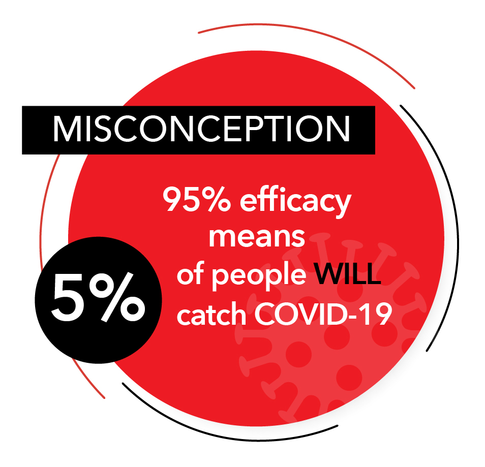 One common misconception is that a 95% efficacy rate means that 5% of the participants in the trial contracted COVID-19, and that similarly, 5% of the vaccinated population will catch it as well. That is not the case. The purpose of the efficacy rating is to show how much the RISK of catching the disease is reduced.
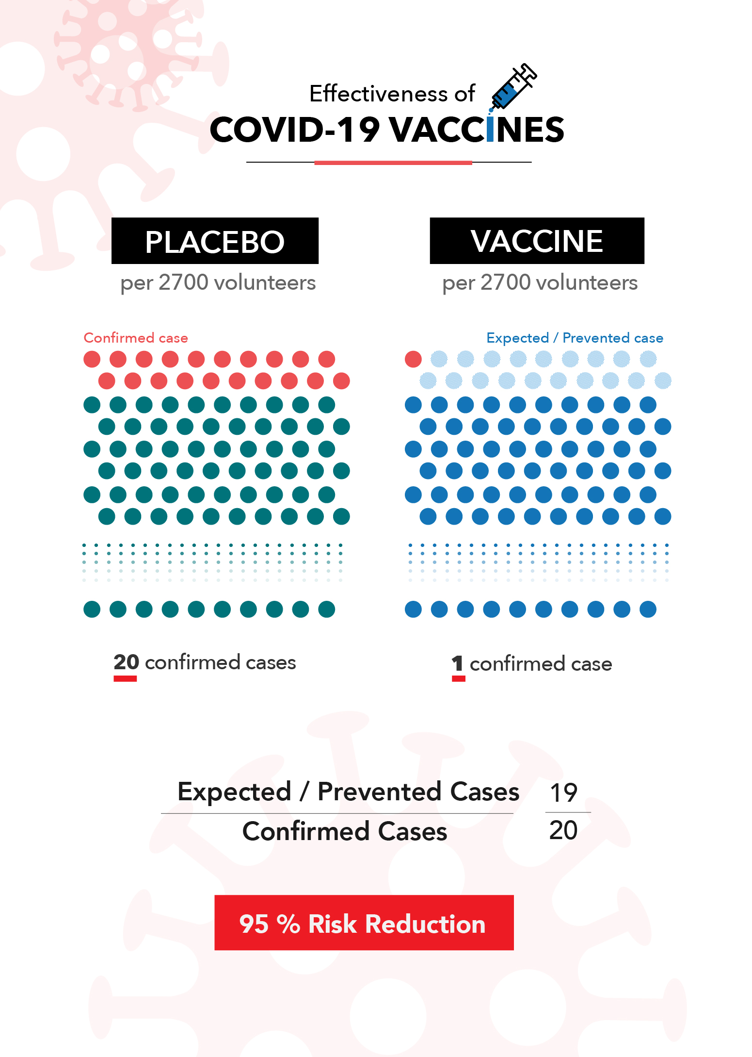
Let’s look at what this means using the Pfizer-BioNTech clinical trial. According to their released data, 160 out of the 21,728 people in the placebo group tested positive for COVID-19. Conversely, more than a week after receiving the second vaccine dose, only eight out of 21,720 people tested positive.
This means that over the course of the trial, it could be expected that the average unvaccinated person had a 0.7% chance of catching COVID-19. Alternatively, if you had received the Pfizer vaccine, you had a 0.04% chance of catching it. This is where their 95% efficacy rating comes from. It means that there were 95% fewer cases than would have been expected if the trial participants were not vaccinated.
Clinical trials can be hard to compare to one another because they occur during different time periods, in different places and have different definitions and criteria. This is a major reason health officials caution against comparing the efficacy numbers of different vaccines against one another. Small variances in the details of the trial can impact the final numbers.
The unique nature of clinical trials can also lead people to wonder how the vaccines perform in the real world, especially when issues like new variants come into play. Thankfully, we’re already seeing evidence that the real-world effectiveness of these vaccines matches up with the numbers reported in their clinical trials.
Now that a significant portion of the population is fully vaccinated, we can also examine recent, in-the-wild data to further understand how the vaccines reduce risk. We know that the vaccines aren’t perfect, and the CDC is actively collecting data on breakthrough cases (confirmed infections among vaccinated people).
As of April 26, the CDC reported 9,245 infections among the more than 95 million Americans who had been fully vaccinated. Using historical data* as a benchmark, an average of 264 vaccinated Americans tested positive for COVID-19 per day over the last two weeks of April. During that same period, the U.S. saw an average of 62,800 new cases per day among the entire population. That roughly equates to three cases per 1 million vaccinated Americans per day, compared to about 260 cases per 1 million unvaccinated Americans per day. It’s not perfect, but it represents a significant reduction in risk.
During that same two-week period, the U.S. recorded 8,926 total deaths due to COVID-19, 58 of which were fully vaccinated individuals. Given what we know about the size of the vaccinated and unvaccinated population, this means that vaccines likely saved at least 3,000 lives in those two weeks alone. The total lives saved is likely even higher, when one accounts for the fact that the demographics of the first groups of vaccinated Americans were among the most vulnerable for severe complications and death due to COVID-19.So what does all of this mean as you consider whether the vaccine is a good choice for you and your family? Getting the vaccine does not offer a guarantee that you won’t catch the disease or get seriously ill from it. But it does offer a very significant reduction of risk.
For example, consider that wearing seatbelts in a car is estimated to carry a 45% reduction in risk of death, and doing so is a choice most of us would make whether it was the law or not. Even if we believe our risk of an auto accident is low, we still make a conscious choice to further reduce the possibility of severe injury. Seatbelts don’t offer 100% protection, and neither do COVID-19 vaccines, but the data shows the added safety is worth it.
* As of May 14 the CDC has changed how they report breakthrough cases. Visit the CDC website for up-to-date information.
![]() About SAS: Through innovative analytics software and services, SAS helps customers around the world transform data into intelligence.
About SAS: Through innovative analytics software and services, SAS helps customers around the world transform data into intelligence.
Vaccines and Misinformation | Understanding how misinformation can fuel vaccine hesitancy
Misinformation about the COVID-19 vaccine is contributing to a hesitancy to get vaccinated. In an effort to separate fact from fiction and provide a better understanding of the reasons for that reluctance, we’re going to spend this week focusing on the issue and providing trustworthy information about it.
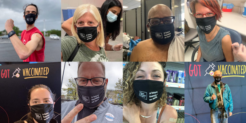
NLP’s staff members snapped selfies while getting their vaccine shot.
We’re starting with an update to our COVID-19 webpage, which includes links to credible health care organizations and reporting that have debunked many of the myths surrounding the vaccines. Additional resources dive more directly into the reasons people have expressed for not getting a shot. Our friends at SAS are providing context to the data about the vaccines that we hope will show you how effective they’ve been in preventing the spread and harm from the virus.
We’re also producing a special episode of our podcast Is that a fact? We’ll get insight from Dr. Erica Pan, California state epidemiologist and deputy director for the Center for Infectious Diseases at the California Department of Public Health, and Brandy Zadrozny, a senior reporter for NBC News who covers misinformation, extremism and the internet. They share their expertise on how the vaccines were created, their effectiveness, the impact of misinformation on vaccine hesitancy and how anti-vaxxers have used the pandemic to sow more confusion and grow their ranks.
Last week, the Centers for Disease Control and Prevention announced new guidelines stating that “fully vaccinated people no longer need to wear a mask or physically distance in any setting,” along with some specific exceptions. It’s clear that the vaccinations are saving lives, reducing the health risks of the virus and helping us return to some semblance of normalcy. We hope that by providing this information, you can help the people in your community make informed decisions about getting the vaccines. Please share these resources, and remember, the best advice we can offer people who are hesitant to get a vaccine is to suggest that they talk to their health care provider about the benefits and risks of getting vaccinated.
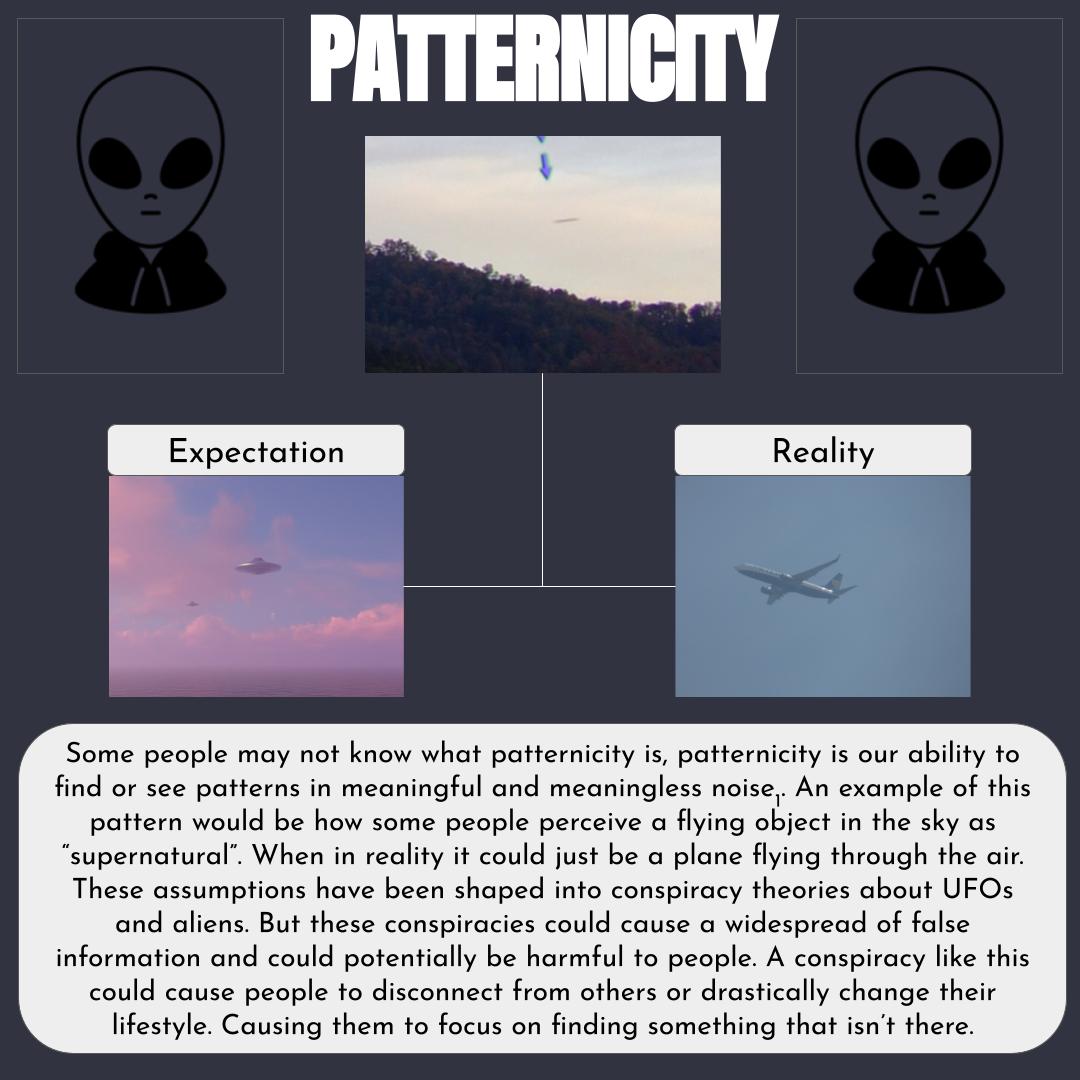
Patternicity contest demonstrates mastery of key concept
Our brains are built to look for patterns, and we tend to see them everywhere. We look up at a cloud and see the shape of a cat. Or we recognize the outline of a face in a puddle.
Patternicity is the term for this tendency to perceive meaningful patterns and connections among unrelated events. It’s often a harmless diversion. However, it can be used to support a belief that is otherwise lacking in evidence, like a conspiracy theory.
NLP created a contest to measure Checkology® students’ understanding of patternicity — an important news literacy concept. Students submitted a poster or infographic explaining the dangers of creating or believing false evidence rooted in patternicity.
Grace Bradley of Missouri won NLP’s first patternicity contest. The senior is a student in Nicole Cusick’s English class at Lee’s Summit West High School. Cusick taught patternicity in her media studies course as part of a segment on conspiratorial thinking. The course asks students to seriously evaluate media consumption and media’s role in society.
Student Grace Bradley’s poster. Click image to view full poster.
“When I saw the contest, I originally thought it would be a fun way to learn about conspiracy theories. After a closer look, I thought it would be a perfect way to have an authentic assessment of their learning about how conspiratorial thinking develops and the impact it can have on us and our society,” Cusick says.
Clear definition of patternicity
Kim Bowman, NLP’s user success associate, says Grace’s entry offered a clear definition of what patternicity is and why we tend to look for patterns. “Grace skillfully explained the dangers of this illusory perception (when it leads to conspiratorial thinking) using topical examples. In addition to being very informative, the final product was creative and unique with both the layout and images.”
“It was such a fun assignment and project, and I’m so proud of my infographic, so I’m really happy I won,” Grace says.
She also enjoyed using Checkology to study news literacy. For example, she likes the ease of use, ability to learn at her own pace and relevancy of the lessons. “I like how much effort they have put in to making it more interesting and interactive as well. They’re really moving with the times. Everything is tailored to high school students, and it really shows,” says Grace.
And the contest itself motivated students, Cusick says. The recognition helped them see the payoff from their hard work. It also gave students a new perspective about what they learn and why. “They are seeing how the skills of my English classroom are applicable to their lives outside of the classroom as well,” she says.
Click image thumbnails above to view the full posters created by Gabby Reynolds, Noah Stice and Miyabi Schroth (left to right).
The patternicity contest runners-up included two of Grace’s classmates: Gabby Reynolds and Noah Stice. Miyabi Schroth of Berkeley, California, is the other runner-up. Schroth is a student in teacher-librarian Melanie Ford’s class at Longfellow Arts and Technology Middle School, where the eighth-grader is also a library assistant.
Grace and Cusick will receive an assortment of NLP-branded swag in recognition of their work.
Celebrating AAPI journalists and news media
More than 40 years ago, the United States first celebrated the heritage of Asian-Americans and Pacific Islanders (AAPI) with a commemorative week in May 1979. But this year, amid disturbing violence and abuse targeted at Asian-Americans, immigrants and other people of color, appreciating the culture and contributions of the AAPI community is more important than ever.
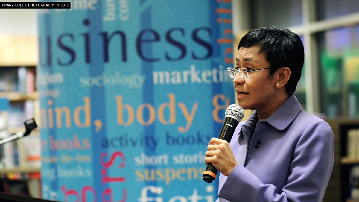
Photo credit: Franz Lopez on Flickr, licensed under CC BY-NC 2.0
For Asian/Pacific American Heritage Month, NLP is highlighting AAPI journalists and news organizations — past and present — on social media. We begin with Rappler co-founder and CEO Maria Ressa. She received the 2021 UNESCO/Guillermo Cano World Press Freedom Prize on the eve of World Press Freedom Day, May 3. Ressa, a Filipina-American journalist, and her team continue their unflinching coverage of President Rodrigo Duterte’s authoritarian rule in the Philippines despite harassment, threats and jail time. In 2020, Ressa was a guest on NLP’s podcast Is that a fact?, where she discussed her work and why she presses on despite the risks. “… you don’t wake up and you say, ‘I’m going to fight for press freedom.’ I never did. I just did my job,” she told us.
Important AAPI milestones
So why is May Asian/Pacific American Heritage Month? The U.S. Congress selected this time of year to celebrate the AAPI community because of important milestones. “The month of May was chosen to commemorate the immigration of the first Japanese to the United States on May 7, 1843, and to mark the anniversary of the completion of the transcontinental railroad on May 10, 1869. The majority of the workers who laid the tracks were Chinese immigrants,” according to the Asian/Pacific American Heritage Month website. Educators will find lessons plans and other classroom-ready resources for teaching about AAPI heritage on the site.
And be sure to follow our thread on Twitter throughout the month as we focus on the impact of AAPI journalists and news organizations @NewsLitProject.
Behind the headlines: Blocking press freedoms
This article is from a previous issue of our Get Smart About News newsletter for the general public, which explores timely examples of misinformation as well as press freedom and social media trends and issues. Subscribe to our newsletters.
By Suzannah Gonzales
Journalism — “arguably the best vaccine against the virus of disinformation” — is obstructed in a majority of countries around the world, according to Reporters Without Borders (RSF) and its new press freedom ranking.
The 2021 World Press Freedom Index, an annual ranking of 180 countries and territories, showed that journalism “is totally blocked or seriously impeded in … 73% of the countries evaluated.” The “data reflect a dramatic deterioration in people’s access to information and an increase in obstacles to news coverage,” an overview of the ranking said. COVID-19 is being used to block availability to sources and reporting on the ground, making it hard to cover controversial stories. RSF questioned whether access will improve once the pandemic ends.
In addition, RSF noted a troubling measure of public mistrust of journalists, citing the results of a survey in 28 countries called the 2021 Edelman Trust Barometer. It found that nearly 60% of those who responded believe “journalists deliberately try to mislead the public by reporting information they know to be false” when in actuality, journalism combats “infodemics” of misinformation and disinformation, RSF said.
The United States advanced one place (to 44) with its press freedom categorized as “fairly good,” RSF said, despite unprecedented numbers of assaults against and arrests of journalists (about 400 and 130, respectively).
Norway remained at the top of the list for the fifth year, and Finland held on to its second-place spot while Sweden reclaimed its third-place ranking. Totalitarian countries once again claimed the bottom three places — Turkmenistan (178), North Korea (179) and Eritrea (180). Malaysia, which recently enacted a law against what authorities deem false content, dropped the most in the ranking — 18 spots to 119.
Related:
- “Governments are using Covid-19 as an excuse to crack down on press freedom” (Sara Torsner and Jackie Harrison, Nieman Lab).
- “Guilty Verdict for Hong Kong Journalist as Media Faces ‘Frontal Assault’” (Austin Ramzy and Tiffany May, The New York Times).
- “Very telling/chilling response by Hong Kong government to latest RSF press freedom rankings” (Timothy McLaughlin, Twitter).
- “Listening to what trust in news means to users: qualitative evidence from four countries” (Reuters Institute).
Behind the headlines: Values, trust and media
This article is from a previous issue of our Get Smart About News newsletter for the general public, which explores timely examples of misinformation as well as press freedom and social media trends and issues. Subscribe to our newsletters.
By Hannah Covington

It can be tempting to view the public’s distrust of the news media as simply a matter of political differences. But a recent study offers new ways of looking at and addressing the “media trust crisis.” It suggests that not all Americans embrace the core values that journalists follow in their work, and that this misalignment — rather than partisanship — may help better explain media trust divides. For example, people who value authority and loyalty may be wary of journalists’ role as watchdogs over the powerful.
“When journalists say they are just doing their jobs, in other words, the problem is many people harbor doubts about what the job should be,” the report said.
The study was released on April 14 by the Media Insight Project — a collaboration of the American Press Institute and The Associated Press-NORC Center for Public Affairs Research — and examined “public attitudes toward five core values of journalistic inquiry.”
Most agree on importance of facts
These values include acting as watchdogs over powerful people; making information open and transparent; valuing facts in pursuit of truth; offering a voice to those lacking power; and shining light on societal problems.
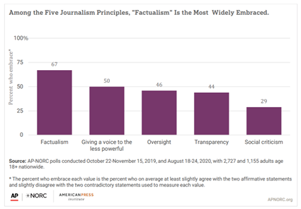
Only 11% of Americans fully embrace all five of these principles, the study found. The importance of facts in pursuit of truth attracted the most widespread support (67%), while just 29% of Americans embraced spotlighting social problems as an effective way to solve them. Distrust among these groups, the study points out, “goes beyond traditional partisan politics.”
The study highlights ways that news organizations can rebuild trust without compromising core values. Simple tweaks to headlines, first sentences and story framing, for instance, can go a long way to broaden the appeal of news reports among a wider audience.
Related:
- “American Views 2020: Trust, Media and Democracy” (Gallup and Knight Foundation).
- “Americans See Skepticism of News Media as Healthy, Say Public Trust in the Institution Can Improve” (Pew Research Center).
Behind the headlines: Clarity or deception?
This article is from a previous issue of our Get Smart About News newsletter for the general public, which explores timely examples of misinformation as well as press freedom and social media trends and issues. Subscribe to our newsletters.
Written by: Peter Adams

Florida Gov. Ron DeSantis answers questions about his state’s COVID-19 response at a press conference at the Urban League of Broward County on April 17, 2020.
An April 4 report from the long-running CBS News newsmagazine 60 Minutes on disparities in Florida’s vaccine rollout has touched off a wave of criticism questioning the piece’s accuracy and fairness.
The controversy stems from the report’s unsupported suggestion that Republican Gov. Ron DeSantis used the state’s vaccination program to engage in a “pay-to-play” scheme with the supermarket chain Publix when he announced a distribution partnership with the company in January, shortly after it donated $100,000 to his political action committee.
But critics of this segment of the report say it failed to provide substantive evidence of wrongdoing and mischaracterized key details. The report also included footage from a press briefing at which 60 Minutes correspondent Sharyn Alfonsi asked DeSantis about the Publix relationship. However, important parts showing DeSantis denying wrongdoing (at 32:30 in footage of the briefing) weren’t included in the clip. The director of the Florida Division of Emergency Management, Jared Moskowitz, and Palm Beach County Mayor Dave Kerner, who are both Democrats, have backed up the governor’s account.
CBS News defended the edits and stands by the report. At the conclusion of its April 11 episode, 60 Minutes acknowledged criticism of its report and read several letters from viewers. DeSantis, meanwhile, has responded to the incident by going on the offensive, broadly accusing “partisan corporate media” of maliciously trying to damage him.
Note: Most of the 60 Minutes report presented accurate information about well-documented racial and economic disparities in the state’s COVID-19 vaccination distribution. But the controversy over the DeSantis allegations overshadowed that reporting.
Also note: CBS said DeSantis declined to be interviewed by 60 Minutes for the report.
Related:
- “Opinion: ‘60 Minutes’ embraces innuendo in Ron DeSantis story” (Erik Wemple, The Washington Post).
- “Not everything was wrong with the ‘60 Minutes’ story on Florida Gov. Ron DeSantis and COVID-19 vaccines” (Tom Jones, Poynter).
- “Ron DeSantis is Taking His 60 Minutes Feud All the Way to the Bank” (Charlotte Klein, Vanity Fair).
- “Why Being ‘Anti-Media’ Is Now Part Of The GOP Identity” (Meredith Conroy, FiveThirtyEight).
Discuss: Can journalists include everything a source says in their reporting? How should journalists decide what portions of interviews to include and which to leave out?
Idea: Use this video comparison from NLP to highlight for students the edits 60 Minutes made to the governor’s response to Alfonsi’s question. Do they agree with CBS’ claim that these were justifiable edits made for clarity? Or do they agree with claims by DeSantis that the editing was deceptive and unfair?
Journalist’s classroom visit high point of the year for California sixth-graders
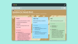
NPR journalist Hannah Bloch is used to asking questions, but during a virtual visit with 80 sixth-graders at Chaparral Middle School in Diamond Bar, California, she was the one peppered with them.
The conversation with Bloch, lead digital editor on NPR’s international desk, was the highlight of a media literacy component that educator Sherry Robertson developed for her language arts class.
“Speaking with Sherry Robertson’s class was a delight. The students were so engaged (even over Zoom, which I expected might be tough). Their questions were thoughtful, and I loved their genuine curiosity about journalism and what it’s like being a journalist,” Bloch says.
Robertson arranged the January visit through the News Literacy Project’s Newsroom to Classroom program. Part of the Checkology® e-learning platform, the program enables educators to invite vetted journalist volunteers to visit their classrooms in person or remotely.
“I felt very passionate about creating a unit on this. The younger we start, the better,” Robertson says. “I’m on a mission to do my part in the world to make my kids literate online.”
Before the visit, Robertson’s students completed the Checkology lessons “InfoZones” and “Arguments & Evidence.” They then submitted questions to Bloch ahead of time through the platform, Padlet.
Inspiring visit
Introducing a new subject area has both challenged and inspired Robertson. “As educators, we weren’t trained to teach this,” she says. “This is new for me. I’m teaching them something I’m learning at the same time.”
Bringing in a subject matter expert was a real help. The conversation with Bloch covered several topics, from what inspired her to become a journalist, to how she determines whether a story is credible, to which fast food restaurant she recommends.
“It was so amazing. She was fantastic and went out of her way to answer my kids’ questions,” Robertson says. And the conversation with a working journalist was eye-opening for her students. “She’s so accomplished, and here she is talking to them as equals. This was something my kids could aspire to. Journalism could be attainable to them. I don’t think they realized it,” she adds.
In a year when distance learning has posed significant challenges to educators, parents and kids, Robertson was able to easily arrange the visit with Bloch, who lives on the East Coast. And it was a natural fit given that everyone has essentially been “living” online since the pandemic began.
Robertson also wanted to ensure her students enjoyed their first year in middle school, despite the circumstances. She sought to keep them engaged and provide something fun. Bloch’s visit was just that. “This was literally the best experience my kids had this year,” Robertson says.
For Bloch, the visit was also a delight. “It was a pleasure to have the opportunity to spend that time with them and I’m thrilled to hear that they enjoyed it, too. And I have so much respect for the work teachers like Ms. Robertson are doing at this most challenging of times,” she says.
Behind the headlines: Sexism in journalism
This article is from a previous issue of our Get Smart About News newsletter for the general public, which explores timely examples of misinformation as well as press freedom and social media trends and issues. Subscribe to our newsletters.
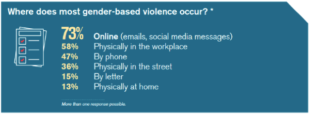
Women working as journalists increasingly face gender-based violence outside of their newsrooms, including a barrage of threats and hate online. But they also endure it inside their workplaces, from discrimination to sexual assaults and harassment, according to a new Reporters Without Borders (RSF) report detailing the toll sexism has taken on journalism.
“The two-fold danger to which many women journalists are subjected is far too common, not only in traditional reporting fields as well as new digital areas and the Internet, but also where they should be protected: in their own newsrooms,” the report said.
Reporters Without Borders “Sexism’s Toll on Journalism” report, March 8, 2021
Published on March 8 — International Women’s Day — the report includes RSF’s analysis of 112 responses to questionnaires sent to its global correspondents and journalists who cover gender, and collected between July and October 2020.
The trauma female journalists experience due to violence both in and out of the newsroom silences victims and leads some to close their social media accounts or even resign, the report found. Issues affecting women “become invisible” in news coverage when there aren’t enough women in top leadership positions, the report said: “The lack of multiple viewpoints within media organisations has major editorial consequences, including in the representation of women in the content offered to the public.”
Note: A separate March 8 report by the Reuters Institute for the Study of Journalism revealed that 22% of top editors at 240 major news organizations are women.
Related:
- “New York Times Defends Reporter Taylor Lorenz From Tucker Carlson’s ‘Cruel’ Attack” (Jordan Moreau, Variety).
- “Carlson, Times tussle over online harassment of journalist” (David Bauder, The Associated Press).
- “Maria Ressa: Fighting an Onslaught of Online Violence” (International Center for Journalists).
- “UNESCO launches campaign to end online violence vs women journalists” (Rappler).
- “Malign Creativity: How Gender, Sex, and Lies are Weaponized Against Women Online” (Wilson Center).
Behind the headlines: Atlanta shootings coverage fallout
By Suzannah Gonzales and Hannah Covington
This article is from this week’s issue of our Get Smart About News newsletter for the general public, which explores timely examples of misinformation as well as press freedom and social media trends and issues. Subscribe to our newsletters.
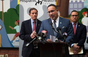
News coverage of the March 16 fatal shootings at Atlanta-area spas that occurred amid a recent spate of anti-Asian violence across the country spurred important debates over journalism ethics and news decisions — especially as the story first unfolded. Questions and criticisms of coverage highlighted several notable issues, including the bias and credibility of law enforcement sources; the need for more diverse news organizations, journalists and sources; and hesitation by newsrooms to call the shootings a “hate crime.”
 Protestors hold signs at the End The Violence Towards Asians rally in Washington Square Park on Feb. 20, 2021 in New York City. Credit: Ron Adar / Shutterstock.
As the story developed, the Asian American Journalists Association (AAJA) published guidance for newsrooms covering the shootings. Its recommendations include providing context on the recent increasing violence, and understanding the history of anti-Asian racism. It also underscored the need to consult Asian American and Pacific Islander expert sources and to be careful with language that could contribute to “the hypersexualization of Asian women.”
AAJA reported that some newsrooms have questioned whether Asian American and Pacific Islander journalists will show bias or are “too emotionally invested” to cover the shootings. Calling such reports “deeply concerning,” it urged news organizations to empower these journalists “by recognizing both the unique value they bring to the coverage of the Atlanta shootings and the invisible labor they regularly take on, especially in newsrooms where they are severely underrepresented.”
Note: AAJA also released a pronunciation guide for Asian victims of the shootings.
Related:
- “The rush to report on Atlanta-area shootings amplified bias in news coverage” (Doris Truong, Poynter).
- “Connie Chung: The media is miserably late covering anti-Asian violence” (Alexis Benveniste, CNN Business).
- “‘Enough Is Enough’: Atlanta-Area Spa Shootings Spur Debate Over Hate Crime Label” (Bill Chappell, Dustin Jones, NPR).
- “Why don’t we know more about the Atlanta shooting victims?” (Ariana Eunjung Cha, Derek Hawkins and Meryl Kornfield, The Washington Post).
- “Teen Vogue’s New Top Editor Out After Backlash Over Old Racist Tweets” (Maxwell Tani, Lachlan Cartwright, The Daily Beast).
Statement: Base proposed voting measures on facts, not falsehoods
As numerous states consider steps to change the way voters participate in elections, we urge elected officials to base their actions on credible evidence.
We believe that the right to vote is an essential act of an informed citizenry. But legislation premised on widespread disinformation about the 2020 election — including baseless voter fraud claims and conspiracy theories — runs counter to our values and would do lasting harm to voting rights, which are among the most sacrosanct tenets of American democracy.
In a joint statement in November, two federal election security agencies assured the public that the 2020 election was ‘“the most secure in American history.” They noted: “While we know there are many unfounded claims and opportunities for misinformation about the process of our elections, we can assure you we have the utmost confidence in the security and integrity of our elections.”
NLP’s work is rooted in the belief that facts are essential to making sound decisions. That’s why we’re calling on legislators to weigh whether proposed laws represent a response to demonstrated problems with existing voting infrastructure and procedures. While we welcome changes that improve the fairness, transparency and accessibility of elections, we oppose laws based on disproven allegations and manufactured narratives that place unnecessary burdens and restrictions on Americans’ right to elect their leaders and hold them accountable.
The last election saw the largest voter turnout since 1900, and as supporters of an engaged and well-informed voting public, we will continue our work to ensure that people know how to recognize fact from fiction and to use that knowledge to exercise their democratic rights.
CNN’s Abby Phillip joins board of the News Literacy Project
 Abby Phillip, CNN senior political correspondent and anchor of “Inside Politics Sunday,” is joining the board of the News Literacy Project.
“Abby brings us exceptional credentials as a journalist as well as a fresh perspective,” said Alan C. Miller, founder and CEO of NLP, the nation’s leading nonpartisan education nonprofit. “With her experience, we anticipate that she will contribute valuable insights to the board. We look forward to working with her to expand our reach and impact at this crucial moment for the country’s democracy.’’
Phillip expressed a strong commitment to NLP’s work. “The mission of the News Literacy Project has always been essential to a functioning democracy, but it is needed now more than ever,” she said. “I’m grateful for the opportunity to serve on the board of this great organization as it continues in its work of helping people navigate the modern information environment. As a journalist, I view the work of the News Literacy Project as a perfect complement to what we do every day to bring facts and the truth to the American people and our viewers and readers around the world.”
Greg McCaffery, the chair of NLP’s board, welcomed her to the organization. “Abby Phillip’s commitment to NLP’s goals and mission is clear. We are thrilled to have her join the board.”
Phillip established her initial connection to NLP in 2016 when she was a reporter at The Washington Post. She participated in a “virtual visit” event along with Matea Gold, who is now the Post’s national political enterprise and investigations editor and a member of NLP’s National Leadership Council.
Deep experience covering politics, other major stories
Based in D.C., she left the Post for CNN in 2017 to cover the Trump administration and served as White House correspondent through 2019. In January 2020, she moderated the CNN Democratic presidential debate in Iowa. She also anchored special coverage of “Election Night in America” for the 2020 election — coverage that lasted for several days until CNN was the first news outlet to project Joe Biden as the winner.
While at the Post, Phillip was a national political reporter. She covered the White House and wrote about a wide range of subjects related to the Trump administration. As a campaign reporter during the 2016 election, she covered Hillary Clinton’s presidential campaign and was also a general assignment reporter, covering domestic and international news — including the mass shootings in Charleston, South Carolina, and San Bernardino, California.
Before joining the paper, Phillip was a digital reporter for politics at ABC News. She also covered the Obama White House for POLITICO as well as campaign finance and lobbying.
A graduate of Harvard University, Phillip is working on her first book, THE DREAM DEFERRED: Jesse Jackson, Black Political Power, and the Year that Changed America, which will be released in 2022. It will be the first major contemporary book on the life and political legacy of Jackson, focusing on his groundbreaking run for the Democratic presidential nomination in 1988.
News literacy ambassador brings ‘seasoned’ approach to education
 When you view educator Sandra Street’s LinkedIn profile, your gaze quickly finds the word “seasoned,” which appears directly under her name at the top of the page. In this understated way, she makes her wealth of experience and expertise evident.
An award-winning history teacher at the Gordon Parks School for Inquisitive Minds in Queens, New York, and a news literacy ambassador for NLP, Street is committed to elevating her students’ learning experience through her “seasoned” approach.
“I remember many years ago, I bought a wok and was washing it out. My brother said, ‘Don’t wash it with soap and water, just wipe it out so that every time you cook, it seasons the food,’” she recalls. “When you add a little heat to something, you bring a whole lot of different flavors.”
This cooking metaphor, she believes, applies to teaching.
Street, who became an educator after working on Wall Street, harvests the flavors from a diversity of experiences and opportunities that she brings to the classroom. Here are just a few examples. She is a member of the New York State Council for the Social Studies Supervisory Committee and completed New York City’s Leaders in Education Apprentice Program. She studied the African diaspora at New York University and attended the Tufts in London program. Also, she earned a certificate in education leadership and administration from Harvard University’s Graduate School of Education.
News literacy ambassador, teacher
This ever-curious and engaged approach to learning and life led her to make news literacy education an imperative. “I have been teaching it because I’m compelled to do so. Because we’re living it,” says Street. This year, because of COVID-19 restrictions, she teaches history remotely to 74 eighth-graders.
NLP’s Checkology® virtual classroom is a main ingredient in this instruction. “When I went into Checkology, I just wanted to stay in there all day,” Street says. She considers the guidance to stop and weigh information before believing, sharing or taking action a fundamental lesson. “I use that in the classroom. I’ll say, ‘Let’s pause. Before you make a decision, make sure you are well informed.’”
Relying on events both current and historical, she encourages students to make their own realizations about the information they encounter. She reminds them, “I’m not here to tell you what to think; it’s my goal to get you to think.”
A mom herself, Street brings a maternal concern to the classroom. “What I want for my children, I want for other children: Access and exposure to information where they can find their truth,” she says.
As an NLP ambassador, Street advocates for news literacy education and support educators who join NLP’s News Literacy Educator Network — NewsLit Nation. This role gives her a new and important way to bring a little extra seasoning to the education system, and to her life.
Black History Month: Pioneering journalists, media
This February, during Black History Month, we’re shining a light on pioneering Black journalists and news media from the past two centuries. Many of these reporters and outlets overcame incredible obstacles and discriminatory systemic structures to report the facts in their communities. Many are also relatively unknown to the news-consuming public. We hope to help change that. Follow our Twitter thread throughout February as we highlight a journalist and/or news outlet each weekday.
We began by highlighting the Freedom’s Journal, the first Black-owned and -operated newspaper in the United States. The four-page, four-column paper debuted in 1827, the same year that slavery was abolished in New York State. Like many of the publications operated by or created for Black Americans that would follow, Freedom’s Journal served to counter racist commentary published in the mainstream press.
Twenty years later, Frederick Douglass and Martin Delaney launched The North Star. The abolitionist newspaper would become the most influential anti-slavery publication of the 19th century, focusing on anti-slavery progress, women’s rights and Black empowerment. The North Star published 565 issues between 1847 and 1851, according to the Library of Congress. In the late 1800s, Black investigative journalism rose to the forefront as Ida B. Wells exposed the widespread practice of lynching, particularly of Black men. Wells’ work is featured in our Checkology® lesson “Democracy’s Watchdog.”
Still publishing today
The 1900s saw the creation of more Black-owned newspapers, including two of the most respected publications that still publish today. Robert Sengstacke Abbott founded The Chicago Defender in 1905, and shepherded its growth into a local paper with a weekly circulation of 16,000 in its first decade. James H. Anderson put out the first edition of the Amsterdam News, a New York paper, on Dec. 4, 1909, with six sheets of paper and a $10 investment. The publication grew quickly to cover not just local stories but national news as well. A year later, in 1910, W.E.B. Du Bois served as the editor of the NAACP’s first issue of The Crisis, its official magazine. It took off from there.
Continuing chronologically through the 1900s, we’re highlighting just some of the many Black journalists that made indelible impacts with their reporting. From Charlotta A. Bass to Ted Poston and on and on, follow our Twitter thread for more throughout February.
New education secretary must prioritize civics education
Strengthening our democracy by transforming civics education
 As the U.S. Senate begins the confirmation hearing for Miguel Cardona to become the next Secretary of Education, it must ensure that he prioritizes a robust civics curriculum for the nation’s middle schools and high schools that includes news literacy education.
One of the primary purposes of public education is to teach the next generation about the functioning of a democratic society — and to foster its engagement as equal and engaged participants who will seek to preserve and improve democratic norms and practices. But those who lead by falsehoods represent a threat to our democracy, in part because many people lack an understanding of how our system of government works and how they can become informed about it. If we fail to teach civics, our young people — tomorrow’s voters — will be at a great disadvantage. And the fewer people who can engage in rational, fact-based debate, the greater the chance that we will be unable to govern ourselves, jeopardizing the future of our democratic way of life.
We can commit to resolve this problem by making civics the centerpiece of a quality education. An effective civics curriculum must include news literacy at its core to help young people develop critical thinking skills to discern fact from fiction and determine the credibility of the news and other content that bombards them daily. News literacy gives people the ability to become smart, active and engaged consumers of news and information and empowers them to participate in the civic life of their communities and country.
We understand the many challenges that Secretary of Education nominee Cardona faces in overcoming the unprecedented obstacles imposed by the COVID-19 pandemic, but this moment is too important to let civics fall by the wayside. As President Biden said in his inaugural address, “We must reject the culture where facts themselves are manipulated and even manufactured.” Cardona can take the lead on this by recommitting the country and our education system to a civics education that has news literacy has a key component.
NLP launches NewsLit Nation, the News Literacy Educator Network
Nationwide community of teachers, librarians and administrators advocate news literacy education
![]() To work toward reducing the harmful effects of misinformation on young minds, NLP is launching NewsLit Nation, the home of its News Literacy Educator Network. NewsLit Nation members advocate for news literacy education and support educators helping students navigate the complex digital news ecosystem.
To work toward reducing the harmful effects of misinformation on young minds, NLP is launching NewsLit Nation, the home of its News Literacy Educator Network. NewsLit Nation members advocate for news literacy education and support educators helping students navigate the complex digital news ecosystem.
With educators on the frontline of the fight against misinformation, NewsLit Nation provides resources and know-how for this urgent and important work. The network also organizes locally to enable educators to push for news literacy instruction in their schools and communities, says Ebonee Rice, NLP’s vice president of the educator network.
“We’re building an army of news literacy educators to mobilize their peers and create a future founded on facts,” she says. “We’re here to empower educators with the tools they need to actively teach students the abilities to become equal and engaged participants in our democracy.’’
What is NewsLit Nation?
NewsLit Nation:
- Trains teachers, librarians and school administrators across the country to advocate on behalf of a news literacy curriculum.
- Helps you find opportunities for local partnerships and build channels of communication for your communities as local news literacy champions.
- Gives you access to exclusive professional development opportunities, webinars, other training and additional support through online forums and message boards.
- Acts as the resource library for all our news literacy materials for educators.
And, NewsLit Nation includes a network of ambassadors — educators working to create a sense of community in their local and regional school districts. (Thirteen news literacy ambassadors are already working in 10 cities across the country.)
Educators can easily join the network by registering here.
NewsLit Week | Wisconsin students win PSA contest
Students in Lisa Ruehlow’s Media Literacy class at Amery High School in Wisconsin combined creativity and their Checkology® lessons to create public service announcements about the importance of news literacy for young people. And two of them took top honors for the national PSA contest sponsored by the News Literacy Project (NLP) and The E.W. Scripps Company. The new contest was part of National News Literacy Week (Jan. 25-29.) One of Ruehlow’s students won first prize, and another was selected as runner-up.
The winners are:
First prize: Nicholas Hahn, senior
His video featured clips from current events to demonstrate the real — and often harmful — impacts of misinformation. Watch Nicholas’ PSA.
Runner-up: Mary Mallum, senior
She used animated graphics to provide tips for parsing the false from the factual. Watch Mary’s PSA.
NLP and Scripps, sponsors of National News Literacy Week, asked students taking Checkology virtual classroom lessons to submit a 30-second video PSA related to the week’s theme: Get NewsLit fit. The PSA contest aimed to encourage young people to promote news literacy to their peers.
The winning students took a new course that Ruehlow created and taught for the first time last fall. The class of 20 included mostly seniors, plus a few juniors and sophomores. All completed the PSA assignment for class. Throughout the semester the students enthusiastically embraced the topic of news literacy, Ruehlow says.
“I am exceedingly happy that students see the value of the tools they have learned — they are sharing their insights with others, and are quite passionate about it,” she says. “Many have told me that they think this class should be required of every high school student since this topic is so incredibly important to their daily lives.”
The importance of media literacy
When she asked students why they thought media literacy was important, they offered thoughtful responses.
- “Media Literacy is more critical than ever as people spend so much time on social media, where anyone can post something and claim it as ‘news.’”
- “It’s important to know what’s true and how to verify or debunk it for ourselves. With people spending so much time-consuming media, it can help our relationships, our country, and our digital communities by knowing what’s real and not allowing it to evoke such a severe emotional response.”
- “Media literacy is important because being misled by false information can result in harmful or incomplete understandings. That can result in action being taken, such as storming the Capitol.”
Her students clearly grasp the significance and urgency of becoming more news-literate. Ruehlow — and other educators like her — who are dedicated to this work — make that possible.
NewsLit Week | Use ‘PEP’ to talk to conspiracy believers
In Texas, an air conditioning repairman is run off the road and assaulted by a former police captain trying to find forged presidential election ballots. Closer to home, you learn your cousin is convinced of widespread voter fraud. A suicide bomber detonates a massive explosion in downtown Nashville, possibly targeting the AT&T building over 5G technology paranoia.
Meanwhile, your college roommate frequently posts about 5G causing coronavirus. A Wisconsin pharmacist is accused of deliberately ruining doses of the COVID-19 vaccine because he believed it would alter human DNA; your spouse is worried the vaccine contains a microchip.
Conspiratorial beliefs are seemingly everywhere, and they’re being shared by friends, family and loved ones.
Talking to conspiracy believers
You might be struggling with how to talk to these otherwise rational people about obviously irrational beliefs — and you’re not alone. According to the Pew Research Center, 71% of U.S. adults have heard one or more conspiracy theories about the coronavirus outbreak and 25% see at least some truth in them. You may feel like there’s nothing you can say or do to persuade friends or family from beliefs like these that are thoroughly and credibly proven false. You might feel too discouraged to even try, but you’re not powerless to confront this.
Addressing a person with entrenched false beliefs requires what I call an ongoing “PEP” talk – an approach based on patience, empathy and persistence. It’s more than just one difficult conversation. You’ll need to understand the feelings and emotions that motivate people to dive deeper into these false narratives. You’ll have to recognize that these are genuine beliefs that “feel” true to the people who share them. Do not criticize or attack. This causes a “backfire effect,” making the person reject contradictory information and hold tighter to anything that reinforces their belief. You need a base level of respect and a genuine desire to commit to a shared set of facts to succeed.
Start with patience, then empathy
The person you care about did not develop these beliefs overnight. Your friend or relative may have joined an online community of believers and soon become immersed in their echo chamber. You must listen to how and why they formed their beliefs and understand the sources of their information. This can be frustrating. Take a deep breath and pause before getting angry and shutting down any conversation.
Confronting someone to tell them they may be wrong about something they firmly believe in is uncomfortable – for both sides involved. That’s why empathy is so important. Respect that this person genuinely believes their thinking is accurate and recognize how they arrived at it. Many had fears and anxieties that they sought to alleviate, leading them to these new beliefs. This likely led to conflicting and contradictory ideas and cognitive dissonance, a form of psychological and emotional stress created by those conflicted feelings. They engaged in motivated reasoning, or the active searching for any and all information that reinforces the belief and eases the stress. The belief was reinforced in their new community and eventually became part of their identity, making it significantly more difficult to dissuade them. Understanding this will help you to be empathetic about their feelings.
Be persistent
Finally, use persistence. Regularly share new, verified information in a way that encourages the person to evaluate that information for themselves and to begin questioning their existing beliefs. Ask them, politely, to read new articles, consider new sources and tell you what they think. Express your feelings about their sources as skepticism, not outright rejection, and ask them to explain how and why they trust them. Using their criteria for a trustworthy source, share more reputable sources that might meet them and discuss why you trust them. Make this a dialogue, focusing on sharing ideas, beliefs and information.
Resolve to not give up on your friend or relative. Consider including other friends or loved ones who share your approach. The News Literacy Project has created a new Checkology® lesson to help people understand how conspiratorial thinking works; be sure to share it. Try to keep an the conversation going, without pestering. The goal is to ensure that your friend or relative gradually will accept your guidance and recognize your effort is out of love, respect and friendship, not derision and mockery.
Many of us are dealing with deep rifts among friends, family and loved ones, which are only likely to expand with persistent conspiracy theories, like recent false claims about COVID-19 vaccines. We can stop this from tearing us apart, if we devote the effort to trying. That’s at least one thing we can all agree on.
NewsLit Week | Seventh-graders connect dangers of misinformation to daily lives

A student’s poster depicting the information ecosystem as the solar system using InfoZone categories.
During a news literacy unit, seventh-graders in Jeff Rosen’s history class learned about different categories of information and the dangers of misinformation. They also learned about themselves and their place in the information ecosystem.
“They began to identify some of the harmful things they were seeing,” says Rosen, a social studies teacher at The Joseph Sears School in Kenilworth, Illinois. “I don’t think the kids knew they were being exposed to misinformation.”
An educator for 14 years, Rosen led his history class through a two-week unit on media literacy using NLP’s Checkology® virtual classroom. He focused on the “InfoZones” and “Misinformation” lessons and COVID-19 misinformation resources. But the learning didn’t end there.
“I try to find ways for the kids to apply the skills they learn to their everyday lives through tracking documents and reflection,” he says. “There’s a really urgent need to learn this now. They’re consuming information every day from a variety of sources and are not equipped with skills to differentiate what they are seeing.”
Measuring behavior
To accomplish this, students connected what they learned to their own lives by tracking information they consumed over two days. They categorized content by primary purpose — news, opinion, entertainment, advertising, raw information and propaganda/misinformation. Students then illustrated their findings in pie charts and reflected on what they found.
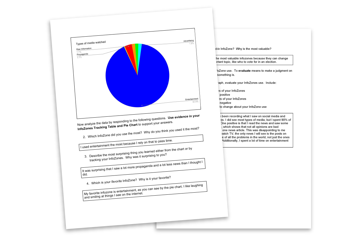
Examples of student work tracking their media consumption and reflecting on their habits.
Here is one student’s honest insight.
“I spent 90% of my time watching entertainment. One positive is that I read the news and saw some respectful opinions on the internet, which shows that not all opinions are bad propaganda. However, I only read one news article. This was disappointing to me because if I don’t read articles or watch TV, the only news I will see is the posts on Instagram. I want to be more aware of all the problems in the world, not just the ones that make it onto people’s stories.”
Recognizing dangers of misinformation
The students also discovered that so-called “fake news” is actually part of the information they see and engage with every day, underscoring the dangers of misinformation.
To reinforce this, Rosen had his class delve deeper by creating posters that describe a system with symbols for the “InfoZones” categories. They then demonstrated how misinformation poses a threat to a healthy system. One student represented misinformation as an asteroid in the solar system. Another labeled misinformation as pollution in a marine ecosystem.
“This shows that the kids have a deep understanding of these kinds of information. Applying symbols to them requires abstract thinking,” Rosen says. “It’s not just a surface skill they’re learning. They’re starting to internalize it and put it into practice.”
Rosen has also learned a good deal over the four years that he has been teaching Checkology. Originally, students simply enjoyed Checkology’s use of examples they could relate to — familiar YouTube stars or advertisements for favorite products.
“Now kids really recognize the importance of being able to identify what they’re seeing, and it’s an important skill to them. I’ve seen a change in their attitudes toward the media. Kids recognize the importance and urgency of being able to do this,” he says.
And that urgency and importance are never going away, Rosen notes. “We’re never going back. We’re never going to be able to say ‘don’t use these platforms.’ There’s so much good information out there but so much that’s bad. We need to teach them how to navigate it.”
With his creative approach, Rosen is doing just that.
Delivering news literacy to journalism students, remotely
When the Houston Independent School District started the 2020-21 school year with 100% remote learning, journalism educator David Fanucchi needed to find an engaging way to teach news literacy to his students at Margaret Long Wisdom High School.
A colleague at Houston’s Bellaire High School, Andrea Negri, suggested NLP’s Checkology® virtual classroom. The browser based, e-learning platform with interactive lessons that students can do independently was exactly what Fanucchi was looking for.
“I thought Checkology provided a fantastic way for students to complete some relevant online lessons about journalism at a time when it is so difficult to keep their attention remotely,” Fanucchi says. “Teachers are struggling to find tools like that to use, and I was just so excited that these easy-to-understand modules were created and that I could use them in my classes.”
He assigned all seven of his classes the Checkology 101 course, which explores essential news literacy topics through the lessons “InfoZones,” “The First Amendment,” “Democracy’s Watchdog,” “Practicing Quality Journalism,” “Understanding Bias” and “Misinformation.” The course also includes related activities, such as source detection and evidence evaluation “missions” to reinforce the lessons.
“We went through them all in about three weeks (a total of six or seven class periods that each lasts about 90 minutes),” Fanucchi explains. “This was all done virtually on their own laptops.”
A deepened understanding
Dulce Macha, a sophomore in one of Fanucchi’s journalism classes, had a basic understanding of news literacy before she began using Checkology. “What I had known about news literacy was that it helps you judge the reliability and credibility of information given,” she says.
But the lessons deepened her knowledge. “The most surprising thing that I learned during the course was that there are many steps that go into a journalist’s work, such as checking for credibility and staying away from bias,” Macha says.
Fanucchi found the “Practicing Quality Journalism” lesson particularly valuable to his student journalists. “It taught them a real-life scenario of being a news reporter and covering the scene of a car crash. I think it did a phenomenal job of giving the students a real feeling of what a journalist does to ensure accuracy in his/her reporting,” he says.
Macha enjoyed that assignment and how Checkology enabled her to illustrate what she learned in different ways. “What I liked about the lessons was that they had areas where we had to choose the right answer and also areas where we had to be in the journalist’s shoes, and write our opinions on it,” she says.
‘Extremely important during these times’
Fanucchi says students need help understanding how credible journalism works and identifying reliable sources and fact-based information. “It is extremely important during these times of so much chaos in the news business. Students are having a harder time every day figuring out what the truth is,” he says.
Since studying news literacy, Macha is having an easier time doing just that. “It has changed the way I consume the news and judge content and sources. This course has given me a way of judging the credibility of the news that I read and judging whether it could be fake or not,” she says.
Macha has not yet needed to help friends or family members avoid being fooled by misinformation, but she is prepared to do so. “If there was a point where something like that happened, I would certainly help them out and talk to them about the ways they should judge the credibility and reliability of the information given,” she says.
Making civics relevant through news literacy

Scott Zwierzchowski teaches civics to students in grades 11 and 12 at Lincoln Park High School in Chicago. In September 2020, he and his colleagues implemented a short news literacy unit. Their goal is to prepare students to evaluate sources and sort fact from fiction throughout the year. NLP recently checked in with Scott to learn more about how he incorporates news literacy into his courses. Teaching is taking place in a fully remote learning environment due to the COVID-19 public health crisis.
NLP: Why did you decide to use Checkology®?
SZ: [My colleagues and I] had a conversation about the continual need to connect civics and government topics to modern day issues and debates/discussions, and thus a need for quality news literacy. After finding more out about Checkology, I was really psyched about it. Looking at how interactive Checkology was, and how it was really tailored to ease of use and quality engagement tools, we knew it would be helpful for us. In addition, the option to bring in a vetted, professional journalist into the classroom was a very intriguing option — although we ultimately did not do it for time constraints, I think we would pursue it in the future..
NLP: How did it fit in with your civics/law focus?
SZ: We try to start out the year with a unit on news literacy. Our plan has been to introduce topics of news literacy and continually refer back to them throughout each unit of study, but that is a continual process of development. My colleagues and I are working on ways, for example, for students to use the summative assignment they make throughout the year to evaluate sources they find online.
NLP: What did fully remote implementation of Checkology look like?
SZ: It looked different on different days! On some days, we would introduce the topic synchronously in our Google Meet, for about 10 to 15 minutes, then let the students loose to do the lesson on their own, and I would give feedback to the students as they completed it. On one day, we did it together by me projecting the lesson and them answering the questions on their own devices. That worked decently well, as they were already a bit familiar with that format through PearDeck.
NLP: What did students think about using the platform?
SZ: Students reported really liking the asynchronous aspect. They also reported really liking the format — they said it was easy to navigate, easy to answer questions, and was super simple to provide their ideas. They thought it was clear, and mentioned that they learned from it, and also mentioned that it wasn’t too hard, or too easy.
NLP: What kind of impact have the lessons had on your civics students?
SZ: I think our teachers on the team have seen some great improvements! As we dive into our elections unit, the students are demonstrating skills of being keenly aware of the author of the source, biases of sources, and have pointed out even logical fallacies of their peers, other teachers, and administrators.
NLP: Do you plan on using Checkology in the future?
SZ: We DEFINITELY plan on using it in the future. I’ve been recommending it to colleagues who teach the AP Government and Politics course, and others throughout our school, and how beneficial it is. Ultimately, I’d love to create more plans to bring a full, longer unit into fruition.
Check out this civics news literacy unit
Checkology teachers: assign Scott’s course to your class. Click here for instructions.
Essential question
What does it look like to be an educated information consumer?
Objectives
Students will be able to achieve mastery in the following unit content topics and skills.
Topics
- Defining news
- Media bias
- Language in news
- Commentary vs. news
Skills
- Identify news source information
- Analyze news sources for purpose and content
- Evaluate news sources for bias and logical fallacies
Unit plan
Day 1: What is News?
What factors determine the newsworthiness of a story? Students learned about Checkology’s “Big Four” factors in the lesson “What is News.” They are the extent to which something is timely, interesting, important and unique.
Day 2: Understanding Bias
Students completed the Checkology lesson. Then, they examined three news stories in groups and analyzed the types and forms of bias that they may have detected in the stories.
Days 3 and 4: The Power of Language with Checkology’s “Arguments and Evidence” lesson
On day 3, students completed “Arguments and Evidence” asynchronously. Then, together in class on day 4, students debriefed on the lesson and further practiced together remotely using the “Spot the Logical Fallacy” exercise from Checkology.
Day 5: Fact-checking in the digital age
Students supplemented Scott’s fact-checking lesson with the Checkology fact-checking mission “Verifying social media content” with David Clinch from Storyful.
- Note: The class went through Hurricane Sandy photos [in this slide deck] and discussed “How might people who are trying to get information about the hurricane have been influenced by the images?” Discussing how altered images and unconfirmed sources affect one’s perception of the world helped us ground some of our initial ideas on verifying online content. Discussing the Truman photo and its impact helped us further discuss why verifying information in all forms of news media is important (which we’ll definitely be talking about in class this week post-election). We had used this fact-checking in the digital age handout, but found that many students have used this site before in their computer science classes. Therefore we went with the Checkology lesson. Students said the lesson made the task easy to accomplish and helped them better understand the steps for fact-checking. The Checkology lesson also provided them with a more realistic example of what they would see every day, versus examples concocted for classroom purposes.
Days 6 and 7: End-of-unit project
Students created a process to help them determine the credibility of a news source. This process is meant to be used throughout the year when studying other topics and referencing news sources. View the assignment and a template You can also use Checkology’s Quick Check widget in the Check Center to help guide students through the process of determining the credibility of a claim or a source.
NLP offers new, urgently needed lesson on conspiratorial thinking
As recent events have demonstrated, false conspiracy theories online can fuel dangerous actions in real life. In this context, NLP is introducing a new lesson to educate students and the public about how conspiratorial thinking develops and its effects.
The comprehensive “Conspiratorial Thinking” lesson, included with NLP’s free Checkology® e-learning platform, seeks to help people understand the factors that allow conspiratorial thinking to take hold and conspiracy theories to flourish. It is available to educators and the general public.
You can preview the lesson here. For the best experience, register here to explore this and all Checkology lessons.
“The need to educate about conspiracy theories and why people believe them cannot be understated,” said John Silva, NLP’s senior director of education and training. “This is why we developed a lesson to teach young people about conspiratorial thinking and how it leads to a breakdown of critical, rational thought and belief becoming more important than facts. We must address the warning signs of cognitive dissonance and motivated reasoning — the thought processes that make us seek any information to support a belief.”
Renée DiResta, research manager at the Stanford Internet Observatory who investigates the spread of false narratives across social networks and assists policymakers in understanding and responding to them, hosts the lesson.
The new lesson teaches people to understand key components of conspiratorial thinking, including:
- What a conspiracy theory is and what separates it from other kinds of misinformation.
- How it can be captivating despite a lack of evidence to support it.
- The real-world consequences and the political and social impact of conspiracy theories.
“More importantly, added Silva, “people will learn how to recognize forms of cognitive biases that make false information seem true and how to evaluate sources and accept information as true only if it is verifiable and credible.”
“Conspiratorial Thinking” is the 14th lesson in NLP’s browser-based platform, which teaches students how to navigate the digital landscape by developing news literacy knowledge, skills and habits of mind.
NewsLit Week | NLP, Scripps team up for National News Literacy Week 2021
 With information – and misinformation – surging around recent national events, the News Literacy Project and The E.W. Scripps Company are teaming up for National News Literacy Week 2021, which begins with a national public awareness campaign to promote news literacy and the role of a free press in American democracy.
This second annual National News Literacy Week (Jan. 25-29) aims to promote news literacy as a fundamental life skill and to provide the public with the tools needed to be an informed and empowered populace.
The public service announcement, an animated video that challenges people to test their “news literacy fitness” and to resolve to be healthier news consumers, will run in both Spanish and English across Scripps’ social, digital and broadcast channels including its 60 local broadcast television stations; national networks Newsy, Court TV, Bounce, Laff, Grit and Court TV Mystery; and promotions from the Scripps National Spelling Bee, Simplemost and Triton Digital.
Media partners large and small are offering pro bono ad space to further amplify the campaign’s message: The Associated Press, BuzzFeed News, the Los Angeles Times, NPR, The New Yorker, The New York Times, Pro Publica, Vox Media, The Wall Street Journal, The Washington Post, and members of the Local Media Association and Local Media Consortium are among the organizations committing space to the effort.
Engagement with students, educators, public
The News Literacy Project (NLP) will engage educators, students and the public throughout the week with quizzes, tips and tools featured through its social media channels and on the NewsLiteracyWeek.org landing page. A national professional development event, NewsLitCamp®, will be held on Jan. 26 in partnership with CNN, as well as a #NewsLiteracyWeek Twitter chat on Jan. 25 at 3 p.m. ET and an edWeb session on conspiratorial thinking with NLP’s education team on Jan. 27 at 4 p.m. ET. NLP will also formally launch its NewsLit Nation educator network, which will support local ambassadors advocating for news literacy to be taught in their local schools.
Consequences for democracy
“In today’s complex information and media ecosystem, the proliferation of rumors, lies and the deliberate spread of misinformation has devastating consequences for our democracy,” said Scripps President and CEO Adam Symson. “At the same time, it’s harder than ever to distinguish verified facts and objective journalism from opinion, propaganda and even total fiction. It is our urgent responsibility – as friends, coworkers, teachers, parents and fellow citizens – to equip ourselves and younger generations with the tools necessary to discern truth from misinformation. With our partners at the News Literacy Project, Scripps is committed to bringing discussions about what it means to be news-literate into newsrooms, classrooms and living rooms across the country to empower the public to be stronger news consumers.”
“The corrosive threat of misinformation now permeates every aspect of our civic life,” said Alan C. Miller, founder and CEO of the News Literacy Project. “We’ve seen it surge in the past year around the global pandemic, racial justice protests and during the presidential election. As the violent assault on the U.S. Capitol demonstrated, this contagion of viral rumors and conspiracy theories can have deadly consequences. It’s time to confront this rising tide that threatens our democracy. Together, we must take personal responsibility for the news and other information we consume and share to assure a future founded on facts.”
During National News Literacy Week 2021, Scripps’ news teams will premiere stories related to the topic of news literacy on-air and online across Scripps’ platforms, with a selection available at the campaign landing page, NewsLiteracyWeek.org.
National News Literacy Week 2021: How to get involved
The public can get involved with National News Literacy Week, Jan. 25-29, in a number of ways:
- Visit NewsLiteracyWeek.org to test your “news literacy fitness” and take the pledge to be news-literate.
- Watch NLP’s new Checkology® virtual classroom lesson “Conspiratorial Thinking” to learn how and why conspiracy theories develop and how to prevent people from falling for them.
- Join the conversation on social media at #NewsLiteracyWeek.
National News Literacy Week is part of an ongoing partnership between Scripps and NLP to advance awareness of news literacy.
Our statement on the assault on the Capitol
We deplore the violent assault on the U.S. Capitol today by a lawless mob. While we support the right to peaceful assembly and free speech guaranteed by the First Amendment, this was an anti-democratic attempt to prevent the culmination of a free and fair election.
The attack on the Congress — and the post-election events leading up to it — underscore the need for robust civics education that gives people a basic understanding of the Constitution and the fundamental principles of democracy. We call on the new Congress to appropriate funds now to achieve this goal and to protect our democracy. This must include funding for news literacy, which empowers people to discern credible information from misinformation and gives them the tools to be equal, informed and engaged participants in the country’s civic life.
Such an education is essential to bridging the deep partisan divide and alternative realities that have driven our democracy to such a dangerous place.
NLP launches News Literacy Ambassador Program
If 2020 has made anything clear, it’s that the future of our democracy depends on our collective ability to sort fact from fiction — and teaching students news literacy skills is crucial to this. To build our local footprint through community organizing efforts in the fight against misinformation, we have launched a News Literacy Ambassador Program.
Through this regional model for news literacy education, we can create a sense of belonging and community among educators. We know that if this movement is to be successful, it must be inclusive and local. These paid local organizers serve as our thought leadership partners, helping to identify the unique needs of educators in their school districts. These efforts will further help to combat misinformation and create a more news-literate generation of news consumers.
Thanks to news literacy leaders like you we have been able to make significant achievements during this challenging year. With our News Literacy Ambassador Program, we can do even more.
We welcome the following group of ambassadors:

Annual report: NLP meets challenges, expands mission
This week, we're releasing our annual report for fiscal year 2020 (July 2019-June 2020). It presents results of our work as we expanded our mission to reach not just students and educators but also the public. It also covers a time of great challenges for all of us. We believe that it reflects significant progress during the past year, and great promise for the future.
By Greg McCaffery and Alan C. Miller
Our world has been shaken and transformed since we shared our first annual report with you. In fact, it often feels like last fall was a decade ago.
We’re proud to say that NLP has responded to the myriad challenges wrought by COVID-19 with resourcefulness and determination. As a result, with the second year of our four-year strategic plan completed, we marked numerous important gains.
During the 2019-20 school year we brought news literacy education to 702 educators and 33,894 students through our Checkology® virtual classroom. The student assessments conducted at the end of the school year prove that Checkology works. Far more students were able to recognize the standards of quality journalism and to understand the watchdog role of a free press and the First Amendment in a democracy.
The pandemic and the accompanying “infodemic” — an overabundance of information, including misinformation — inspired us to step up in new and innovative ways.
A rapid, robust response
In March, in response to schools nationwide transitioning to remote teaching, we decided to provide Checkology at no cost to educators and parents engaged in distance learning or homeschooling. In addition, we created a special page on our website with reliable information about COVID-19, used our weekly newsletter The Sift® to debunk misinformation about the virus, and developed two educational webinar series that drew 1,768 participants.
We knew we had to invest in additional resources to provide a growing number of educators with the support they needed to teach news literacy. We created an educator outreach and success team to respond to our educators and to help them succeed, providing support to implement Checkology and promoting the platform to school districts. And we also brought Ebonee Rice, a community engagement expert, on board to create and mobilize a nationwide network of 20,000 educators committed to news literacy.
Amid a perfect storm of misinformation and disinformation from the pandemic, the protests for racial justice and the 2020 elections, we moved to expand our mission to include you. Our free resources are now available to meet the urgent need for news literacy among people of all ages, and to help everyone become savvier consumers of news and information.
We hope that as you read this annual report, including a special section on the start of this new fiscal year, you will recognize your contributions in making these accomplishments possible.
Thank you for your ongoing support and for helping to preserve a future founded on facts.
From the Sift®: Understanding misinformation in the wake of the election
Misinformation and conspiracy theories thrive when curiosity and controversy are widespread and conclusive information is scarce or unavailable. The deeply polarized 2020 presidential election not only produced these conditions, it sustained them as ballots in a number of swing states with narrow vote margins were adjudicated and carefully counted.
To be sure, viral rumors swirled in the aftermath of Election Day. People who had been primed by partisan rhetoric to expect voter fraud leaned into their own biases. They misinterpreted isolated moments on livestreams of the ballot counting process in counties in several swing states, mistakenly saw “evidence” of rogue ballots being delivered in vague video clips, and were exploited by bad actors who readily circulated staged, manipulated and out-of-context content designed to mislead.
But the impact of these falsehoods was blunted by the work of professional fact-checkers, disinformation researchers and standards-based news organizations — and by social media platforms, which improved their content moderation efforts for the election. Facebook and Twitter took more effective actions against misinformation than either had previously. (However, Twitter indicated that with the election over, it would stop using warning labels on false or misleading tweets about the election outcome but continue its use of labels that provide additional context.) YouTube was more lax, allowing videos containing false claims about the election — including those that it acknowledged undermine trust in the democratic process — to remain live but without ads.
The days of uncertainty sparked isolated protests and some arrests, including two armed Virginia men. But for all the unresolved questions and still-rampant falsehoods, it seems, at least so far, that the worst-case scenarios were averted, even in an otherwise historic election with record turnout.
Related:
- “Here’s A Running List Of False And Misleading Information About The Election” (Jane Lytvynenko and Craig Silverman, BuzzFeed News).
- “Twitter and Facebook warning labels aren’t enough to save democracy”(Geoffrey A. Fowler, The Washington Post).
Note: Misinterpreting videos of the vote counting process at locations across the country is a textbook example of confirmation bias.
Alan Miller: Don’t fall for falsehoods while votes are counted
Alan C. Miller, founder and CEO of the News Literacy Project, issued the following statement about the outcome of the election:
“The voters have spoken, and now it’s up to our state election officials to fairly count all the votes. As key states methodically complete the process of tallying their ballots, it’s vital that we do not let misinformation fill the void while we await the final count.
“We urge the news media, state officials and the general public to refrain from spreading or amplifying false or unverified information. In a contested election, facts matter more than ever. We must unite in support of a fair and transparent vote-counting process and rely on information from trusted and reliable news sources so that we have an accurate understanding of the process and ensure its validity.
“The news media must share only verified information and be transparent about what it knows and what it does not so that all Americans can be confident in its reporting as well as in the legitimacy of the election results.
“Ultimately, we believe every legal vote should be counted, and the result should determine how states award their presidential electors. As part of our mission to make all Americans more news-literate, we help to give students and the public the skills to become equal and engaged participants in a democracy. We hope that the election process will reward that engagement in 2020 with a full, fair and accurate tally.”
Understanding COVID-19 data: Examining data behind racial disparities
This piece is part of a series, presented by our partner SAS, that explores the role of data in understanding the COVID-19 pandemic. SAS is a pioneer in the data management and analytics field. (Check out other posts in the series on our Get Smart About COVID-19 Misinformation page.)
by Mary Osborne
Are communities of color at greater risk for COVID-19? The question of COVID-19 racial disparities has circulated across media outlets since the start of the pandemic. Science tells us that viruses do not target individuals by race or ethnicity, and yet, this novel virus significantly impacts communities of color in disproportionate ways.
To understand why communities of color are disproportionately impacted by COVID-19, we must look beyond race alone and consider other risk factors that may draw dividing lines. By examining why certain populations are more severely impacted than others, we can begin to identify the underlying causes. To do that, we have to look at the data. Although the data is limited within many communities of color, there is enough to better understand the impact of COVID-19 in certain communities.
Data has demonstrated how a person’s age or underlying medical conditions can be the difference between surviving COVID-19 or succumbing to it. But are there other risk factors to be considered and could any of those factors be tied to racial inequalities?
Population, race and COVID-19
It’s no secret that minority populations have been greatly affected by the COVID-19 pandemic, often at rates that are disproportionate to those of white people. The Black Non-Hispanic population has been hit particularly hard. While they represent 13% of the population in the United States, Black Non-Hispanics comprise over 22% of COVID-19-related deaths.
The disparities in cases and deaths by race vary from state to state, driven by percentages of population. However, a negative trend has emerged in one of the nation’s smallest populations — the American Indian/Alaska Native Non-Hispanic (AI/AN) group. AI/AN people make up around 1.5% of the U.S. population but have experienced almost 1% of total COVID-19 deaths. Let’s read that again: 1% of total COVID-19 deaths are attributed to the AI/AN population, which is enormous considering that this community is such a small percentage of the total population.
Source: US Centers for Disease Control and Prevention
The U.S. Centers for Disease Control and Prevention (CDC) have reported that the AI/AN population has a case rate that is 2.8 times higher than the White population, a death rate that is 1.4 times higher than the White population, and a hospitalization rate that is 5.3 times higher than the White population. The hospitalization rate is higher for this population than any other population in the U.S.
Source: US Centers for Disease Control
Secondary risk factors and healthcare access
Yet, the COVID-19 numbers we see in the AI/AN population aren’t dissimilar to those seen in other communities of color. This is likely because they may share risk factors with other minority populations. Similar to members of the Black and Hispanic populations, many Native American families live in close quarters — sharing their homes with more than one generation or extended family. That is partially unique to the AI/AN population because housing on reservation lands is limited, and an increase in the Native American population in the last decade has put a strain on housing resources. These types of living arrangements pose a higher risk of spreading diseases like COVID-19.
Within the AI/AN population, diabetes, obesity and hypertension have emerged as factors that increase risk of severe COVID-19 disease and the need for hospitalization. According to the American Diabetes Association, this disease is more prevalent in the AI/AN population than in any other racial or ethnic group. And AI/AN people are 50 percent more likely to suffer from obesity than Non-Hispanic white people. Hypertension is also common in this population, especially among people with diabetes.
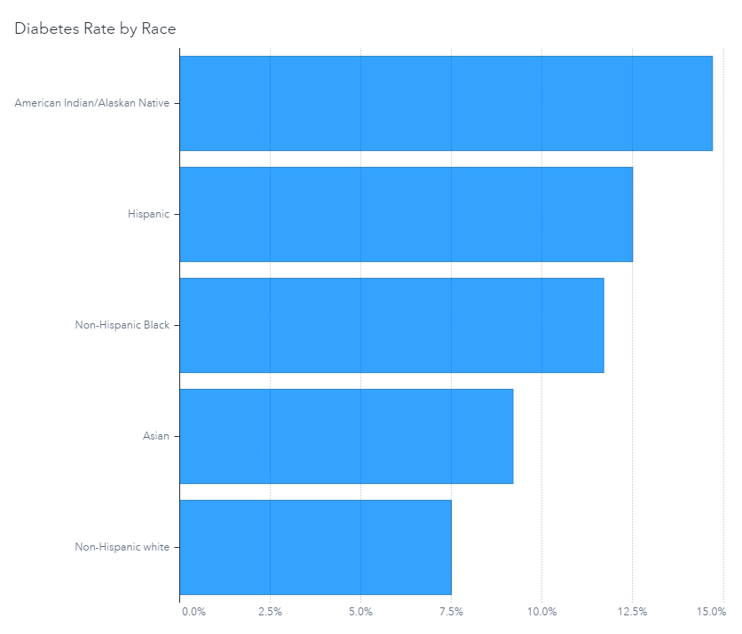
Source: American Diabetes Association
Economic impacts
The long-term economic impacts from the virus also are disconcerting. AI/AN people have the highest poverty rates of any other U.S. racial ethnic group. Sociologist Beth Redbird from the Institute for Policy Research has found unemployment to be the most significant factor driving poverty in Native American populations. Given the current uncertainty with job markets and employment, an improvement in poverty rates is unlikely.

Source: U.S. Census Bureau/American Community Survey
Access to healthcare is another factor to consider. In some cases members of the AI/AN communities drive an hour or more to reach a medical provider. This is further complicated by a lack of transportation on most reservations. The Indian Health Service (IHS) is underfunded and lacks medical providers, equipment and facilities to handle critical patients. It runs 24 hospitals, which have fewer than 71 ventilators and just 33 ICU beds.
So, are there COVID-19 racial disparities?
We know that the color of one’s skin doesn’t make a person more susceptible to COVID-19. But what we’ve seen from the data is that AI/AN communities are disproportionately affected because of other contributing factors. These same factors amplify the risk of COVID-19 among all communities of color.
This pattern of impact isn’t unique to COVID-19 — other diseases behave in much the same way. Instead, COVID-19 has placed a necessary spotlight on these issues because of its devastating effects. The data reaffirms that more research is needed —regarding inequality of healthcare access and how certain populations are affected by viruses like COVID-19. We need to increase society’s diligence to understand and address the unbalanced systems affecting communities of color. While the AI/AN population is often overlooked because of its small numbers, statistical insignificance doesn’t mean members of these communities are insignificant.
Other articles in this series:
- Comparing data across countries.
- Comparing data across time.
- Case fatality rate vs. mortality rate vs. risk of dying.
- Age isn’t everything.
![]() About SAS: Through innovative analytics software and services, SAS helps customers around the world transform data into intelligence.
About SAS: Through innovative analytics software and services, SAS helps customers around the world transform data into intelligence.
Early news literacy ‘lessons’ benefit Washington Post reporter
When Shane Harris, an intelligence and national security reporter at The Washington Post, was in fourth grade in the mid-1980s, he received an informal introduction to news literacy.
As part of his language arts and English class, Harris and his classmates spent a week learning how to read the newspaper. They started with the front page, as the teacher explained how stories placed there were likely the most important of the day. Then they turned to the opinion pages, learning the difference between columns and news stories.
“That is basic news literacy,” Harris said recently, “and it kind of informed a lot of my behavior as a news consumer ever since.”
Harris has reported about intelligence and national security for two decades and is the author of two books: The Watchers: The Rise of America’s Surveillance State and @War: The Rise of the Military-Internet Complex. He’s also a firm believer in news literacy as a solution to today’s convoluted information landscape. So Harris quickly jumped on board when the Post’s executive editor, Marty Baron, told the newsroom about the News Literacy Project’s Newsroom to Classroom program , which connects journalists with students.
“I was just really pleased that as an institution, we were encouraging our reporters to go talk to young people about how to read the news and how to be smarter consumers about it,” Harris said.
Connecting Washington Post, classroom
Once he signed up, Harris, who lives in Washington, D.C., connected with Cade Elkins, a high school teacher in Huntington, West Virginia. Initially, the session was going to take place over Skype with Elkins’ students in the room to ask questions of the journalist. But then COVID-19 hit and the school went remote. Elkins solicited questions from his students and presented them to Harris during an insightful, hour-long video conversation.
You can watch it here.
 Harris was not surprised that the students asked pointed questions. He said he always enjoys speaking with young people, because they think of topics he’s not normally asked in everyday conversations about his job.
“They tend to ask like really frank questions that oftentimes go to just core basic issues about what we do, how we do what we do,” Harris said. “And I was also really impressed that they were clearly discerning. They had skeptical questions, too, about how we report and what they read and what they see.”
Elkins and Harris talked at length about an issue that Harris sees as critically important to having an informed public that trusts standards-based reporting — demonstrating how quality journalism is done.
Lifting the curtain on journalism
“I think that sometimes we hide behind the mystique of what we do to kind of convey some level of authority to it of, ‘Just trust us, we’re professionals,’” Harris said. “Well, you know, to a degree, yes, we’re professionals, but that doesn’t mean we’re above explaining how we do things to people.”
That’s a big part of what the Newsroom to Classroom program — and our NewsLitCamp® — are all about. If students have a better understanding of how reporting works and that a story doesn’t start and end in a day but develops over time, Harris noted, they will be more likely to trust good reporting and believe in its importance.
Journalists also can gain trust by helping students — and the general public — understand that they are doing their jobs to inform readers and are not insiders armed with special information that they choose to disclose based on personal motivations.
“I think the more that we can convey to people that what we do is a job and that we’re moving through the world just like everybody else, it makes it seem, I hope, that what we’re doing is more trustworthy and certainly more transparent,” Harris said.
News literacy a must
In high school, Harris’ favorite class was civics. He loved learning about government. But a lack of civics knowledge and education is a problem in the U.S. Almost half of adults questioned about civics couldn’t name all three branches of the government, according to the 2020 Annenberg Constitution Day Civics Survey. Given that reality and the immensely challenging information landscape, Harris thinks news literacy is a must for students and the public.
“We’re talking about basic tools that you have to equip people with not just to be good citizens participating in a democracy, but to ensure that they’re not exploited and they’re not taken advantage of,” he said. “I feel really strongly that news literacy is an important part of that kind of curriculum.”
The Newsroom to Classroom program is part of the solution.
If you are a teacher signed up for Checkology®, reach out to a journalist in the directory. If you are a reporter interested in talking about your profession to students, learn more about the program here.
Free news literacy resources for the public
Since 2008, NLP has helped students across the U.S. and beyond learn to sort fact from fiction. Now, to meet the urgent need for news literacy among people of all ages, we are unveiling free tools and resources for the public. This includes a customized version of our signature e-learning platform, Checkology®.
This expansion of our mission comes in response to the growing crisis of false information in America.
“We believe misinformation and a lack of news literacy skills and knowledge pose an existential threat to our democracy,” said Alan C. Miller, NLP’s founder and CEO. “We recognize the critical need for people of all ages to have the ability to determine what news and information to trust and to understand the importance of a free press as informed and engaged participants in a democracy.”
News literacy lessons for all
We have developed a version of Checkology that provides the public with a comprehensive news literacy program. And it is now available at no cost. Launched in 2016, Checkology is widely used by educators to teach middle and high school students news literacy skills, habits and mindset.
This new public version includes foundational lessons, supplemental practice opportunities and fact-checking tools for reverse image searches, geolocation and more. In addition, it teaches users how to identify credible information, seek out reliable sources, understand media bias — as well as their own. It also helps users learn to apply critical thinking skills to differentiate fact-based content from falsehoods. And users gain an understanding of the importance of the First Amendment and the watchdog role of a free press.
Learn more by watching our video:
New podcast
And today, we launched the podcast Is that a fact?, featuring experts who address the question, “How can American democracy survive and thrive in our toxic information environment?” The first episode, featuring writer and professor Brendan Nyhan of Bright Line Watch, is available on our website and on various podcast platforms. Upcoming guests include Kara Swisher of Recode and The New York Times, Maria Ressa of Rappler and Michael Luo of The New Yorker.
The 10-episode season is hosted by Darragh Worland, NLP’s vice president of creative services. The show will include conversations with leading American thinkers, journalists, foreign policy experts, psychologists and authors. It will seek to help listeners understand how they can become part of the solution to the misinformation crisis. Future segments will drop every Wednesday.
Additional resources
Also, starting Tuesday, Sept. 22, we will publish a free weekly newsletter for the public called Get Smart About News. This publication is adapted from our popular free newsletter for educators, The Sift®. It will highlight and debunk timely examples of the most widespread conspiracy theories, hoaxes and rumors. Readers will find tips and tools to help navigate today’s complex information landscape. Get Smart About News will arrive in subscribers’ inboxes every Tuesday.
Finally, in 2019, we launched a free mobile app Informable®. Updated in 2020 to address COVID-19 misinformation, Informable helps people of all ages practice four distinct news literacy skills in a game-like format using real-world examples.
PSAs to help voters learn to navigate election misinformation
NLP and The Open Mind Legacy Project (OMLP) released public service announcements today to educate voters on how to avoid being misinformed about the November elections. Comcast, The E.W. Scripps Company and public media stations will air the video and audio PSAs, which also will be featured in a paid and organic digital ad campaign on social media and other streaming platforms.
As the election approaches, misinformation and disinformation about the voting process by both domestic and foreign sources have the potential to undermine the democratic process. U.S. intelligence officials have issued warnings that other countries are already using such tactics to sow confusion and interfere in the election.
The initiative aims to prevent voters from being misled by false information, such as being told that they can vote by text or by phone, that the election is canceled or that polling places are closed or have been moved.
PSAs in English and Spanish
The PSAs include four 30-second and two 15-second videos in English and Spanish, as well as audio versions of the spots. They will debunk myths about voting, address the need for voters to break out of their filter bubbles and advise them to verify facts before sharing social media posts. The PSAs will drive viewers to a special webpage created to help the public understand how misinformation can influence elections. The page will include real-time examples of falsehoods, free resources for the public, blog posts with tips on understanding election-related data, downloadable graphics that show people how to identify misinformation, and quizzes and other tools to help build news literacy skills in the weeks leading up to the election.
The PSA campaign will focus on communities targeted in previous election-related misinformation campaigns that remain vulnerable to voter suppression tactics, including Black and Latinx populations. The effort is expected to reach millions of Americans.
You can watch and listen to the spots here. Anyone interested in airing them can download them or contact NLP for more information at www.newslit.org.
About The Open Mind Legacy Project
The Open Mind Legacy Project, a civic education and media nonprofit, produces The Open Mind, a weekly public affairs broadcast and daily podcast, supporting fact-based discourse, deliberative democracy and engagement of ideas.
Making sense of data: How to be savvy about data in the news
Making sense of data: How to be savvy about data in the news is is the conclusion of a series, presented by our partner SAS, exploring the role of data in understanding our world. SAS is a pioneer in the data management and analytics field.
Data is one of the best ways to understand our world, but it can also be one of the most challenging things to get right. Over the course of this series we’ve looked at the power and shortcomings of data and data visualizations. If you aren’t paying close attention, data easily can be used to mislead you. Common areas of concern arise in each step of data collection, analysis and presentation. Additionally, data can also be misleading in infographics and social media, two increasingly popular ways people are exposed to data. But, with this series and more practice, you can feel more confident about the way you are exposed to and consume data.
As we all experience increased exposure to media and data-driven messaging, we need to stay vigilant in how we read and respond to those messages. So, here are the top six takeaways from this series on how to be a savvy data consumer:
Be a critical thinker
What is the author trying to convey with the data? Does the data match the argument? Is more information needed to better understand the data?
Go beyond the numbers and search for context
Also, where did the numbers come from? What exactly does each number represent? Gather all the information you can about how the data was collected and why to help you understand what it really means.
Ask and answer your own questions
So, what does the data make you curious about? Does it prompt you to want to learn more? Are you able to answer your questions with the data that’s been provided? Try doing your own analysis on the data and see what you find.
Check important chart elements
And remember to double-check the most important elements of the chart to see if the data visualizations may be misleading in any way. This includes checking the scale on both axes as well as legends and labels to ensure they match what you expect.
Look past design
Is the visualization you’re looking at focused more on being beautiful or on accurately presenting information? Focus your attention on the underlying data and not the visual elements.
Be skeptical of flashy messaging
Big, bold titles and messages can be misleading. Confirm whether eye-catching content really matches the data presented. Even when you see subtle mentions of the author’s conclusions, it’s good to double-check those, too.
And keep in mind that data is all around us. It’s not only important to be a savvy consumer of data but also to give data the context it deserves when presenting your own findings. Continue to think critically about the data you see and be sure to take a closer look if something appears misleading. With these guidelines in mind, you have the power to use data to better understand and describe the world.
Test yourself: Take our data quiz (here or below)!
Related articles:
- 6 Strategies for making sense of data in the media
- Diving into charts and graphs in the news
- Exploring statistics in the media
- Understanding complications with data collection
- Evaluating claims made from data
- Special look at issues with infographics
- Spotlight on data in social media
- Quiz: Can you make sense of data?
![]() About SAS: Through innovative analytics software and services, SAS helps customers around the world transform data into intelligence.
About SAS: Through innovative analytics software and services, SAS helps customers around the world transform data into intelligence.
Making sense of data: Spotlight on data in social media
Making sense of data: Spotlight on data in social media is the sixth in a series, presented by our partner SAS, exploring the role of data in understanding our world. SAS is a pioneer in the data management and analytics field.
Like infographics, social media and other forms of user-generated content pose unique challenges regarding data. Many news outlets and journalists have checks and balances in place to ensure that information reported (especially information based on data) is as accurate as possible. But those same checks and balances do not hold true for those creating and sharing content. Social media gives user-generated content a wider reach and greater influence than ever before. Sharing content on social media poses additional challenges. For example, it can be difficult to identify the original source, and consequently, its credibility. In this post we’ll examine common issues that arise with user-generated and shared social content.
Social media posts are often criticized for allowing users to share pieces of information without putting it in context. This is particularly problematic with data. While the numbers and charts may represent real information, the reader needs context to interpret information correctly. Readers may inadvertently share questionable charts or statistics because social media platforms make it easy to do so. Images of graphs and charts pulled from research articles can quickly be shared without citing the source. These images might then circulate widely without context.
Intended for sharing
Even thoughtfully designed charts and graphs taken out of context can be problematic, but what happens when content is designed specifically for social media? Authors of social content know that readers often prefer brief messages instead of a large amount of information. Knowing shorter content is more likely to quickly spread to a wider audience, authors may intentionally design their social posts with content that will catch the eye of the audience they wish to reach.
In earlier posts, we’ve discussed features that can make data and data visualizations hard to interpret correctly. Whether it’s logarithmic scales or truncated axes, we’ve seen how these may make data easier to read, but may unintentionally cause readers to draw inaccurate conclusions. While these mistakes are often unintentional, some users may intentionally manipulate visualizations to reinforce a specific point of view.
A fresh look
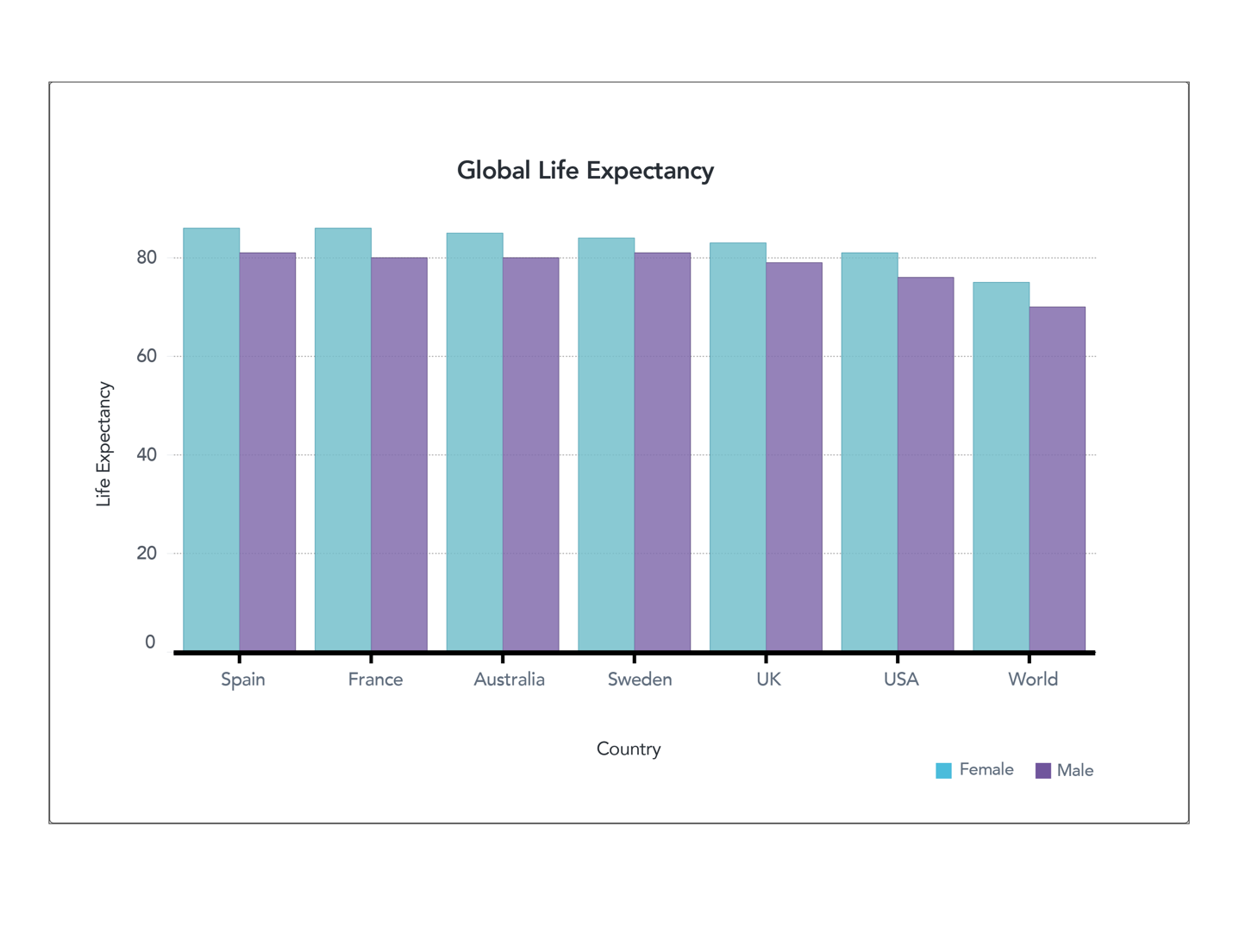
Figure 2. Global Life Expectancy (full axis) World Bank (male) World Bank (female)
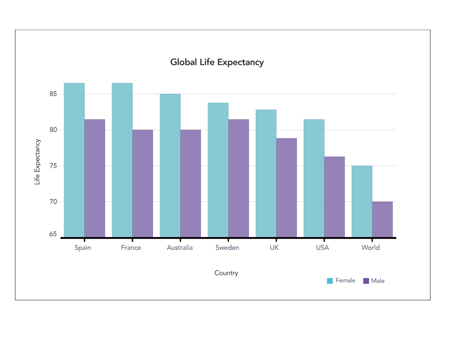
Figure 1. Global Life Expectancy (truncated axis) World Bank (male) World Bank (female)
Let’s take another look at some of the data we examined before. These two charts show life expectancy in different countries. We demonstrated how truncating the axes allow you to see the differences in data, but also might lead readers to view those differences as more significant than they really are. Now suppose this isn’t an honest mistake, and the author wanted to create content to convince you of something – perhaps that you should move to France to live longer. If that were the case, the author might create a chart like the one below.
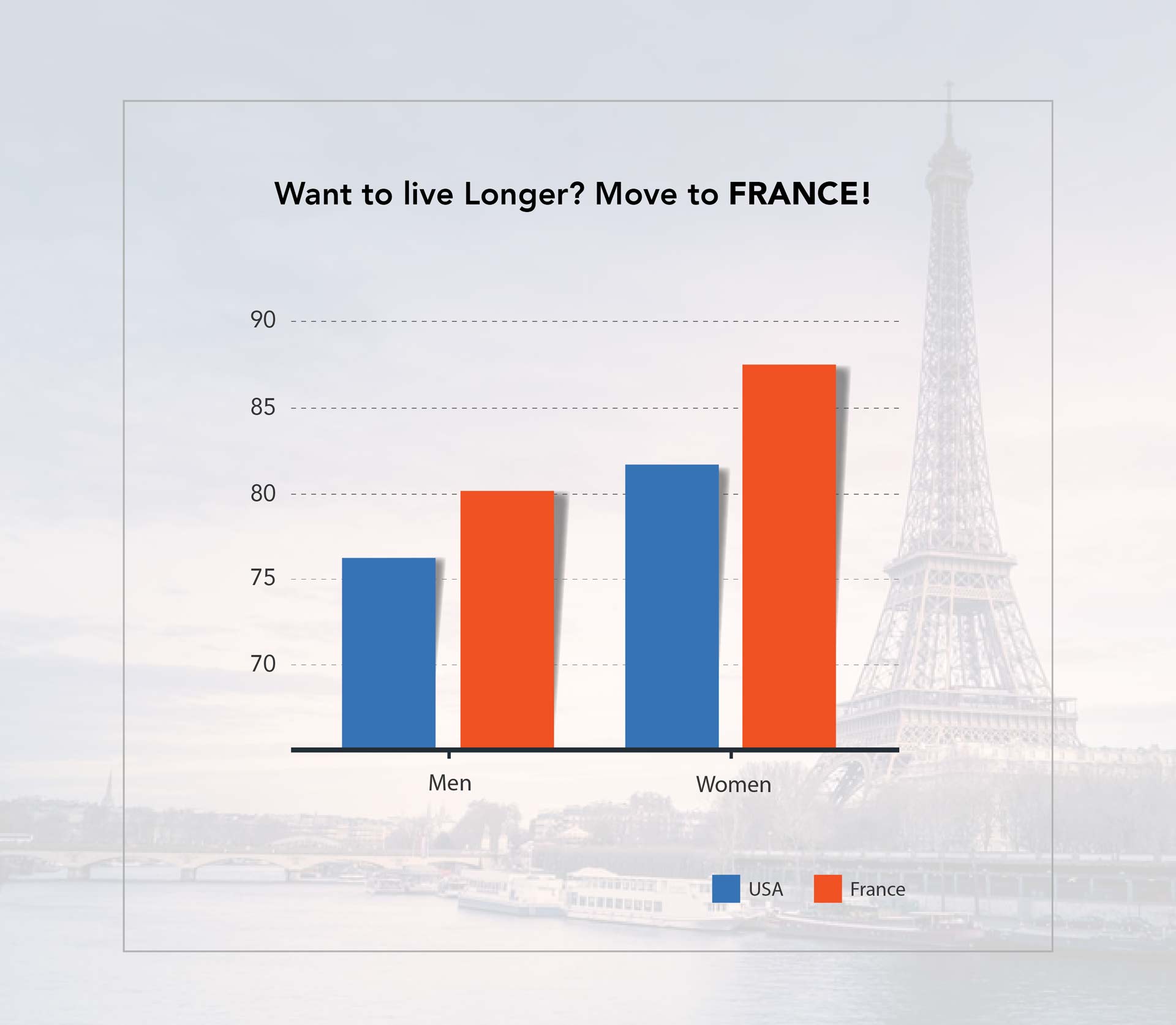
Figure 3. Life Expectancy Social Media Post
Does this seem like something you might see on your social media feed? The is the same data as in previous charts, but it’s been heavily manipulated so that you focus on what the author wants you to see. First, it includes a large title with the conclusion the author wants you to make – that moving to France will lead you to live a longer life. It doesn’t mention that this is solely the life expectancy of the country’s residents. A variety of cultural and lifestyle factors come into play, and would not apply if you simply move to a place. Also, removing gridlines and shrinking the size of the font showing age makes it harder to read the scale of the data. The choice of colors also further conveys the purpose — implying that the U.S. is worse than France.
Manipulating data to make a point
Let’s take a look at another chart. Here’s data from the same source, presented two different ways.
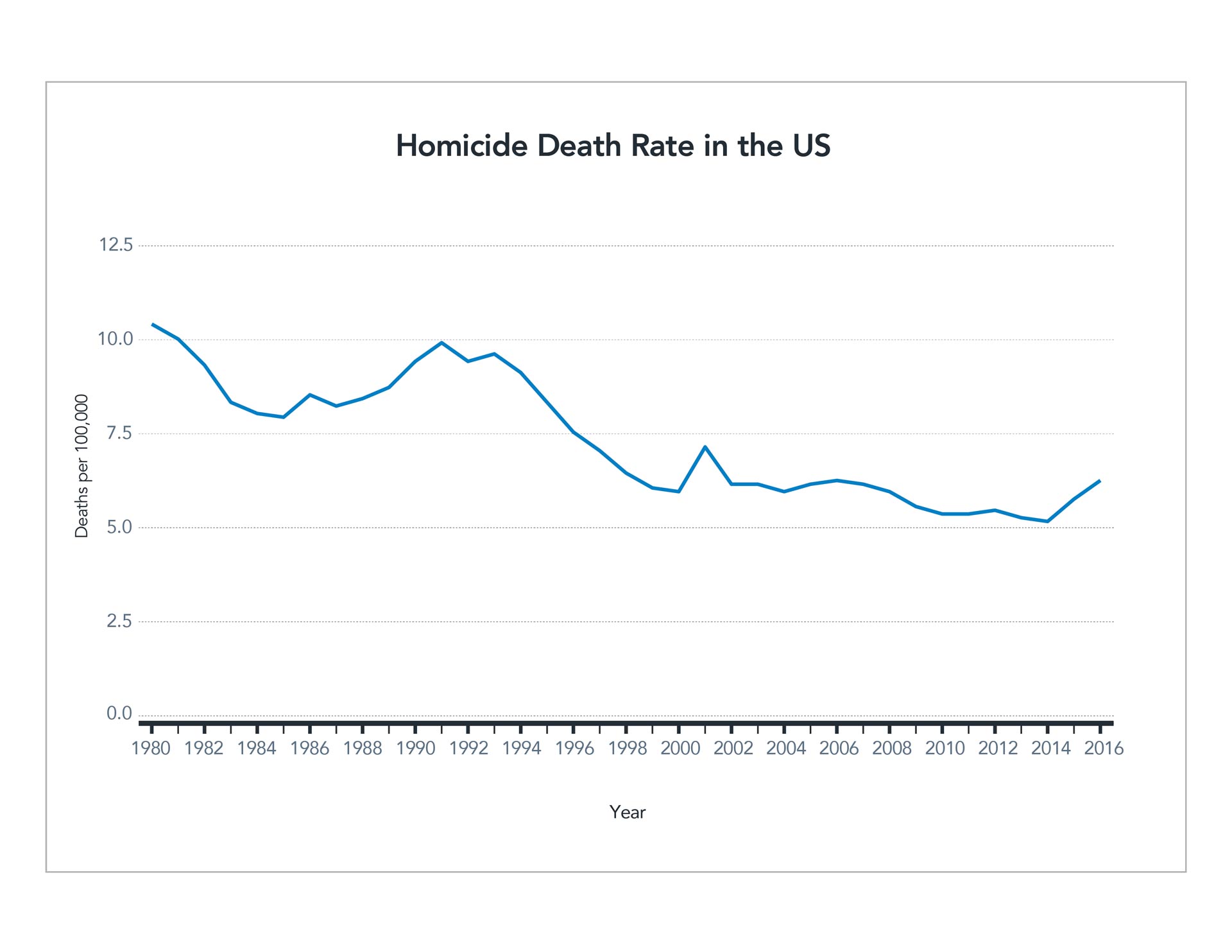
Figure 4. Homicide Rate Line Chart CDC
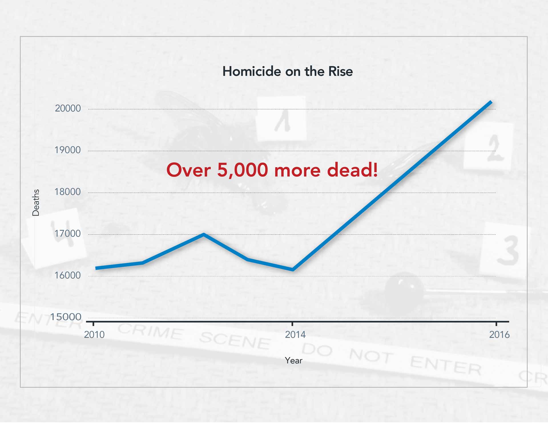
Figure 5. Homicide Rate Social Media Post CDC
The first shows the death rate by homicide relative to the population. It charts the rate over 36 years and indicates a mostly steady decline. Despite some bumps and dips, but overall, the trend is downward. However, look how the data can be manipulated to prove a specific point. The second graph uses a different unit, the raw number of homicides each year. It dos not average it out as population increases. The scale of years also is manipulated slightly. The first half of the graph represents four years, while the second half represents only two years. However, this isn’t brought to the reader’s attention. The axes are truncated, and the width is even reduced to further exacerbate the angle of the line. Again, the chart has a bold title with a random (and in this case meaningless) statistic tossed in for good measure.
There are many ways to manipulate data to prove a specific point. These graphs are just two examples of the ways people may present data to make a particular point, especially when sharing on social media. If you see a graph like the one above, with a catchy headline and no additional context, take a careful look and see if you can find how the author may have manipulated information to emphasize a point.
Disregard suspect data
It is challenging and sometimes impossible to conduct further research on social media posts or find the source or context of data presented. If you can’t find a reputable source that provides this context, it’s best to ignore the information. Approach it as an opportunity to be a responsible consumer of data — don’t share or “like” such posts! If you’re particularly curious about a point being made, see if you can find your own data to back it up and perhaps create your own content in a thoughtful, context-driven way.
To learn more see Diving into charts and graphs in the news or our full list of related articles below.
Test yourself: Take our data quiz (here or below)!
Related articles:
- 6 Strategies for making sense of data in the media
- Diving into charts and graphs in the news
- Exploring statistics in the media
- Understanding complications with data collection
- Evaluating claims made from data
- Special look at issues with infographics
- How to be savvy about data in the news
- Quiz: Can you make sense of data?
![]() About SAS: Through innovative analytics software and services, SAS helps customers around the world transform data into intelligence.
About SAS: Through innovative analytics software and services, SAS helps customers around the world transform data into intelligence.
Making sense of data: Special look at issues with infographics
Making sense of data: Special look at issues with infographics is the fifth in a series, presented by our partner SAS, exploring the role of data in understanding our world. SAS is a pioneer in the data management and analytics field.
Infographics are one of the most visual ways to tell stories with data. They are designed to catch the reader’s eye, and they use visuals to provide a lot of information in a small amount of space. However, we’ve learned there are many ways data can mislead a reader, and those same issues often come up when using infographics. Let’s explore some of the special features of infographics that make these representations particularly challenging to interpret correctly.
Over-designing infographics
Infographics are intended to attractively display information and often incorporate several design elements. But sometimes those design elements overpower the data and distract the reader from the underlying information. Common design elements inspire the infographic below.

Figure 1. Example Infographic CDC
This infographic communicates facts regarding the causes of accidental deaths in the U.S. in 2013. The charts are designed to be visually appealing, and they are. However, the data itself could be communicated in a clearer and more concise manner if the creator used traditional graphs and charts.
Let’s start with the pie chart. It shows the main causes of accidental death. There isn’t much of a difference between the rates of poisoning (30%), falls (26%) and motor vehicle accidents (23%). Yet, the enlarged wedges imply that poisoning deaths far exceed deaths in motor vehicle accidents. This type of design violates the principle of proportional ink.
The next graphic shows a rounded bar chart depicting motor vehicle deaths by age. Here again, this type of display alters the perception of the data. Because the inner circle has a smaller radius, the yellow bar appears to go farther than any other bar. But if you look at the actual data, it should be much smaller than the purple or blue bars. The manipulation of the graphic makes it appear more significant than it is.
Consider size and scale
The use of icons to represent data, as seen in the chart showing accidental deaths of infants, is a common infographic design. However, if the creators aren’t careful, the size and scale of the icons can make the data difficult to accurately interpret. In this graphic, the drowning icon is smaller in scale than the others, hiding how many more deaths are caused by drowning compared to other causes. This graphic would be much easier to interpret correctly if the scale of the icons was equal.
The next bar chart, showing drowning by age, uses a different design treatment — a 3D view. This makes the chart more appealing than a traditional bar chart, but again, the design makes it harder to read. The 3D view doesn’t display axes so the only thing the reader can do is compare the different categories, not make judgments on the total numbers. The perspective on the chart is misleading as well. The scale of the first bar (ages 5-25) looks significantly larger than the last bar that’s further away (65+) but, the actual difference in these values is not substantial (710 and 554 respectively). This is another case where the design treatment of the graph makes it easy to draw incorrect conclusions.
The last graphic, accidental deaths by firearm, uses icons to communicate a statistic, but the graphic isn’t particularly helpful. Here each image icon represents 10 people accidentally killed by firearms, but the use of the graphic doesn’t help the user understand the scale of deaths. It is simply there to add visual display to a statistic.
Prioritizing design
In addition to the design issues above, important information may be left out of an infographic. The creator isn’t intentionally trying to mislead readers in this case, but rather, he or she is prioritizing design because the additional data might detract from the overall product. This can include important features such as axes, labels and other elements that are critical for reading and understanding a chart. Consider the 3D bar chart in our example. Without an axis labeling the value of those bars, it is impossible to interpret the chart accurately.
Context is often one of the most important things infographics can lack. We’ve talked in detail about the importance of asking questions about the data you’re reading, such as “what did the survey ask?” and “where does this data come from?” That information is often present in longer articles able to describe the methodology and sources of data. Infographics may not have this context to help you answer critical questions. A good infographic will provide at least a reference to where the data comes from, or where you can find more information, but this isn’t always the case. You may see infographics with data from a variety of sources, which means it may have been collected using different methodologies or samples, making it challenging to piece together a cohesive picture.
Overall, infographics can be a nice way to engage readers with data and information. However, issues arise when the design of the infographic takes precedence over accurately communicating information. Creators of infographics should carefully focus on readability first, before considering design. And readers should recognize that the issues we have covered about interpreting data in reports, articles and surveys hold true when interpreting infographics, and may be especially challenging in this case.
Test yourself: Take our data quiz (here or below)!
Related articles:
- 6 strategies for making sense of data in the media
- Diving into charts and graphs in the news
- Exploring statistics in the media
- Understanding complications with data collection
- Evaluating claims made from data
- Spotlight on data in social media
- How to be savvy about data in the news
- Quiz: Can you make sense of data?
![]() About SAS: Through innovative analytics software and services, SAS helps customers around the world transform data into intelligence.
About SAS: Through innovative analytics software and services, SAS helps customers around the world transform data into intelligence.
Making sense of data: Evaluating claims made from data
Making sense of data: Evaluating claims made from data is the fourth in a series, presented by our partner SAS, exploring the role of data in understanding our world. SAS is a pioneer in the data management and analytics field.
Every day people use data to better understand the world. This helps them make decisions and measure impacts. But how do we take raw numbers and turn them into information that we can easily understand?
We make claims, or statements, about what we think the data tells us. And we often get our information from what the media report about data. And authors use data to support arguments or inform the public. However, the claims may depend heavily on how and what type of data was collected. We discussed some issues with data collection in the last post, but let’s go into more detail about issues that may arise when authors use data to build arguments or make claims.
Control or comparison groups
People often use data to draw comparisons between different types of groups or behaviors. It’s important to pay attention to the questions asked and who is being asked. And, it’s equally important to ask what researchers are comparing their claims against.
Imagine we poll people and find that 60% say green is their favorite color and they eat vegetables every day. We could claim that liking the color green means a person is more likely to eat vegetables. While the survey indicates that most people who like the color green eat vegetables daily, it’s hard to draw further conclusions without a comparison group.
If only 20% of people who don’t like the color green eat their vegetables, this might suggest an interesting relationship. However, it might also be true that 60% of people who don’t like green eat their vegetables – the exact same proportion. In this case, liking the color green has absolutely nothing to do with vegetable consumption. You might also find that 90% of people who don’t like the color green eat vegetables daily. This shows a negative relationship between liking the color green and eating vegetables daily.
As you can see, if an author presents only one number without comparison, interpreting the true value of the statement can be difficult. We need to compare that number against another group to get a better picture of its significance.
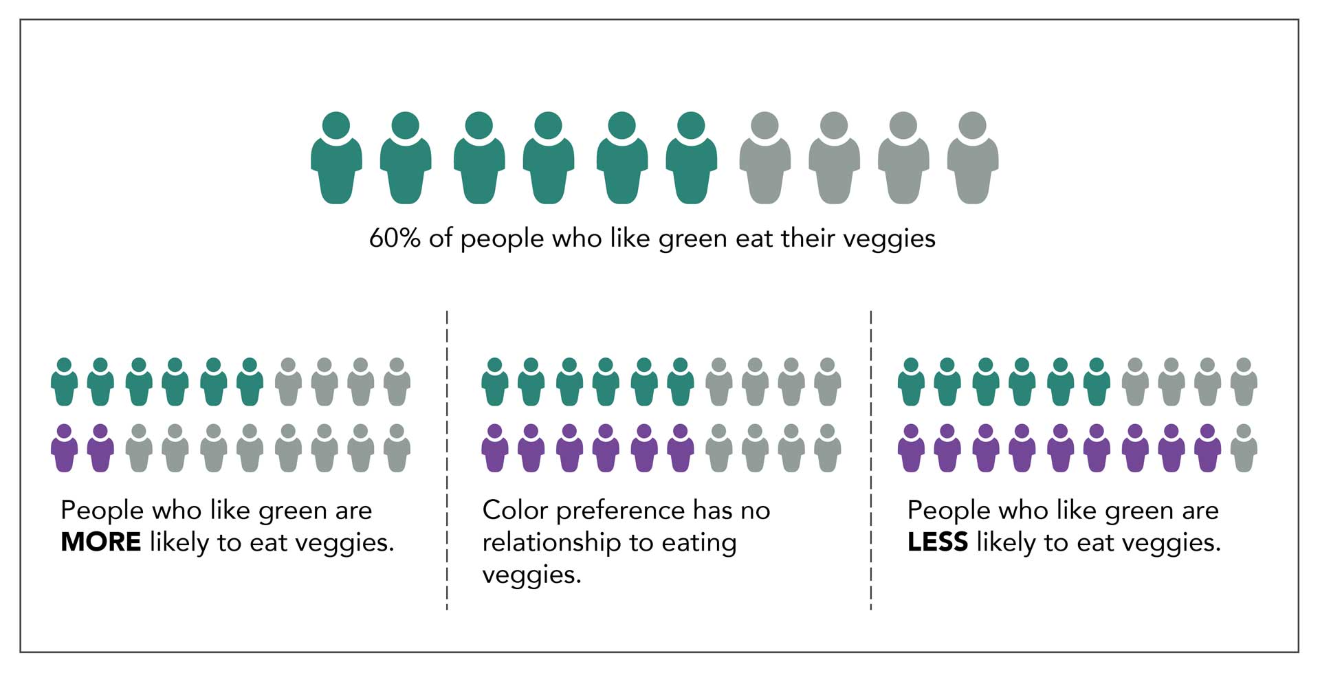
Figure 1. Comparison groups
Learn more: Making Sense of Data on Checkology
Interventional studies
This is especially important when researchers conduct interventional studies in areas such as medicine, fitness, food, and other areas to investigate a particular outcome. In these cases, researchers use a control group. This is a special population that serves as a comparison and does not receive whatever is being tested. Designing an appropriate control group can be tricky because things can change simply because the group is aware it is being observed.
Imagine we conduct a trial for a new weight loss drug. Participants are split in half. One group receives the new drug, and the other group receives nothing. Our goal is to determine which group loses the most weight. It may be that the people who receive nothing realize that the situation remains the same and they are not receiving treatment. It’s unclear how this might affect their behavior. Similarly, the people taking the drug assume something might happen, and perhaps this affects their attitude and behavior. We can’t tell if the drug had the impact or if the act of taking a pill changed their behavior. For this reason, many studies include a placebo, a pill that doesn’t contain any chemicals at all, as part of the comparison. This works well especially if researcher and participants do not know who gets the placebo and who gets the real drug.
More challenging studies
This can be much harder in studies that don’t involve medication. Perhaps my intervention is an exercise program. How can I design a fair control group? Do I give my control group advice to not exercise? Do I ask them to do exercise that is similar to my program but not exactly the same? Each of these decisions directly impacts the comparisons I might be able to make and how I will communicate results.
When reading such study data, it’s important to look at the actions of both the experimental group and the control group. Ask yourself if the comparison seems fair, or if it seems as though one group had an advantage or disadvantage. What other factors might explain the results you see?
Bias in research
Finally, why the studies are being conducted and who is interested in the research are of particular concern in data and research studies. Specifically, organizations collecting data on their own products may be motivated to prove those products work or that people like them. They may unintentionally make decisions in designing their research questions or comparison groups that increase the chances they get the results they’d like to see. Researchers who receive money from a specific organization may also make decisions that favor the group that funded their research. As we’ve already learned, there are many complicated decisions that go into collecting data that will inevitably impact the quality of the final result, so it’s important to critically analyze these choices.
While data allows us to measure and better understand our world, it is not a perfect representation of reality. There are many opportunities for bias or flaws when collecting data that can impact the quality of the results. Critical thinking is the best way to find these biases or flaws when reading about data. Ask how the data was collected and from whom. Look for who was included and who was left out. If there is something that seems impressive, ask “compared to what?” To gather those answers, you may have to do some digging of your own, but it will help you determine what data you can trust and recognize data that may be too biased or flawed and should be disregarded.
Test yourself: Take our data quiz (here or below)!
Related articles:
- Six strategies for making sense of data in the media
- Diving into charts and graphs in the news
- Exploring statistics in the media
- Understanding complications with data collection
- Special look at issues with infographics
- Spotlight on data in social media
- How to be savvy about data in the news
- Quiz: Can you make sense of data?
![]() About SAS: Through innovative analytics software and services, SAS helps customers around the world transform data into intelligence.
About SAS: Through innovative analytics software and services, SAS helps customers around the world transform data into intelligence.
Making sense of data: Understanding complications with data collection
Making sense of data: Understanding complications with data collection is the third in a series, presented by our partner SAS, exploring the role of data in understanding our world. SAS is a pioneer in the data management and analytics field.
As we have seen, statistics and visual representations of data can be misleading. But what happens when the data itself is misleading? And if data is supposed to be based on fact, you might wonder how data can be misleading. It comes down to the way it is collected. It is essential to have a strict process of collecting data before analyzing or presenting it. To ensure the data is accurate and as representative as possible, we must pay special attention to how data is collected.
Here are some of the most important questions to consider when understanding how data is collected:
- Who or what is represented in this data?
- What questions are being asked?
Sample selection and data collection
Without collecting data on an entire population, it’s nearly impossible to report it with complete accuracy because of sampling limitations. Suppose we want to better understand the eating habits of Americans. The only way to ensure we have an accurate picture of American eating habits is to monitor every single American, every second of the day, and record everything they eat. Since this is impossible, researchers will oft en use a sample, or a small portion of the population of interest. When the sample selected isn’t representative of the larger group, you get misleading data.
Consider how this might play out if someone was conducting a dietary study of Americans. In this case, the study asks 100 people about their eating habits. But how are those people selected? Options are endless:
- Collect data from 100 friends. That’s a convenient sample, but most people’s friends are about their age and eat similar types of foods.
- Gather data from a local restaurant or grocery store. Again, this might impact the type of data collected. For example, surveying people in a fast-food restaurant may give very different answers than surveying people in an upscale restaurant or a health food store.
- Conduct surveys at a non-food establishment, such as a library. This could be problematic, as library–goers might eat differently than the rest of the population. But even more concerning, those library–goers all come from the same area. The type of food people eat varies by locale. Those who live in cities likely eat different foods than those who live in rural areas. Food preferences can also vary depending on a person’s background or culture.
All of these are confounding factors or present possible issues with data. If we want a representative sample, we need to gather data from a cross section of age, gender, race, residence, income level, and so on. Finding such a representative sample can be incredibly difficult, and so it doesn’t often happen. Researchers typically report the population used in samples. This helps the reader understand who is reflected in the sample and the impact that might have on the results. As a consumer of data, it’s important to pay close attention to this piece of information. Ask yourself if the results presented by the researchers apply to the whole population or if those results only apply to the population sampled.
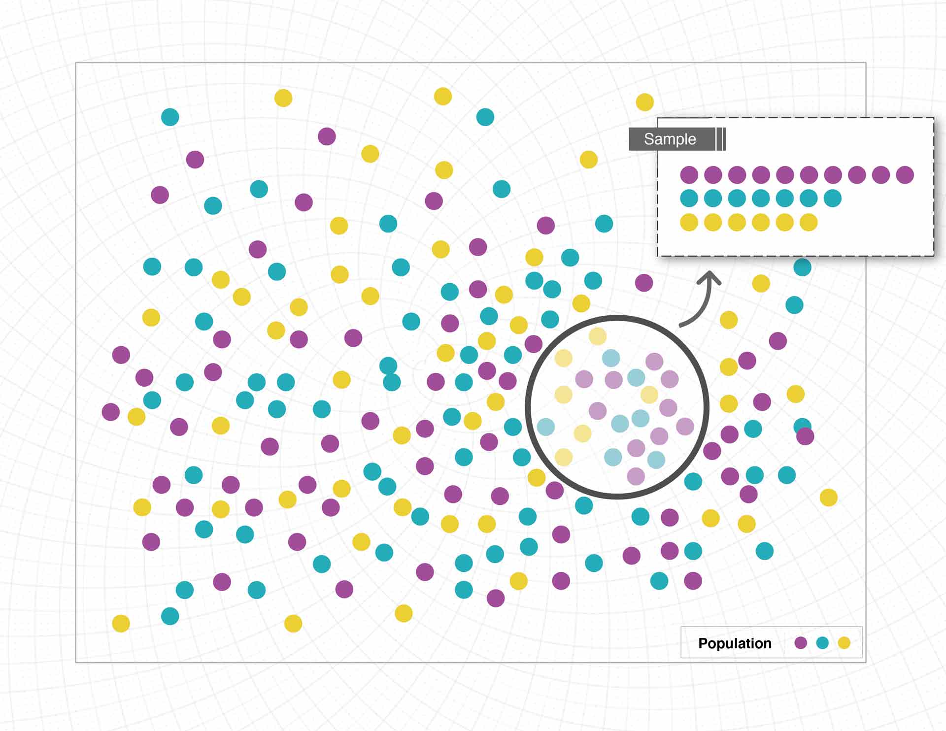
Figure 1. Biased Sample
Additionally, there can be issues when how the data is collected, or the questions asked, only tell part of the story. We said before that the best way to see what people are eating is to consistently monitor what they do, but getting firsthand access to information like this is often impossible or unethical. Instead, researchers design studies or questions to gather similar information. Consider the following scenarios:
- Researchers ask participants to keep a food log for a week that details everything they eat and track total servings of fruits, vegetables, meat, etc.
- Researchers ask participants “In general how many servings per day do you have of fruits, vegetables, meat, etc.?”
- Researchers ask participants “What kind of foods do you usually eat?”
Each of these scenarios is trying to answer the same question: What do people eat? But the information is being gathered in very different ways.
Scenario 1 seems closest to our observation study, but there are some ways that the data may be biased. One concern is that people know they’re recording their foods, and this may lead them to eat differently for the duration of the study. The data could also vary depending on the time of year. Many people make different food choices in the summer compared to the winter.
Scenario 2 also presents problems. This question asks people to think more holistically but relies on memory and judgment. Individual estimates of what is typical may vary from what is actually eaten. People may intentionally or accidentally make themselves appear to be healthier eaters than they really are. It can also be difficult to accurately judge your own behavior.
In Scenario 3, the question isn’t specific enough to gather good information. While people might report the amount of fruits and vegetables they eat, the question leaves room for general or unrelated answers, such as cuisine type (Italian, Mexican or others), or a preference to eat out or at home.

Figure 2. Conducting a Survey
As you can see, the way questions are asked, and who is asked those questions, makes a big difference in the kind of information collected. Some questions are better than others. When interpreting data, see if you can find the questions asked by the researchers. Are they good questions? And are the results influenced by how the researcher asked them or how they gathered the data?
Test yourself: Take our data quiz (here or below)!
Related articles:
- Six strategies for making sense of data in the media
- Diving into charts and graphs in the news
- Understanding complications with data collection
- Evaluating claims made from data
- Special look at issues with infographics
- Spotlight on data in social media
- How to be savvy about data in the news
- Quiz: Can you make sense of data?
![]() About SAS: Through innovative analytics software and services, SAS helps customers around the world transform data into intelligence.
About SAS: Through innovative analytics software and services, SAS helps customers around the world transform data into intelligence.
Making sense of data: Exploring statistics in the media
Making sense of Data: Exploring statistics in the the media is the second in a series, presented by our partner SAS, exploring the role of data in understanding our world. SAS is a pioneer in the data management and analytics field.
“Numbers don’t lie” is a phrase we often hear to support the idea that something must be true if you can cite data or statistics about it. But even accurate numbers can paint a misleading picture, particularly if people don’t know what to look for. Several common ways to report metrics and statistics can easily mislead readers. Let’s explore how statistics can be misinterpreted.
Mean vs. Median
Mean and median are two statistical concepts that often get muddled. Both are measures of central tendency, meaning the values are intended to represent the “middle” of the data. But this can be done in different ways, which is important to understand.
To find the mean, or average, add together the value for every member of a group and divide it by the total number of members. Say you and four friends were trying to figure out the average amount of money in your wallets. You’d count up the total amount of all your money and divide it by five. Median, on the other hand, represents the value in the very middle. In this case, you’d arrange each person’s money from the least amount to the greatest. The median is the amount in the middle. Two people have larger amounts, two people have smaller amounts. The person with the median amount of money is smack in the middle.
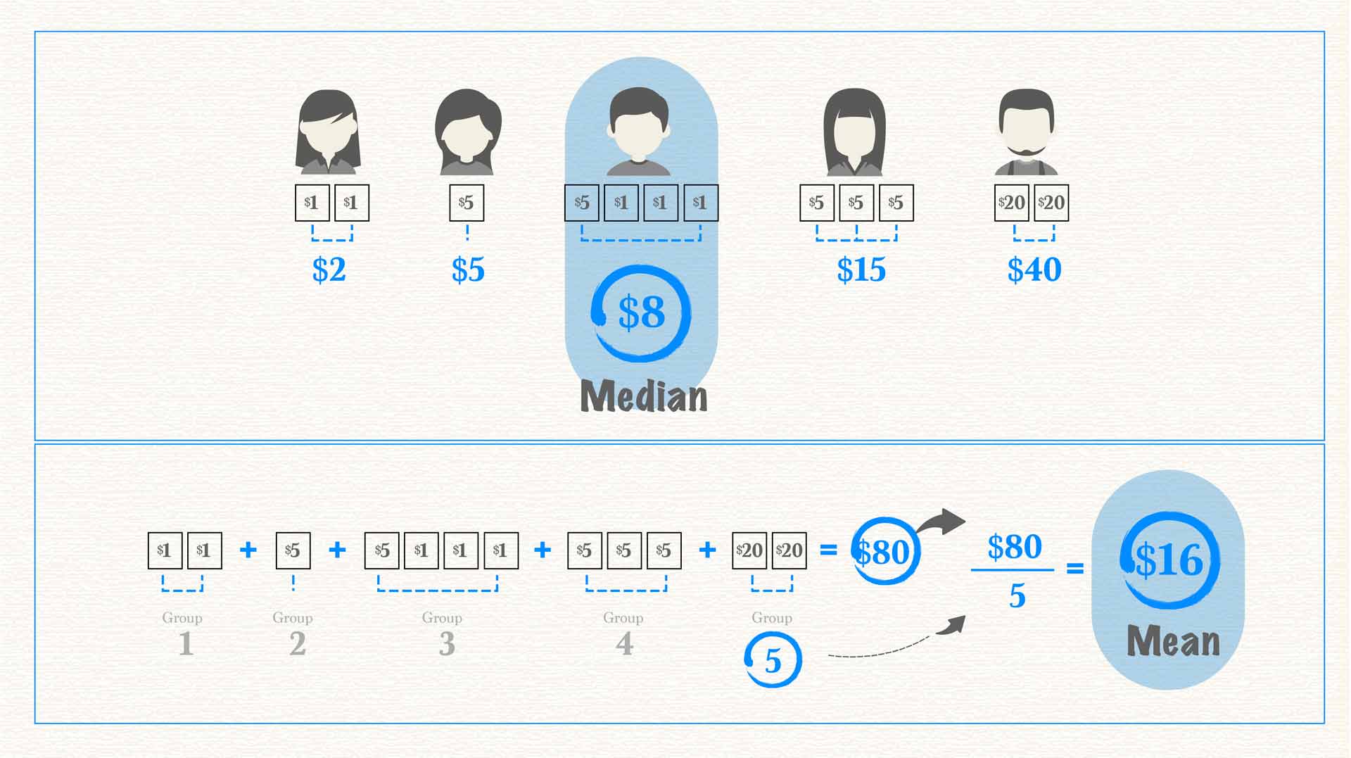
Figure 1. Median vs. Mean
As you can see in the image above, the average and the median are not always the same. In fact, with heavily skewed data, they can be quite different. When we talk about skewed data, we’re referring to data with a heavy concentration of values on one end and only a few values on the other end. This often happens when discussing income, which is easily skewed because most of us have middle- or low-income levels while only a small percentage have very large incomes. Take U.S. income data from 2014, for example.
Figure 2. Distribution of Annual Household Income in the United States (2014) U.S. Census Bureau
Don’t be misled
The median income in the U.S. is approximately $33,000, while the mean (average) income is approximately $50,000. This data shows half the U.S. population makes $33,000 or less. However, if you consider the total of 2014 incomes across the population and divide by income-level breakdowns, the average salary is $50,000. This average salary might lead you to believe that the “average American” is doing better than he or she actually is. In reality, people who make the median salary would love the 50% raise the average salary represents. The value reported can make a big difference in how people understand information.
Impact on decision-making
A solid understanding of these metrics is especially important when statistics influence decision-making. Consider how life expectancy is often reported. Though we rarely see the term “average” used, that is what the data show. The average age at death in the U.S. is around 79, but the median age at death is about 83. This difference has a big impact on decision-making, such as retirement planning. It is quite different to say, “the average person dies at 79” compared to “half of adults live 83 years or longer.” Our retirement funds would likely be more of a priority in the second instance than in the first.
So, which measure is the best one to give when explaining data? Whenever possible, the answer is both. Knowing both mean and median gives the reader a better understanding and clearer picture of the data at hand and helps them draw accurate conclusions. But having people apply this thinking is not always in the best interest of the person reporting the numbers. You’ll notice that lottery tickets often advertise the “average winnings,” which can be enticing, compared to the “median winnings,” which are usually $0.
Percent Change
Changes, when given as a percentage, are another type of statistic commonly misused or misinterpreted, and can cause confusion.
One particularly confusing case arises when the value that is changing is, itself, a percentage. Suppose a local politician is performing “fairly well” with an overall approval rating of 50%. Then, this politician opposes a bill to fill all the potholes in town, and with that, the politician’s public approval plummets. If the politician’s approval rating dropped by 20 percent, that is 20% of the initial 50%, giving the politician a 40% approval rating. The narrative changes if the politician’s approval rating drops 20 percentage points. This brings the rating of 50% down to 30% — 20 points lower. The language sounds very similar but the resulting numbers are quite different.
Another common source of confusion arises when something increases over 100%, or doubles. Imagine we’re talking about a garden and how many more tomatoes were grown this year compared to last. If 100% more tomatoes were grown this year compared to last year, that means the yield doubled — 10 tomatoes became 20. What if the yield went from 10 tomatoes to 15? The yield increased by 50%, but the total yield is 150% of the previous year. Confusing? Yes! That’s why statistics can be difficult to interpret.
Avoiding confusion
Sometimes authors confuse the two and report that something increased 150% when it only increased 50%. Say the garden produced 25 tomatoes this year, an increase of 150%. But someone might interpret that to mean the garden had 150% of the yield and only had 15 tomatoes. It’s often confusing, and when reading someone else’s reporting it can be hard to tell if the correct percentage is being cited since these terms are often and easily misused accidentally, or perhaps by design. If reporting an increase, an easy way to solve this problem and help the reader fully understand the metric being used is to provide all the numbers up front. One could report, “the garden’s yield increased from 10 to 25 tomatoes. That’s a 150% increase!”

Figure 3. Tomato yield example
Another tricky area when interpreting data involves the unit an author chooses to present. Sometimes, the same information can look very different depending on the unit presented. For example, during the COVID-19 pandemic we’ve seen different sources report new cases, total cases and cases per capita, all of which have very different patterns of behaviors across states and countries. Authors also might talk about total deaths, deaths per capita or deaths as a proportion of positive cases. This post provides more detail about the differences these numbers represent and how those differences in reporting can impact how we understand data.
A significant influence
The types of statistics and metrics authors use to communicate data can have a significant influence on how information is interpreted, especially if the author is not careful to fully explain the reasoning behind them. Authors can also make mistakes when presenting and interpreting statistics because of nuanced differences in language and calculations.
To ensure you understand data you encounter, carefully consider whether the metric used is the relevant one, given what the author is trying to communicate. If you don’t feel it is, try to find more information about what might be missing. If you are presenting your own data, the safest route is to carefully explain the metrics being used and the motivation behind those metrics. Working through this explanation helps you as well, providing the opportunity to confirm you’re reporting information in the best way possible.
Test yourself: Take our data quiz (here or below)!
Related articles:
- Six strategies for making sense of data in the media
- Diving into charts and graphs in the news
- Understanding complications with data collection
- Evaluating claims made from data
- Special look at issues with infographics
- Spotlight on data in social media
- How to be savvy about data in the news
- Quiz: Can you make sense of data
![]() About SAS: Through innovative analytics software and services, SAS helps customers around the world transform data into intelligence.
About SAS: Through innovative analytics software and services, SAS helps customers around the world transform data into intelligence.
Making sense of data: Diving into charts and graphs
Making sense of data: Diving into charts and graphs is the first in a series, presented by our partner SAS, exploring the role of data in understanding our world. SAS is a pioneer in the data management and analytics field.
Charts and graphs are useful tools for communicating complex information. They allow consumers to see — rather than read or calculate — differences and trends. Charts and graphs provide readers the ability to visually consume information, answer their own questions and draw novel conclusions. Yet, these types of data visualizations are often designed to communicate the purpose of the creator. Those creators make decisions while designing charts and graphs to potentially emphasize characteristics of the data that lead users to draw specific conclusions.
Need an example? Let’s start with this chart showing life expectancy for males and females in different countries.
Figure 1. Global Life Expectancy (truncated axis) World Bank
This chart was specifically designed to highlight the differences among groups. It’s very clear that in all the countries selected, women outlive men by several years. We see that the high-income countries selected in this chart have greater life expectancy compared to the rest of the world, but people in the U.S. have a lower life expectancy than those in other industrialized nations.
If we examine the chart more carefully, we see that it violates the principle of proportional ink. This principle of data visualization recommends that the amount of ink used to represent values be proportional to the value it represents. This chart violates this principle with a truncated — or shortened — vertical axis that starts at age 65. When you look at the difference between male and female life expectancy across the world, twice as much ink is used for the female bar as for the male bar. If viewers don’t double–check the labels on the axis, this may inadvertently lead them to think that women are living twice as long as men. More likely, readers notice the labels but still perceive the difference as being very significant.
Figure 2. Global Life Expectancy (full axis) World Bank
Alternatively, the above chart represents the same data but follows the principle of proportional ink. The height of each bar is proportional to the value it represents. Here, the significance of the trends is visible but much less stark. We can again see that women outlive men and that the U.S. is a bit behind the rest of the industrialized nations, but this chart highlights that the differences are a matter of a few years and not a much higher order of magnitude.
If an author were trying to discuss the differences, you could imagine that this chart would be less compelling than the first. Neither is inaccurate; they just use visual cues to highlight different aspects of the data, which can lead readers to draw different conclusions.
Looking at a line chart
Let’s explore a different approach using a line chart. The chart below shows changes in the U.S. birth rate (births per 1,000 people) over time. This line appears to be moving slowly and steadily downward, representing a decline in births over time.
Figure 3. US Birth Rate (full axis) World Bank
The information is correct, but what happens if we truncate the axis again?
The declining birth rates begin to look much more significant in the following chart. This visualization also highlights that the steady decline seen above wasn’t actually so steady. From 1997 to 2008, the birth rate stayed more or less the same. So which graph is accurate? Again, technically both.
Both highlight different aspects of the story using the same data. If an author wanted to highlight the pattern of steadiness from 1997 to 2008, they might use the second graph. If they wanted to highlight the slow and steady decline, they might choose the first. An author may even further manipulate the information by focusing on a specific time frame.
Figure 4. US Birth Rate (truncated axis) World Bank
Now take a look at a graph depicting birth rates that starts in 1997, below. This data visualization makes it look like something happened in 2008 that caused a sudden, unprecedented downturn in birth rates. When we have access to the larger historical perspective, we can see that declining rates occur over the last 30 years, but the context is lost in this presentation. This could be a case of intentionally misleading the reader. The author may choose not to give the reader the full picture in order to reinforce a specific point.
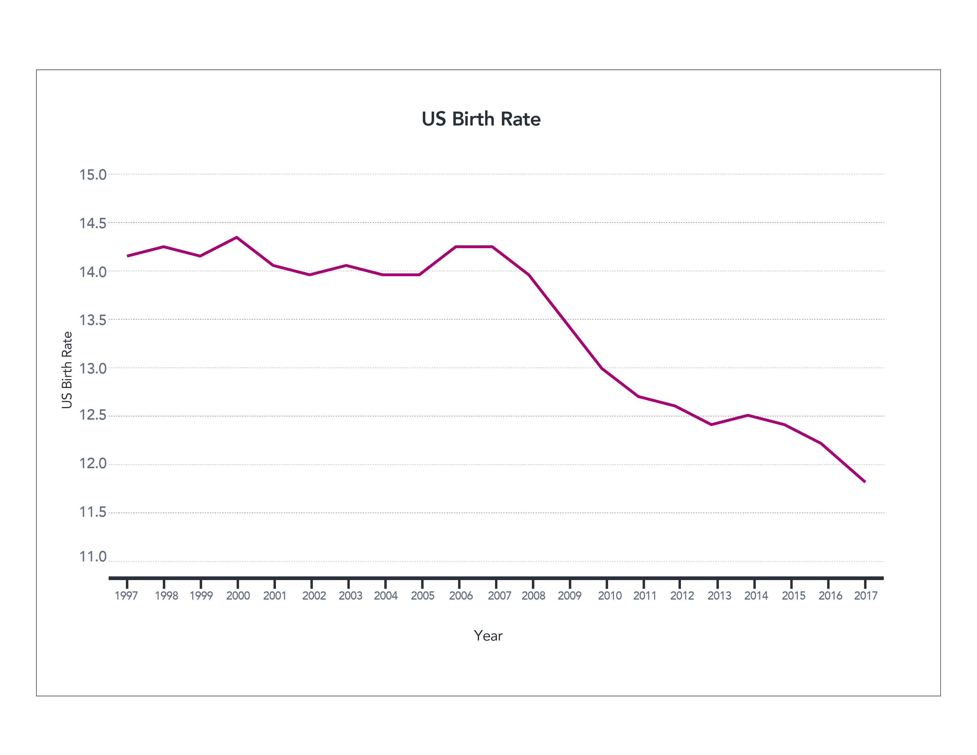
Figure 5. US Birth Rate (1997-2017) World Bank
Here’s another example that may be particularly hard to interpret. Sometimes authors wish to present data that occurs on very different scales. The chart below shows the leading causes of death in the U.S. over time. Heart disease, the number one cause of death, killed around 400 people per 100,000 in 1980. The fourth most common cause of death, unintentional injuries, killed approximately 40 people per 100,000. What’s harder to see are the rates of the lowest–ranked causes of death. They’re all clustered at the bottom because of the scale of the vertical axis, making them hard to read.
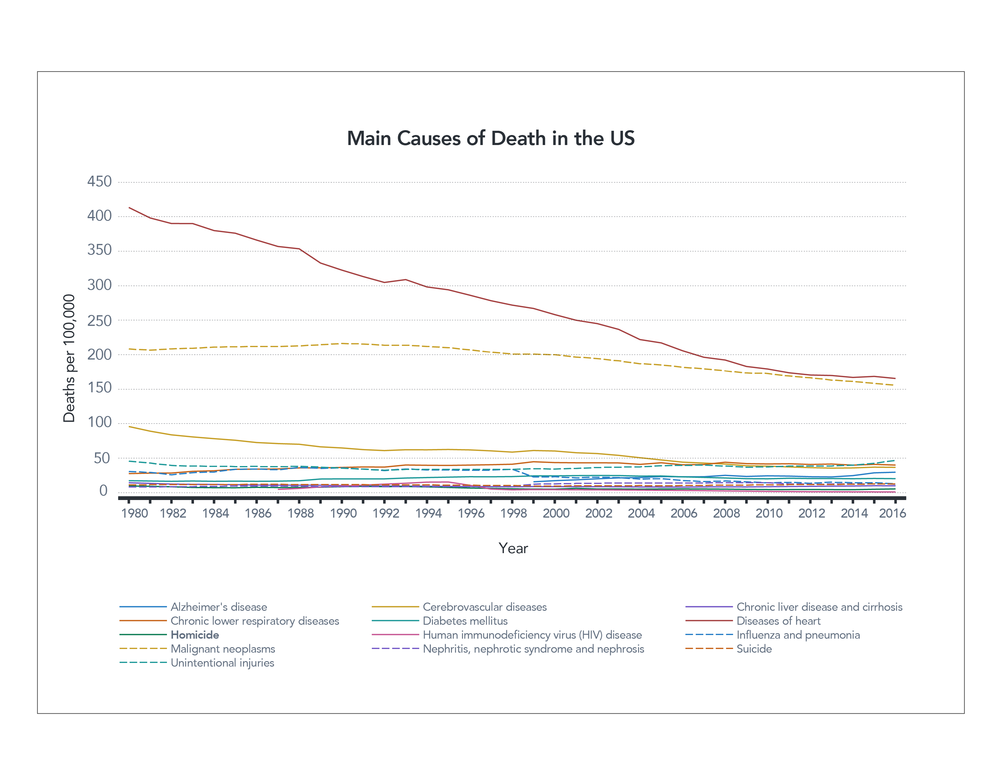
Figure 6. Main Causes of Death in the US (linear axis) CDC
Understanding a logarithmic scale
One way to fix this is by using a logarithmic scale. This means that values from 1-10 are given the same vertical real estate as values 10-100, and 100-1,000. Using a logarithmic scale can help spread out data that have significant differences in values. You then can see individual trends in each line much better. By spreading out the data in the chart below, you can see the drop in deaths from HIV much more clearly than in the first graph.
However, logarithmic scales are not necessarily something most people are familiar with, and they can be challenging to read properly. You might look at this chart and note that there has been a slight decrease in the number of deaths caused by heart disease from 1980 until now, but in reality the number has been reduced by more than half, from about 400 to 160 people per 100,000.
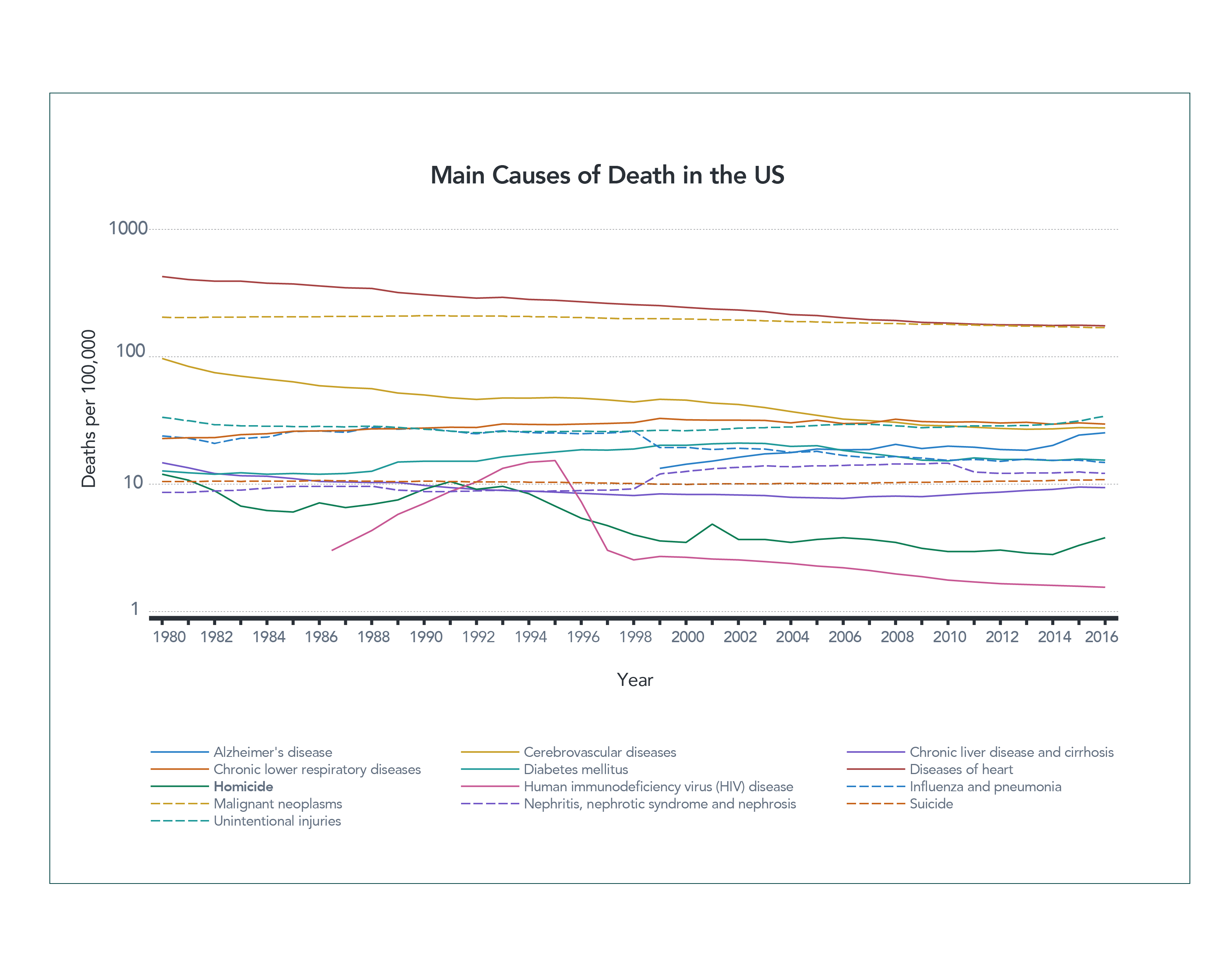
Figure 7. Main Causes of Death in the US (logarithmic axis) CDC
Both graphs have their value. One allows you to see the lower values more clearly; the other is easier for most people to interpret. Which is the appropriate one to use? Unfortunately, the answer is “it depends.”
As with all other forms of information, authors will choose the one that most accurately communicates their purpose. That purpose might be to persuade you or simply present a particular piece of information more prominently. What matters most is how you, the reader, respond to the data.
You can be a better consumer of data visualizations by examining the charts and graphs you see more carefully. Take note of whether a vertical axis has been shortened or distorted in some way, for example. Consider what the data might look like if presented differently. Examine the data that’s been chosen, what’s been left out, and if the graph tells the whole story. Could you gather more information to give the graph better context?
Asking and answering these types of questions will make you a smarter and more responsible consumer of data. You’ll be able to find the true answers behind the data and distinguish those from the information the author was specifically trying to draw attention to.
Test yourself: Take our data quiz (here or below)!
Related articles:
- Six strategies for making sense of data in the media
- Exploring statistics in the media
- Understanding complications with data collection
- Evaluating claims made from data
- Special look at issues with infographics
- Spotlight on data in social media
- How to be savvy about data in the news
- Quiz: Can you make sense of data?
![]() About SAS: Through innovative analytics software and services, SAS helps customers around the world transform data into intelligence.
About SAS: Through innovative analytics software and services, SAS helps customers around the world transform data into intelligence.
Making sense of data: Six strategies for making sense of data in the media
The series described below, presented by our partner SAS, explores the role of data in understanding our world. SAS is a pioneer in the data management and analytics field.
Data can be a powerful tool. It helps us to understand the world with more precision and greater clarity. Data is often the foundation for research, news articles and social media posts. Authors rely on data to help tell their story or prove their point. Because of its power to influence our understanding and decision–making, it’s essential that we learn how to confidently and critically consume the data we encounter.
If data is so intertwined with our daily lives, how then do we gain the skills to make sense of it, ask the right questions and draw the right conclusions?
We will address these questions and more in this blog series and cover a number of data analysis and presentation topics.
Diving into charts and graphs
When we talk about data visualizations, we’re referring to charts and graphs that help people visually make sense of large amounts of data rather than comparing raw numbers. Charts and graphs make it possible to see patterns and trends more clearly. At times, however, they can create confusion due to the way they’re presented. They can be misleading even if the underlying data is accurate. We’ll explore some of the common decisions that graph designers make when presenting information and how these decisions may impact what you see and understand.
Exploring statistics in the media
Whether it’s climate change or economic growth, statistics are often used to reinforce and better explain issues we face. Yet, there are many ways to use statistics to represent similar information. The type of measure or statistic used can significantly alter the story being told, so it’s important to be careful and understand the numbers. We’ll look at commonly used statistics and how they are often presented to help you understand what those numbers really mean.
Understanding complications with data collection
Even though data represents relevant issues, it is largely impossible to capture a completely accurate picture of the world around us. Instead, researchers rely on data collection methods to gather a close approximation. Unfortunately, the tools used can unintentionally skew the results. Therefore, it is important to understand the context of data creation. We’ll discuss key questions about the data collection process so you can determine what conclusions you can draw from the data.
Evaluating claims made from data
Data is often used to justify claims or statements about our world. However, it’s important to consider the context in which that data was collected to understand whether those claims are justifiable. We’ll look at two areas of concern – when authors use data to make comparisons and when research funding may introduce bias.
Special look at issues with infographics
Infographics are designed to be visually appealing tools that can communicate a lot of information. But their focus on visual design often makes them hard to interpret correctly. We’ll discuss some common issues with infographics and how they tie into the principles we discussed previously.
Spotlight on data in social media
Social media is a powerful tool for communication, and many people are creating their own content to share messages broadly. However, individual content creators may be more likely to post data and graphs that are misleading. One reason is that the flashiest stories are often shared the most rapidly and widely. We’ll discuss how social media encourages users to forgo the guidelines discussed in previous posts.
That’s a lot of information about data to cover, but it’s important. Data matters, and we’re excited to start the journey to understanding it better with you.
Test yourself: Take our data quiz (here or below)!
Related articles:
- Diving into charts and graphs in the news
- Exploring statistics in the media
- Understanding complications with data collection
- Evaluating claims made from data
- Special look at issues with infographics
- Spotlight on data in social media
- How to be savvy about data in the news
- Quiz: Can you make sense of data?
![]() About SAS: Through innovative analytics software and services, SAS helps customers around the world transform data into intelligence.
About SAS: Through innovative analytics software and services, SAS helps customers around the world transform data into intelligence.